This article has been translated to Japanese on SeleQt.
I’ve been using CSS grid (which henceforth will be referred to as Grid) for quite a bit now, and although I often talk about how we can use grid to make all kinds of creative layouts, I’m fully aware that a basic grid is still a design pattern that is very much in demand on the web.
Many conversations with fellow developers about using Grid involve the dreaded “but” statement, i.e. “but what about older browsers? I have to support *INSERT_RANDOM_OLD_BROWSER_HERE*”. And it’s totally understandable, because I also realised that not enough people know about the magic that is Feature Queries.
This post got too long again 😌, so here’s a table of contents, if there’s a particular section you’re interested in. And source code for the demo is available on GitHub.
TL:DR (skip those which bore you)
- Falling back with grace
- First principles of CSS: specifications
- What is this display you speak of?
- Basic, like really basic
- Bedgy, that’s like, basic and edgy
- Why hello, Grid, you revolutionary, you…
- Altogether now
- Useful resources
Falling back with grace
The @supports rule, AKA feature queries, is a conditional group rule whose condition tests whether the user agent supports CSS property:value pairs. In plain English, it’s an if statement to check if the browser supports a particular CSS property.
Here’s how support for it looks like right now:
I can already sense your eyes fixated on the column of red that is Internet Explorer, but stay with me and don’t throw in the towel on feature queries yet. How feature queries work is that, for browsers that don’t support it, all the styles within the @supports block is totally ignored.
Let’s examine this basic example:
main {
  background-color: red;
}

@supports (display: grid) {
  main {
    background-color: green;
  }
}
For browsers that support grid, the background colour of the main element will be green (because the conditional resolves to true), while for browsers that do not support grid, main will have a background colour of red.
The implication of this behaviour means that we can layer on enhanced styles based on the features we want to use and these styles will show up in browsers that support them. But for those that do not, they will get a more basic look that still works anyway. And that will be our approach moving forward.
Websites do NOT need to look the same on every browser.
First principles of CSS: specifications
Before we go into this, I want to emphasise that implementing layout on the web is significantly different than that on any other media. Why? Because our canvas is the browser and the only way to manipulate the layout is through code.
This degree of separation between the canvas and our input means that we must have knowledge of the workings of the browser that will render our code on the screen, a clear understanding of how the code we write will be interpreted.
A little more than a year ago, I asked the question, How well do you know CSS display? That was the first time I sat down and really read the CSS Display Module Level 3 specification. Layout is quite a large topic and crosses multiple specifications, including the CSS Positioned Layout Module Level 3, CSS Box Alignment Module Level 3, CSS Intrinsic & Extrinsic Sizing Module Level 3 and so on. You get the picture.
The specifications themselves refer to each other liberally, and thus reading one of them can result in your browser tab collection growing exponentially as you get linked to more and more related specifications (or maybe it’s just me) 😈.
What is this display you speak of?
In case you don’t share my interest in reading specifications, let’s briefly go through some of the more salient points of the CSS Display specification.
- Browsers draw boxes
- CSS generates a box tree
- Each box represents its corresponding element on the canvas
- For each element, CSS generates zero or more boxes based on the element’s
displayproperty
If you’ve never read the specification before, I suspect you wouldn’t know that the display property defines an element’s display type, which is how an element generates boxes. There are 2 basic display types, inner and outer.
The inner display type dictates how child boxes are laid out.
The outer display type dictates how the box itself participates in the layout.
There are additional display values like <display-listitem>, <display-internal>, <display-box> and <display-legacy>.
A formatting context is the environment in which a set of related boxes are laid out, and different formatting contexts will lay out their boxes according to different sets of rules.
We started out with the block formatting context and inline formatting context back in the 1998 CSS2 working draft, but with the addition of more layout options since then, we now also have the table formatting context, flex formatting context, grid formatting context and ruby formatting context.
Block-level elements are elements that generate a block-level principle box, which participate in the block formatting context. Inline-level elements are elements that do not form new blocks of content, and their content is distributed in lines. They generate inline-level boxes, which participate in the inline formatting context.
An inline-block element, however, is not an inline box. It exists in that in-between state because it participates in the inline formatting context as a single opaque box.
Okay, I think that’s enough specification talk for now. There’s so much more to cover, so I’ll probably do this in bits and pieces, for easier digestibility 🤓.
Basic, like really basic
I just watched Rachel Andrew’s talk at NordicJS the other night and one of the things she covered (and I live-tweeted) was how to fallback gracefully by understanding how the browser handles overridden CSS properties.
do you know what happens when your layout-related css properties override earlier ones? #nordicjs #css #grid pic.twitter.com/g6kOxiSeZO
— HJ Chen (@hj_chen) 7 September 2017
I’m going to be using 25 card-style items for the layout demo. Each card will have an image, a title and a subtitle. The title and subtitle text have variations on their lengths, because that’s just how real life works. The markup, which will be used for all the layouts demonstrated in this post, looks something like this:
<main class="grid">
  <div class="grid__item">
    <img class="card__img" src="images/image1.jpg" />
    <h2>Card title</h2>
    <p>Because the card pattern is soooo popular right now...</p>
  </div>
  <div class="grid__item">
    <img class="card__img" src="images/image2.jpg" />
    <h2>Card title</h2>
    <p>Because the card pattern is soooo popular right now, but not all text are made the same</p>
  </div>
  <!-- And repeat the .grid__item another 23 times -->
</main>
So in that vein, let’s start off with the most basic of layouts using inline-block.
The inline-block layout
Because I’m a stickler for punishment, this basic layout was tested to be working on IE8 (not further back, as I’m not a masochist). This option assumes that each card is a fixed size (e.g. 20em), and the entire layout will be centred on the viewport.
The code for this isn’t very complicated, as the layout container is set to display: inline-block, centring involves using text-align: center on its parent, in this case, the body element.
body {
  text-align: center;
}

.grid {
  display: inline-block;
}

.grid__item {
  width: 20em;
  display: inline-block;
  vertical-align: top;
  margin: 1em 0.5em;
  text-align: left;
}
This method works reasonably well if you want all the items in your grid to be the same fixed width, and doesn’t take much code to do it. You may run into issues if your images are not all the same height though.
I’ll cover the image handling issue in a different post, but for support that goes back to IE8, we can’t use the current markup. Also, if the last row has less items that the total number of columns, they will end up centre-aligned regardless, and maybe you don’t want that either.
Okay, let’s look at another method that falls under the basic category.
The float layout
Ah, the trusty float. This was the prevailing method for a pretty long time, and I’m sure there are many sites that are still using this technique. Responsive float-based layouts are, for the most part, not simple affairs.
Floats weren’t meant for doing page layout to begin with, hence all the trouble with clearing floats, especially when dealing with irregularly sized items within the layout.
And because of the heavy reliance on media queries, a lot of designers just chose to cap the maximum width of the grid, so you didn’t have to write a slew of media queries to support larger and larger viewports. I’m just going to forget that, and max out my layout’s column count at 5 🤷.
Just wanted to add that, if we wanted to make the inline-block layout items take up the width of the viewport, we too can chuck in the same slew of media queries instead of using a fixed width.
Okay, the following code is going to be loooooong…
.clearfix::after {
  content: "";
  display: table;
  clear: both;
}

.grid__item {
  float: left;
  padding: 0.5em;
  width: 100%;
}

@media screen and (min-width: 480px) {
  .grid__item {
    width: 50%;
  }

  .grid__item:nth-child(2n + 1) {
    clear: left;
  }
}

@media screen and (min-width: 768px) {
  .grid__item {
    width: 33.333%;
  }

  .grid__item:nth-child(2n + 1) {
    clear: none;
  }

  .grid__item:nth-child(3n + 1) {
    clear: left;
  }
}

@media screen and (min-width: 1024px) {
  .grid__item {
    width: 25%;
  }

  .grid__item:nth-child(3n + 1) {
    clear: none;
  }

  .grid__item:nth-child(4n + 1) {
    clear: left;
  }
}

@media screen and (min-width: 1280px) {
  .grid__item {
    width: 20%;
  }

  .grid__item:nth-child(4n + 1) {
    clear: none;
  }

  .grid__item:nth-child(5n + 1) {
    clear: left;
  }
}
I also cheated and added a .clearfix class to the layout container, because you can’t have a float-based layout without clearing it. You just can’t. Sorry. But regardless of whether the width of the layout item is fixed or flexible, the nth-child selectors for activating and removing clears are still required.
Because of that, this particular style of writing floats doesn’t work on IE8. Only IE9 and above. To negate the nth-child support issue, we would need additional wrappers around the number of items per viewport. As such, I will admit to rejecting multiple proposals by my designers of “4-3-2-1” responsive columns in the past.
Fallback technique winner: inline-block
Given this basic layout is meant to be the basic fallback, I’d go with the inline-block technique, because it’s much less code, and still looks reasonably decent. And remember that:
Websites do NOT need to look the same on every browser.
Bedgy, that’s like, basic and edgy
So this will be our first layer of feature query, with Flexbox. The idea of Flexbox was discussed before 2008, with the first working draft of the specification published in 2009. But the implementation of Flexbox was rather messy.
The trouble was that a number of developers used this yet-to-be-finalised feature in production, so everyone was in a bind when it came to updating the implementation. Well, that time has passed, and currently, Flexbox support is excellent.
A common issue I hear is that it’s difficult to create a grid system with Flexbox. The thing about Flexbox is, even though you can make a grid system with it, it isn’t the best idea to do so. Flexbox is suited for laying out items in a single dimension, where there isn’t a relationship between the rows and columns. Think of it more like a daisy chain of flex children.


Flex items are laid out and aligned within flex lines, which are those purple lines in the diagram. FYI these diagrams I sort of stole from the wonderful Brenda Storer (I did tell her though) to illustrate this concept. Okay, hers look better than mine but I can’t just use hers directly, that would be plagiarism.
.grid {
  display: flex;
  flex-wrap: wrap;
  margin: -1em 0 1em -0.5em;
}

.grid__item {
  padding: 1em 0 0 0.5em;
  flex: 1 0 20em;
}
So keep in mind that Flexbox isn’t exactly good at being a proper grid. It doesn’t handle gutters natively, hence the use of negative margins to get some space between each layout item. In general, Flexbox holds up pretty well, until we get to the last row of the layout. Unless it happens to end at a neat number, we usually end up with some odd orphan layout item(s).
We can resolve this by doing the same thing we did for floats, and that is, introduce a slew of media queries, like so:
.grid__item {
  padding: 1em 0 0 0.5em;
}

@media screen and (min-width: 480px) {
  .grid__item {
    width: 50%;
  }
}

@media screen and (min-width: 768px) {
  .grid__item {
    width: 33.333%;
  }
}

@media screen and (min-width: 1024px) {
  .grid__item {
    width: 25%;
  }
}

@media screen and (min-width: 1280px) {
  .grid__item {
    width: 20%;
  }
}
Another option is to cap the maximum width of each layout item, so the orphaned items don’t grow to ridiculous sizes. However, by default, everything will align left, and there may be instances where you have an excess of white space on the right of the layout container.
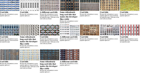
If you’re okay with that, awesome. But anecdotally, most people would like to centre things. 🤷
A little bit about box alignment
Enter, box alignment.
I know I said no more spec talk but this is pretty important, and I’m only covering a tiny part of it, specifically the part on content distribution, i.e. aligning a box’s contents within itself.
There are 2 relevant properties for this purpose, align-content and justify-content, as well as a shorthand place-content. As of time of writing, place-content is only supported in Chrome 59 and above, as well as Firefox (not sure from which version onwards though).
These properties behave slightly differently depending on the container they are applied to, so I’ll just focus on flex container behaviour for now. justify-content affects the flex items in each flex line and applies along the main axis. align-content affects the flex lines themselves and applies along the cross-axis.
Why not use horizontal and vertical axis? Because these physical directions may be different depending on the flex direction applied to the flex container, as well as the writing mode of the document, in various configurations. The diagrams below are just a subset of all possible permutations.


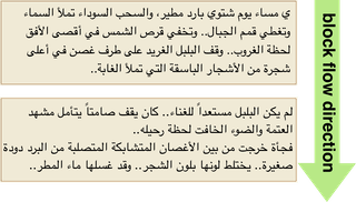

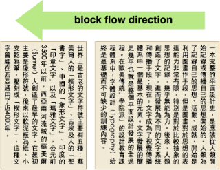
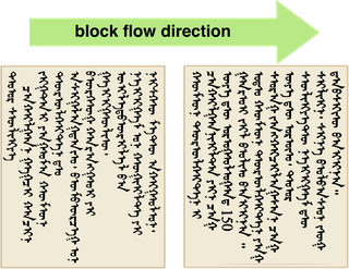
For this particular demo, we’re sticking with the most common setup of flex-direction: row and writing mode of horizontal-tb. The use case here is to centre the content along the horizontal plane, i.e. the main axis. So the property we want to call upon will be justify-content.
There are a myriad of values available for this property, those for distributing content and those for positioning content. For positioning, we have center, flex-start, flex-end, start and end. For distribution, we have stretch, space-around, space-between and space-evenly.
Those values prefixed with flex- only apply to flex containers, but otherwise they do what they say they will do, in that items will align to the start/centre/end of the container. Unfortunately, there is an IE11 bug for justify-content: center, so maybe we could use space-around instead.
For distribution, stretch is treated the same as flex-start. The difference between the other three is the amount of space between each item. space-between will result in the first and last items of the row being flush with the edges of the container.
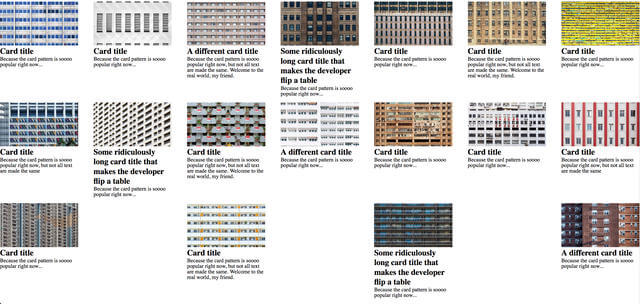
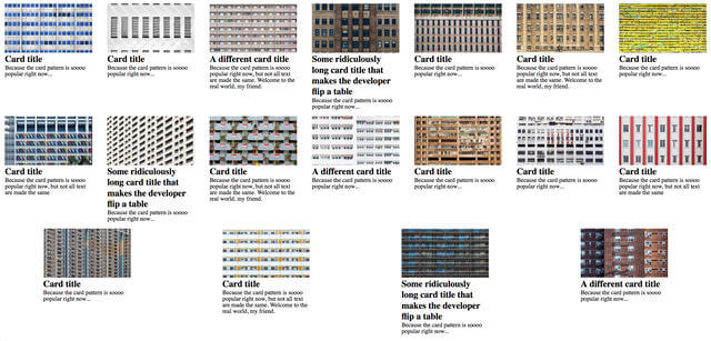
space-around gives each item an equal amount of space around themselves.
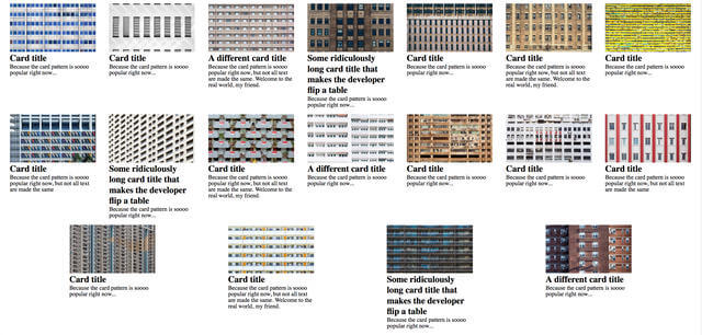
space-evenly, which is only supported by Firefox as of time of writing, distributes all the items evenly on the row, so the space between the first and last items and the edge of the container is the same as between items.
Personally, I will go for the justify-content: space-around option and hence my flexbox code will end up looking like this:
@supports (display: flex) {
  .grid {
    display: flex;
    flex-wrap: wrap;
    margin: -1em 0 1em -0.5em;
    justify-content: space-around;
  }

  .grid__item {
    padding: 1em 0 0 0.5em;
    flex: 1 0 20em;
    max-width: 20em;
    width: auto;
    margin: initial;
  }
}
The width: auto is used to reset the width value applied on the basic layout, and same goes for margin: initial. Now because feature queries are not supported by IE11 and below, none of the code in this block will apply on those browsers. Hence the lack of support for the initial property on those browsers is also a moot point.
It just so happens that the browsers that do support feature queries recognise initial as well, so maybe we lucked out for that one. Except Opera Mini. But I checked to see how it looked, and it really isn’t that bad, so I’ll just live with the extra margin there. Otherwise, you can set an explicit value for the margin for the flex layout, which is fine too.
Again, it’s your call on whether having the orphaned items display differently is acceptable or not. It might be alright if your layout items don’t have an image that spans the full width of the item, or it might not. Every context is different.
Websites do NOT need to look the same on every browser.
Why hello, Grid, you revolutionary, you…
There’s so much I want to say about Grid, but I will hold it all in and only cover what is necessary to achieve the basic grid layout within the scope of this post.
Grid is the most impressive roll-out of a new CSS feature I have ever seen, largely in part due to its development behind a flag. This meant that developers could test out Grid and provide feedback to the browser vendors yet be deterred from writing production code that wasn’t fully baked yet.
The only issue with this approach, which Rachel Andrew has highlighted time and time again, is that developer feedback isn’t as enthusiastic as we want it to be.
If you don't test and offer feedback on new CSS like grid layout you are trusting your future tools to the very few of us who do.
— Rachel Andrew (@rachelandrew) July 15, 2016
The CSS working group has put all the working drafts of specification on GitHub and all of us are free to participate in discussions, raise issues and provide feedback. If you spot something tiny, like a typo in the specification, you can submit a pull request. It doesn’t take too much effort, honestly.
Grid is different from all the layout techniques we’ve used in the past because it is the only solution that works from the container in (credit to Rachel Andrew for this concept). It calls for a big picture view of the grid you have in mind, as opposed to sizing each item individually, which may sometimes lead to a “missing the forest for the trees” situation.
The major benefit here is that we don’t need elements to depend on each other for placement. We can specify their position on x and y axis independent of what is around them.
— Brenda Storer
Another fantastic functionality that only pertains to Grid (at the moment), is grid-gap. We can now tell the browser that we want gaps between the items in our layout and the browser will figure the math out. And we have this feature because Rachel Andrew pushed for it at CSS Day and specification author, Elika J. Etemad (AKA Fantasai), who was in the audience, wrote it into the specification. Detailed story here.
Anyway, with Grid, we finally have a legit technique for laying out items in a grid. Like Pinocchio finally becoming a real boy. None of that complicated math to determine the best width for each item, no more messing with negative margins for gaps. Just good solid CSS grid code.
@supports (display: grid) {
  .grid {
    display: grid;
    grid-template-columns: repeat(auto-fill, minmax(20em, 1fr));
    grid-gap: 0.5em;
    margin: initial;
  }

  .grid__item {
    padding: initial;
    max-width: none;
  }
}
The basic premise of how grid works involves defining the grid, via the grid-template-columns and grid-template-rows. These properties allow you to define the size of the grid tracks for columns and rows respectively. We can then place items in the grid, either by ourselves or allowing the browser to do it for us.
For a regular basic grid, the browser can do it so much better than us, because, you know, math is more their forte than ours? No seriously, the grid auto-placement algorithm is really awesome.
In this basic grid, we’re making use of the repeat() function, and the minmax() function. The repeat() function saves us the trouble of having to repeat the same pattern of columns/rows by hand. It also takes either the auto-fill or auto-fit argument, which means the browser will determine how many columns or rows the grid should have, based on the available space.
minmax() takes 2 arguments, a size range between the <min> and <max> values. It let’s us cap the minimum width of a grid item at a fixed/inflexible width (<min>), while the <max> value can be a fixed value, a flex value or determined by content size using min-content or max-content.
grid-template-columns: repeat(auto-fill, minmax(20em, 1fr));This line tells the browser I want to have as many grid columns as the space given allows that are at least 20ems wide. If there is any extra space available, distribute it evenly amongst all the columns. No extra math, no slew of media queries 🙆.
grid-gap: 0.5em;Instead of using paddings and margins for gutters between each grid item, I just have to set the grid-gap to whatever value I want the gutters to be. grid-gap is actually a short-hand for <‘grid-row-gap’> <‘grid-column-gap’>?, and takes in 2 arguments. If you only use 1 argument, both properties will take the same value.
Altogether now
The final layout code ends up looking like this, based on my decisions to use the inline-block technique for base browsers, the space-around technique for yes-flex-no-grid browsers and grid for all the new kids.
body {
  text-align: center;
}

.grid {
  display: inline-block;
}

.grid__item {
  width: 20em;
  display: inline-block;
  vertical-align: top;
  margin: 1em 0.5em;
  text-align: left;
}

@supports (display: flex) {
  .grid {
    display: flex;
    flex-wrap: wrap;
    margin: -1em 0 1em -0.5em;
    justify-content: space-around;
  }

  .grid__item {
    padding: 1em 0 0 0.5em;
    flex: 1 0 20em;
    max-width: 20em;
    width: auto;
    margin: initial;
  }
}

@supports (display: grid) {
  .grid {
    display: grid;
    grid-template-columns: repeat(auto-fill, minmax(20em, 1fr));
    grid-gap: 0.5em;
    margin: initial;
  }

  .grid__item {
    padding: initial;
    max-width: none;
  }
}
If you ask me, I don’t think this is an excessive amount of code. But of course, you’re free to disagree. I hope that this will convince you that progressively enhancing your CSS is a valuable design pattern to add to your repertoire.
Also, start reading the specifications if you haven’t done so before. They are the root of how browsers are supposed to behave so if you do find a behaviour that doesn’t seem right, it might very well be a browser bug. We can raise those with the respective browser vendors. And voilà! You’ve just made the web better 🎊.
Lastly, and say it with me…
Websites do NOT need to look the same on every browser.
Until the next one! 🤗