Recently I was working on a few chat interfaces, and the general layout is typical to what you would see in most chat applications. There would be an input kissing the bottom of the window, with messages displayed in the chat window on either side depending on who said what.
Usually your own messages would appear on the right, while received messages would appear on the left. Of course there are also some interfaces (Slack) which align all the messages on the left, but the ones I use regularly (Whatsapp, WeChat, Twitter) use the aforementioned left-right style.
Such an interface is not tricky to build with Flexbox and the Box Alignment properties. But I did create a bug in the interface when using the box alignment properties for the messages area. TL:DR, the fix involves using auto margins instead of the justify-content property. Intrigued? Read on.
CSS-ing the chat interface
First, I’ll quickly give a broad overview of how a basic chat interface’s CSS looks like. So the layout should look something like this:
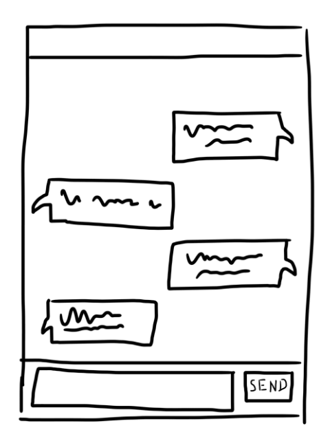
You would need a container for the entire chat window, divy-ed up into a header, a messages area and the input area right at the bottom. Within the messages area, individual messages would be their own element, laid out left and right.
<aside id="chatWindow">
  <div class="header">
    <h1>Live support</h1>
    <button class="btn-close" id="closeChat">
      <svg viewBox="0 0 47.971 47.971">
        <path
          fill="white"
          d="M28.228 23.986L47.092 5.122a2.998 2.998 0 000-4.242 2.998 2.998 0 00-4.242 0L23.986 19.744 5.121.88a2.998 2.998 0 00-4.242 0 2.998 2.998 0 000 4.242l18.865 18.864L.879 42.85a2.998 2.998 0 104.242 4.241l18.865-18.864L42.85 47.091c.586.586 1.354.879 2.121.879s1.535-.293 2.121-.879a2.998 2.998 0 000-4.242L28.228 23.986z"
        />
      </svg>
    </button>
  </div>

  <div id="message-area" class="messages"></div>

  <div class="controls">
    <form id="textentry">
      <input id="textbox" type="text" />
      <input id="submit" type="submit" value="Send" />
    </form>
  </div>
</aside>
For this particular example, I’ve used an <aside> element as the chat window body, and applied a display: flex on it. The entire chat window layout is pretty much going to be powered by Flexbox.
aside {
  display: flex;
  flex-direction: column;
  height: 100vh;
}

.header {
  display: flex; /* Because I have a close button I want aligned with the title text */
  align-items: center;
  /* Visual styles not included here but they exist */
}

.messages {
  flex: 1; /* Allows the message area to expand with viewport height */
  display: flex;
  flex-direction: column;
  overflow-y: scroll;
}

.controls {
  /* Visual styles, not much layout */
}
A flex: 1 on the message area while its parent (<aside>) is a flex container with a flex direction of column means that the message area will grow to fill up additional space as viewport height increases, or vice versa.
Use of a single positive integer as the flex value on a flex item is making use of one of the flex keyword values.This keyword resolves to a flex-grow value of whatever the positive integer was, a flex-shrink value of 1 and a flex-basis of 0.
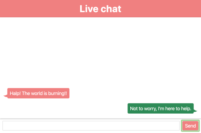
As for the chat bubbles within the message area, each role has their own class, e.g. agent and input. For the chat bubble that is supposed to be on the left, you don’t really need to do anything, and for the chat bubble that is supposed to be on the right, add an align-self: flex-end.
The data loss issue
As more messages get exchanged, the total height of all the messages would exceed that of the message area hence we would like the message area to be scrollable.
Initially, in order to have the chat messages start from the bottom of the message area, I had set a justify-content: flex-end on the message area. This works well enough. At first.
.messages {
  flex: 1; /* Allows the message area to expand with viewport height */
  display: flex;
  flex-direction: column;
  overflow-y: scroll;
  justify-content: flex-end;
}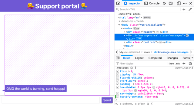
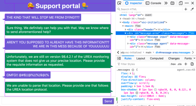
Unfortunately, once we get more messages than the message area can contain, we suffer a data loss issue. We are not able to scroll to the earliest messages.
If you peek into the specification for box alignment, there’s this bit:
When the alignment subject is larger than the alignment container, it will overflow. Some alignment modes, if honored in this situation, may cause data loss: for example, if the contents of a sidebar are centered, when they overflow they may send part of their boxes past the viewport’s start edge, which can’t be scrolled to.
And if you look into the flexbox specification, there’s also this bit:
Overflowing boxes ignore their auto margins and overflow in the end direction.
Now if you use the overflow alignment keyword of safe, what the browser will do is change the alignment mode back to one that does not result in data loss. And you can try this out in Firefox to see for yourself.
.messages {
  flex: 1; /* Allows the message area to expand with viewport height */
  display: flex;
  flex-direction: column;
  overflow-y: scroll;
  justify-content: safe flex-end;
}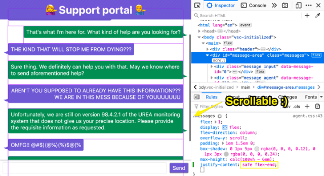
But then the original intention of having the messages start at the bottom of the message area cannot be achieved. The browser has forced the alignment to flex-start to prevent the data loss, so we’re back to square one.
The auto-margins fix
The solution I came up with is, instead of setting a justify-content: flex-end to align the messages to the bottom of the message area, I’d set a margin-top: auto on the first child of the messages area.
If you peek at the Flexbox specification this time, you can find this bit:
Prior to alignment via justify-content and align-self, any positive free space is distributed to auto margins in that dimension.
Regardless of how many message bubbles are in the message area, the top auto-margin on the first message bubble will push all the messages down to the bottom of the message area. And when there are many messages, you will still be able to scroll the message area.
I’ve ported a demo showing the difference between the 2 implementations in this CodePen if anyone is interested: https://codepen.io/huijing/pen/zYYoZZP.