CSS Grid is a two-dimensional layout system created specifically to tackle grid-based user interfaces on the web.
Grids are the fundamental to the design of layouts. Over the web's relatively short life-span, developers have been trying all kinds of methods and hacks for laying out content in the browser. We started off with no way to do page layout, to table-based layouts, followed by float-based layouts. But those approaches were, at best, workarounds, because neither tables nor floats were meant to be used as true layout tools.
Enter CSS Grid. The Grid Layout Working Draft was published back in 7 April 2011. 3 of the 4 authors were from Microsoft and the first IE10 Platform Preview shipped with a -ms prefixed Grid implementation. Over the course of 6 years, the specification has evolved based on feedback from developers and browser vendors working together to come up with a truly effective native CSS grid solution.
CSS Grid introduces a series of properties that allow us to create grid structures and control placement and sizing of grid items using CSS. This means that we are able to use media queries to adapt our grids to different contexts. We can rearrange the layout of grid items independent of their source order, which allows us to shift grid items around to cater for these varying contexts without having to change the underlying markup.
Grid also comes with a powerful auto-placement algorithm, which makes it easier to fill up available space without having to do a lot of complicated calculations. To a certain extent, Grid even allows some flexibility on the z-axis, in that you can overlap grid items if you need to.
Because Grid was created to be very flexible and cater for many different use cases, it is not something that we can just pick up and use in a day. Learning Grid is not difficult. Yes, it will take some time, but once you get the hang of it, you'll be able to spend more time on designing layouts instead of wrangling code to produce the layout you want.
Table of Contents
- Concepts and Terminology
- Grid Container: Defining the Grid Structure
- Grid Items: Placing Items in the Grid
- Grid Alignment: Aligning the Grid and Grid Items
- Grid Inspector tool
- Examples
- Browser Support
- Further Reading
Concepts and Terminology
The Grid specification introduces some terminology and concepts that we need to understand so we can utilise grid to its full effectiveness. By default, the directional context of a HTML document is left-to-right, and all the following examples assume this.
If the base direction of HTML is right-to-left, the concepts still apply, except that the block flow direction becomes right-to-left, where index 1 starts on the right instead. Changing the writing-mode of the document from horizontal to vertical will also affect the block flow direction. This will be covered in the section on Column-axis and Row-axis.
If you have used Flexbox before, you may notice a similarity in terms of usage, which works on the premise of a parent container and its child elements. In this case, we will refer to the parent container as the grid container and its child elements as grid items.
Grid Lines
Grid lines are the horizontal and vertical lines that form the basis of the grid structure. They are used to position items on the grid. We can refer to them by numerical index, which starts at 1.
Grid lines also have negative indices, which allow us to reference grid lines starting from the end of the grid. One of the use cases for negative indices is if you need an item in the last column, regardless of number of tracks, then giving that item a grid-column-end property of -1 will handle it.
.grid-container {
  display: grid;
  grid-template-columns: 150px 150px 150px;
  grid-template-rows: 150px 150px;
}

.item {
  grid-column-start: 2;
  grid-column-end: 4;
  grid-row-start: 2;
  grid-row-end: 3;
}
It is possible name the grid lines so you don't have to count which grid line you need to reference. These names can be declared as optional parameters in the grid-template-columns and grid-template-rows property.
.grid-container {
  display: grid;
  grid-template-columns: 150px [col-foo] 150px 150px [col-bar];
  grid-template-rows: 150px [row-foo] 150px [row-bar];
}

.item {
  grid-column-start: col-foo;
  grid-column-end: col-bar;
  grid-row-start: row-foo;
  grid-row-end: row-bar;
}
Grid Tracks and Cells
A grid track is the space between 2 adjacent grid lines. They are the rows and columns of your grid. The diagram below highlights the grid track between the first and second row grid lines. We can separate grid tracks with gutters, using the grid-row-gap and grid-column-gap properties.
A grid cell is the space between 2 adjacent row grid lines and 2 adjacent column grid lines. It's conceptually similar to a table cell, as it is the single unit of your grid. The diagram below highlights the grid cell between the third and fourth column grid lines and second and third row grid lines.
.grid-container {
  display: grid;
  grid-template-columns: 150px 150px 150px; /* three rows  */
  grid-template-rows: 150px 150px; /* two columns  */
}
Grid Areas
A grid area is made up of 1 or more grid cells, and are bound by 4 grid lines on each side of the grid area. You can refer to a grid area using it's bounding grid lines or it's name as defined by the grid-template-areas property. A grid item can then be assigned to a grid area with grid-placement properties like grid-area, grid-row, grid-column or their long-form equivalents.
.grid-container {
  display: grid;
  grid-template-columns: 150px 150px 150px; /* three rows  */
  grid-template-rows: 150px 150px; /* two columns  */
  grid-template-areas: "a b b"
                       "a b b";
}

.item-1 {
  grid-area: a;
}

.item-2 {
  grid-area: b;
}
The shaded portion of the diagram are gutters between the grid tracks, as mentioned earlier, which can be controlled with the grid-row-gap and grid-column-gap properties (more about that below).
And so, putting it all together:
Grid Container: Defining the Grid Structure
Summary of Properties related to the Grid Container
grid-template-columnsandgrid-template-rowsgrid-template-areasgrid-templategrid-column-gapandgrid-row-gapgrid-gapgrid-auto-columnsandgrid-auto-rowsgrid-auto-flowgrid
The structure of the grid, like how many rows and columns it has and their sizing, is controlled by properties applied on the grid container. Placement of grid items is determined by CSS properties applied to the child elements inside the grid container.
A grid container is defined by setting the display to grid or inline-grid on an element. This creates a grid formatting context for its contents, which are laid out into a grid. The grid formatting context only applies to child elements and does not extend to grandchild elements and beyond.
In the diagram below, we've applied display: grid; to the body element, resulting in the 4 child elements, header, main, aside and footer, becoming grid items. However, the content within the main element are not grid items.
Explicit Grid and Implicit Grid
The explicit grid is what we define using the relevant CSS grid properties, like grid-template-rows, grid-template-columns and grid-template-areas. But say you specified a grid with 2 rows and 3 columns, then placed an item outside this grid. The browser will create an implicit grid to hold that item.
.grid-container {
  display: grid;
  grid-template-columns: 150px 150px 150px; /* three rows  */
  grid-template-rows: 150px 150px; /* two columns  */
}

.item {
  grid-column: 5 / 6; /* grid-column-start: 5; grid-column-end: 6;  */
  grid-row:  2 / 3; /* grid-row-start: 2; grid-row-end: 3;  */
}
In a simple 3x2 grid, the grid column lines only go up to 4. But if we place an item in the 5th column, the browser will add 2 implicit columns (shown by the blue dashed lines on the grid) to accommodate this item.
The size of these implicit grid tracks can be specified with the grid-auto-columns and grid-auto-rows properties. If these properties are not set, their default value is auto, which results in the implicit columns filling up the available space equally. For implicit rows that do not have content, they will have a height of 0, which is the same as if you declared an empty div element.
An interesting thing about implicit grid tracks is that once they are created, grid items which are not explicitly placed will fill up accordingly. Say we have a grid container with 10 child elements and the grid is set up like so:
.grid {
  display: grid;
  grid-template-columns: 150px 150px;
  grid-template-rows: 150px 150px;
  grid-auto-columns: 50px 75px;
  grid-auto-flow: column;
}

.item {
  grid-column: 8;
}By placing a grid item at grid line 8, the browser generates 6 more implicit grid columns based on the values set on the grid-auto-columns property. The items that are not explicitly placed then fill up the implicit tracks accordingly.
Properties related to the Grid Container
The grid-template-columns and grid-template-rows Properties
grid-template-columns: none | <track-list> | <auto-track-list>
grid-template-rows: none | <track-list> | <auto-track-list>
These 2 properties specify the size of the grid tracks and line names. The property value is expressed as a space-separated list, known as a track list. The grid-template-columns property defines the track list for all the columns in the grid, while the grid-template-rows property defines the track list for all the rows in the grid. Line names are optional.
Because Grid was made to be very flexible in terms of how developers can define very customised grids, there are many different options available to define the values of grid-template-columns and grid-template-rows. The possible values and syntax forms have the following meanings:
- none
- This is the initial value. No explicit grid tracks are created.
<dt><track-list></dt>
<dd>
<p>
A list of values that specify the size of each grid track, and grid line names, which are optional. Syntax is as follows:
</p>
<pre>[ <line-names>? [ <track-size> | <track-repeat> ] ]+ <line-names>?</pre>
<h4 id="track_size"><track-size></h4>
<p>There are 3 ways you can define <track-size>.</p>
<ol>
<li>
<code id="track_breadth"><track-breadth></code>
<ul>
<li>Can be a CSS length or percentage, like 250px or 20%</li>
<li>
<p>Can be a flexible length, declared using the fr unit, which takes up a share of the remaining free space in proportion to its flex factor. For example, given a grid container of 750px with 3 columns of 150px, 1fr and 2fr respectively. The flexibly sized columns will take up the remaining 600px in the ratio of 1:2, so the second column takes up 200px and the third column takes up 400px.</p>
<pre>.grid {
display: grid; width: 750px; grid-template-columns: 150px 1fr 2fr; }
min-content, which is the smallest size possible that does not lead to overflow.max-content, which is the minimum size required to fit around the contentsCan be the keyword auto, which will fill up the remaining space available
.grid {
display: grid;
grid-template-columns: min-content max-content auto;
} </li>
</ul>
</li>
<li>
<code>minmax( <inflexible-breadth> , <track-breadth> )</code>
<p>Can be a range as defined by the <code>minmax()</code> function, where the first value is the minimum and the second value is the maximum. For this case, the minimum value cannot be a flexible length, so you can use all the types of values as <code><track-breadth></code> except flexible units.</p>
</li>
<li>
<code>fit-content( <length-percentage> )</code>
</li>
</ol>
<h4><track-repeat></h4>
<p>As for <code><track-repeat></code>, it means we can have repeating <code><track-size></code>s. We can do that with the <code>repeat()</code> notation, which is a helpful function that let's us specify a large number of columns or rows that follow a similar pattern. The syntax for <code><track-repeat></code> is as follows:</p>
<pre>repeat( [ <positive-integer> ] , [ <line-names>? <track-size> ]+ <line-names>? )</pre>
<p>Say we want the pattern of a 30px narrow column and a 100px wide column repeated 4 times. There are 2 ways to declare this:</p>
<pre>grid-template-columns: 30px 100px 30px 100px 30px 100px 30px 100px;
/* same as above but with the repeat() function */ grid-template-columns: repeat(4, 30px 100px);
<h4 id="line-names"><line-names></h4>
<p>
If you're creating a more complicated grid, for example, to layout the entire website, it might be helpful to name the grid lines to make the grid code easier to understand. Lines names can be any string except ‘span’, which is a keyword. Grid lines can have more than 1 name.
</p>
<pre>grid-template-columns: [first sidebar-start] 250px [content-start] 1fr [last];
grid-template-rows: [first header-start] 100px [content-start] 1fr [footer-start] 100px [last];
</dd>
<dt><auto-track-list></dt>
<dd>
<p>
A list of values that specify the size of each grid track, and grid line names, which are optional. Syntax is as follows:
</p>
<pre>[ <line-names>? [ <fixed-size> | <fixed-repeat> ] ]* <line-names>? <auto-repeat></pre>
<h4><fixed-size></h4>
<p>There are 3 ways you can define <fixed-size>.</p>
<ol>
<li>
<code><fixed-breadth></code>
<p>Can be any CSS length or percentage value</p>
</li>
<li>
<code>minmax( <fixed-breadth> , <track-breadth> )</code>
<p>Can be a range as defined by the <code>minmax()</code> function, where the first value is the minimum and the second value is the maximum. For this case, the minimum value must be a <code><fixed-breadth></code>, while the maximum value can be any values allowed for <a href="#track_breadth"><code><track-breadth></code></a></p>
</li>
<li>
<code>minmax( <inflexible-breadth> , <fixed-breadth> )</code>
<p>Can be a range as defined by the <code>minmax()</code> function, where the first value is the minimum and the second value is the maximum. For this case, the minimum value cannot be a flexible unit, while the maximum value must be a <code><fixed-breadth></code></p>
</li>
</ol>
<h4><fixed-repeat></h4>
<pre>repeat( [ <positive-integer> ] , [ <line-names>? <fixed-size> ]+ <line-names>? )</pre>
<p>By using the <code>repeat()</code> notation, we can create a grid where we can specify how many times a fixed-size grid column or row should be repeated.</p>
<h4><auto-repeat></h4>
<pre>repeat( [ auto-fill | auto-fit ] , [ <line-names>? <fixed-size> ]+ <line-names>? )</pre>
<p>By using the <code>repeat()</code> notation, we can create a grid where a fixed-size grid column or row can be repeated to fill up the available space.</p>
<p>The <code>auto-fill</code> keyword will generate as many columns as will fit the available space without causing the grid to overflow, and the <code>auto-fit</code> keyword behaves similarly. The difference is <code>auto-fit</code> will collapse any empty repeated tracks (means their size is 0px).</p>
</dd>
The grid-template-area Property
grid-template-areas: none | <string>+
This property defines named grid areas and provides a visualisation of the grid structure, which may help make underlying code easier to understand.
The possible values have the following meanings:
- none
- This is the initial value. No explicit grid tracks are created, and hence no named grid areas are defined.
<dt><string>+</dt>
<dd>
<p>Each separate string creates a row while each word in the string creates a column. All strings must have the same number of words, otherwise the declaration is invalid. Using a sequence of one or more '.' (U+002E FULL STOP) represents a null cell token, which is an unnamed area in the grid. This is easier to understand with some example code:</p>
<pre>.grid-container {
display: grid; grid-template-areas: “logo stats” “score stats” “board board” “… controls”; }
  <p>We can then assign grid items to these defined named areas like so:</p>
  <pre>.logo { grid-area: logo; }
.score { grid-area: score; } .stats { grid-area: stats; } .board { grid-area: board; } .controls { grid-area: controls; }
The grid-template Property
grid-template: none | [ <‘grid-template-rows’> / <‘grid-template-columns’> ] | [ <line-names>? <string> <track-size>? <line-names>? ]+ [ / <explicit-track-list> ]?
This is a shorthand for setting <‘grid-template-columns’>, <‘grid-template-rows’> and <‘grid-template-areas’> in a single declaration.
The possible values and syntax forms have the following meanings:
- none
- This sets all 3 properties to their initial values (which is
none)
<dt><‘grid-template-rows’> / <‘grid-template-columns’></dt>
<dd>
This sets the <code><‘grid-template-rows’></code> and <code><‘grid-template-columns’></code> to specified values, while <code><‘grid-template-areas></code> is set to <code>none</code>. Note that the order of the syntax is important, with the first value is for <code><‘grid-template-rows’></code> and the second value is for <code><‘grid-template-columns’></code>.
</dd>
<dt>[ <line-names>? <string> <track-size>? <line-names>? ]+ [ / <explicit-track-list> ]?</dt>
<dd>
This sets the <code><‘grid-template-areas’></code> to the listed strings. The <code><‘grid-template-rows’></code> will be set to the <code><track-size></code>s that come after each string. The grid lines will also be named based on the line names sandwiching each string. The <code><‘grid-template-columns’></code> will be set to the track listing specified after the slash. If nothing is specified after the slash, it will be set to <code>none</code>.
<pre>grid-template: [header-top] "a a a" [header-bottom] [main-top] "b b b" 1fr [main-bottom] / auto 1fr auto;</pre>
<p>is equivalent to</p>
<pre>grid-template-areas: "a a a"
"b b b";
grid-template-rows: [header-top] auto [header-bottom main-top] 1fr [main-bottom]; grid-template-columns: auto 1fr auto;
  <svg viewBox="0 0 955 419"><defs><path id="a10" d="M0 0h460v305H0z"/><mask id="b10" width="470" height="315" x="-5" y="-5"><path fill="#fff" d="M-5-5h470v315H-5z"/><use xlink:href="#a10"/></mask></defs><g fill="none" fill-rule="evenodd"><g transform="translate(433 45)"><use fill="#D8D8D8" xlink:href="#a10"/><use stroke="#595959" stroke-width="10" mask="url(#b10)" xlink:href="#a10"/></g><path stroke="#595959" stroke-width="5" d="M740.5 45v305M433 197.5h460M585.5 45v305" stroke-linecap="square"/><text fill="#000" font-size="14" transform="translate(0 -3)"><tspan x="491.208" y="14">auto</tspan></text><path stroke="#9012FE" stroke-width="2" d="M435 23h145m-134.2 3L435 23l10.8-3m123.4 6l10.8-3-10.8-3" stroke-linecap="square"/><text fill="#000" font-size="14" transform="translate(0 -3)"><tspan x="802.208" y="14">auto</tspan></text><path stroke="#9012FE" stroke-width="2" d="M746 23h145m-134.2 3L746 23l10.8-3m123.4 6l10.8-3-10.8-3" stroke-linecap="square"/><text fill="#000" font-size="14" transform="translate(0 -3)"><tspan x="653.074" y="14">1fr </tspan></text><path stroke="#9012FE" stroke-width="2" d="M591 23h145m-134.2 3L591 23l10.8-3m123.4 6l10.8-3-10.8-3" stroke-linecap="square"/><path stroke="#979797" stroke-width="3" d="M430.5 5v35m155-35v35m155-35v35m155-35v35"/><text fill="#000" font-size="36" transform="translate(0 -3)"><tspan x="495" y="287">b</tspan></text><text fill="#000" font-size="18" transform="translate(20 30)"><tspan x="208.06" y="18">header-top / a-start </tspan></text><text fill="#000" font-size="18" transform="translate(55 30)"><tspan x=".934" y="173">header-bottom / a-end / main-top / b-start</tspan></text><text fill="#000" font-size="18" transform="translate(20 30)"><tspan x="194.686" y="328">main-bottom / b-end</tspan></text><path stroke="#979797" stroke-width="3" d="M393 42.5h35m-35 155h35m-35 155h35"/><text fill="#000" font-size="14" transform="translate(0 -3)"><tspan x="382.074" y="281">1fr </tspan></text><text fill="#000" font-size="14" transform="translate(0 -3)"><tspan x="372.208" y="132">auto</tspan></text><path stroke="#979797" stroke-width="3" d="M430.5 355v35m465-35v35"/><text fill="#000" font-size="18" transform="translate(0 -3)"><tspan x="361.065" y="419">a-start / b-start</tspan></text><text fill="#000" font-size="18" transform="translate(0 -3)"><tspan x="833.399" y="419">a-end / b-end</tspan></text><text fill="#000" font-size="36" transform="translate(0 -3)"><tspan x="497" y="132">a</tspan></text><text fill="#000" font-size="36" transform="translate(0 -3)"><tspan x="653" y="132">a</tspan></text><text fill="#000" font-size="36" transform="translate(0 -3)"><tspan x="810" y="132">a</tspan></text><text fill="#000" font-size="36" transform="translate(0 -3)"><tspan x="652" y="287">b</tspan></text><text fill="#000" font-size="36" transform="translate(0 -3)"><tspan x="810" y="287">b</tspan></text><path stroke="#9012FE" stroke-width="2" d="M413 47.5v145m-3-134.2l3-10.8 3 10.8m-6 123.4l3 10.8 3-10.8m-3 20.3v145m-3-134.2l3-10.8 3 10.8m-6 123.4l3 10.8 3-10.8" stroke-linecap="square"/></g></svg>
</dd>
The grid-column-gap and grid-row-gap Properties
grid-column-gap: <length> | <percentage>
grid-row-gap: <length> | <percentage>
These properties specify the gutter size between grid columns and grid rows, respectively. Gutters do not appear on the edges of the grid, which means there is no butter before the first track or after the last track.
The possible values have the following meanings:
- <length-percentage>
- Can be any CSS length or as a percentage of the parent container's width.
The grid-gap Property
grid-gap: <‘grid-row-gap’> <‘grid-column-gap’>?
This is a shorthand for setting <‘grid-row-gap’> and <‘grid-column-gap’> in a single declaration. The first value sets the <‘grid-row-gap’> and the second value sets <‘grid-column-gap’>. If the <‘grid-column-gap’> is not present, it will take the same value as <‘grid-row-gap’>.
The possible values have the following meanings:
- <‘grid-row-gap’>
- Can be any CSS length or as a percentage of the parent container's width.
<dt><‘grid-column-gap’></dt>
<dd>
Can be any CSS length or as a percentage of the parent container's width.
</dd>
The grid-auto-columns and grid-auto-rows Properties
grid-auto-columns: <track-size>+
grid-auto-rows: <track-size>+
When a grid item is placed in a column or row that was not defined by <‘grid-template-columns’> or <‘grid-template-rows>, implicit grid tracks are created to hold these items. We can control the size of these implicit grid tracks with the <‘grid-auto-columns’> and <‘grid-auto-rows> properties. We can also specify multiple track sizes for these implicit grid tracks.
The possible values have the following meanings:
- <track-size>+
Can be any acceptable values for <track-size>. Each set of
<track-size>s can be repeated as a space-separated list.<pre>.grid {display: grid; grid-template-columns: 150px 150px; grid-auto-columns: 50px 100px; }
.item { grid-column: 8; }
    <svg style="max-height:15em;" viewBox="0 0 856 386"><defs><path id="a11" d="M310 0h475v305H310z"/><mask id="c11" width="485" height="315" x="-5" y="-5"><path fill="#fff" d="M305-5h485v315H305z"/><use xlink:href="#a11"/></mask><path id="b11" d="M0 0h305v305H0z"/><mask id="d11" width="315" height="315" x="-5" y="-5"><path fill="#fff" d="M-5-5h315v315H-5z"/><use xlink:href="#b11"/></mask></defs><g fill="none" fill-rule="evenodd"><text fill="#000" font-size="24" transform="translate(798 -7)"><tspan x="45.3" y="24">1</tspan></text><text fill="#000" font-size="24" transform="translate(798 -7)"><tspan x="45.3" y="189">2</tspan></text><text fill="#000" font-size="24" transform="translate(798 -7)"><tspan x="44.3" y="333">3</tspan></text><path stroke="#979797" stroke-width="3" d="M798 8.5h35m-35 155h35m-35 155h35"/><g transform="translate(8 11)"><use stroke="#4A90E2" stroke-width="10" mask="url(#c11)" stroke-dasharray="10" xlink:href="#a11"/><use fill="#D8D8D8" xlink:href="#b11"/><use stroke="#595959" stroke-width="10" mask="url(#d11)" xlink:href="#b11"/><path stroke="#595959" stroke-width="5" d="M0 152.5h305" stroke-linecap="square"/><path stroke="#4A90E2" stroke-width="5" d="M312.5 152.5h475" stroke-linecap="square" stroke-dasharray="5 9"/><path stroke="#595959" stroke-width="5" d="M152.5 0v305" stroke-linecap="square"/><path stroke="#4A90E2" stroke-width="5" d="M362.5 2.5v300m105-300v300m55-300v300m105-300v300m55-300v300" stroke-linecap="square" stroke-dasharray="5 9"/></g><path stroke="#979797" stroke-width="3" d="M5.5 321v35m155-35v35m155-35v35m55-35v35"/><text fill="#000" font-size="24" transform="translate(-2 321)"><tspan x=".3" y="64">1</tspan></text><text fill="#000" font-size="24" transform="translate(-2 321)"><tspan x="157.3" y="64">2</tspan></text><text fill="#000" font-size="24" transform="translate(-2 321)"><tspan x="310.3" y="64">3</tspan></text><text fill="#000" font-size="24" transform="translate(-2 321)"><tspan x="363.3" y="64">4</tspan></text><path stroke="#979797" stroke-width="3" d="M475.5 321v35"/><text fill="#000" font-size="24" transform="translate(-2 321)"><tspan x="469.3" y="64">5</tspan></text><path stroke="#979797" stroke-width="3" d="M530.5 321v35"/><text fill="#000" font-size="24" transform="translate(-2 321)"><tspan x="524.3" y="64">6</tspan></text><path stroke="#979797" stroke-width="3" d="M635.5 321v35"/><text fill="#000" font-size="24" transform="translate(-2 321)"><tspan x="630.3" y="64">7</tspan></text><path stroke="#979797" stroke-width="3" d="M690.5 321v35"/><text fill="#000" font-size="24" transform="translate(-2 321)"><tspan x="687.3" y="64">8</tspan></text><path stroke="#979797" stroke-width="3" d="M795.5 321v35"/><text fill="#000" font-size="24" transform="translate(-2 321)"><tspan x="790.3" y="64">9</tspan></text><path fill="#7ED321" fill-opacity=".75" d="M693 11h100v150H693z"/><text fill="#000" font-size="24" transform="translate(-2 -7)"><tspan x="714.204" y="99">.item</tspan></text></g></svg>
</dd>
The grid-auto-flow Property
grid-auto-flow: [ row | column ] | dense
This property allows us to adjust how the automatic placement of grid items work when they are not explicitly positioned with any grid-placement properties.
The possible values have the following meanings:
- row
- This is the initial value. The auto-placement algorithm will place grid items by filling each row and add new rows as needed.
<dt>column</dt>
<dd>
  The auto-placement algorithm will place grid items by filling each column and add new columns as needed.
</dd>

<dt>dense</dt>
<dd>
  <p>This controls how closely packed the grid items will be. If specified, the algorithm will attempt to fit smaller grid items that appear later in the source order earlier in the grid. This will minimise the incidence of ‘holes‘ in the grid.</p>
  <p>If not specified, the browser will default to the ‘sparse‘ algorithm, which only fills up the grid in order, never back-tracking. This may result in ‘holes‘ in the grid, where grid items do not fit in certain grid areas.</p>
</dd>
The grid Property
grid-grid: <‘grid-template’> | <‘grid-template-rows’> / [ auto-flow && dense? ] <‘grid-auto-columns’>? | [ auto-flow && dense? ] <‘grid-auto-rows’>? / <‘grid-template-columns’>
This is a shorthand that sets all the explicit grid properties and all the implicit grid properties in a single declaration. It also resets any gutter properties set earlier in the cascade. It will impact the following 8 sub-properties:
/* Initial values of each sub-property */
grid-template-rows: none
grid-template-columns: none
grid-template-areas: none
grid-auto-rows: auto
grid-auto-columns: auto
grid-auto-flow: row
grid-column-gap: 0
grid-row-gap: 0
The possible values and syntax forms have the following meanings:
- <‘grid-template’>
- Refer to the syntax for
<‘grid-template’>
<dt><‘grid-template-rows’> / [ auto-flow && dense? ] <‘grid-auto-columns’>?</dt>
<dd>
<p>Used to explicitly set the <strong>grid row tracks</strong>, while specifying how to set the auto-repeat behaviour for grid column tracks. All other grid sub-properties, for example, the gutter properties, get reset to their initial values. We cannot set grid-auto-rows using this syntax form, it will be set to <code>auto</code>.</p>
<pre>.grid {
grid: 50px 75px / auto-flow; }
/* is equivalent to */ .grid { grid-template-rows: 50px 75px; grid-template-columns: none; /* cannot be set explicitly with this syntax form */ grid-template-areas: none; /* cannot be set explicitly with this syntax form */ grid-auto-rows: auto; /* cannot be set explicitly with this syntax form */ grid-auto-columns: auto; grid-auto-flow: column; /* can only set dense or not */ grid-column-gap: 0; /* cannot be set explicitly with this syntax form */ grid-row-gap: 0; /* cannot be set explicitly with this syntax form */ }
<dt>[ auto-flow && dense? ] <‘grid-auto-rows’>? / <‘grid-template-columns’></dt>
<dd>
<p>Used to explicitly set the <strong>grid column tracks</strong>, while specifying how to set the auto-repeat behaviour for grid row tracks. All other grid sub-properties, for example, the gutter properties, get reset to their initial values. We cannot set grid-auto-columns using this syntax form, it will be set to <code>auto</code>.</p>
<pre>.grid {
grid: auto-flow dense / 30% 100px; }
/* is equivalent to */ .grid { grid-template-rows: none; /* cannot be set explicitly with this syntax form */ grid-template-columns: 30% 100px; grid-template-areas: none; /* cannot be set explicitly with this syntax form */ grid-auto-rows: auto; grid-auto-columns: auto; /* cannot be set explicitly with this syntax form */ grid-auto-flow: row dense; /* can only set dense or not */ grid-column-gap: 0; /* cannot be set explicitly with this syntax form */ grid-row-gap: 0; /* cannot be set explicitly with this syntax form */ }
Grid Items: Placing items in the Grid
Summary of Properties related to Grid Items
grid-column-start,grid-column-endandgrid-row-start,grid-row-endgrid-columnandgrid-rowgrid-area
Grid properties applied to the grid container are used to define the structure of the grid while the grid properties applied to the grid items are used to position items in the grid. Where a grid item ends up on the grid depends on its grid position and grid span.
Grid position defines the item's location on the grid. It can be explicitly specified via CSS properties or placed automatically by the browser via the auto-placement algorithm. Grid span defines how many grid tracks a grid item occupies. If not specified, every grid item's grid span will default to the value 1, which means it will take up the space of 1 grid cell.
The browser will determine the position and size of the grid item based on the following 6 values:
- row-start line
- row-end line
- row span
- column-start line
- column-end line
- column span
Specifying any 2 of the 3 values in the row dimension or in the column dimension will determine the third value. For example, if a grid item has a grid-column-start at grid line 1 and a grid-column-end at grid line 3, then it is implied that this grid item has a grid span of 2.
The grid placement algorithm will handle values that don't make logical sense. If a grid item's end line comes before its start line, then the start and end lines will be swapped. If the start line and end line are the same, the end line will be ignored.
.grid__item { grid-column-start: 5; grid-column-end: 2; }
/* will be treated as */
.grid__item { grid-column-start: 2; grid-column-end: 5; }
If both the start line and end line have a span defined, the one applied on the end line will be ignored.
.grid__item { grid-column-start: span 3; grid-column-end: span 2; }
/* will be treated as */
.grid__item { grid-column-start: span 3; }
If the grid line is specified with only a span for a named line, it will be treated as span 1.
.grid__item { grid-column-start: span [foo]; }
/* will be treated as */
.grid__item { grid-column-start: span 1; }
Ordering grid items
If grid positions are not explicitly specified, grid items will be automatically placed into the available empty grid cell according to their source order in the HTML document. However, we are free to rearrange the visual presentation of our grid items using grid-placement properties. As is emphasised in the CSS specification itself, grid placement only affects visual presentation. Having the correct source order is absolutely critical for screen-readers, speech, keyboard navigation and other non-CSS user agents.
It is advisable to have the main content appear first in the source order before additional columns for navigation or related links for improved accessibility. However, from a visual perspective, having the navigation appear before the main content is the most common design pattern. To improve site usability for users who are unable to navigate with a mouse, many sites use "Skip Navigation" links, which is a link at the top of the page that allows users to jump straight to the main content.
With CSS grid, we can now structure the markup of our document to have the main content appear first in the source order, before the navigation links and any other additional content. We can then use grid to visually place the navigation on the left or even above the main content without compromising usability for non-mouse users.
Say we chose to structure our HTML with the main content appearing first in the source order like so:
<body>
  <header>...</header>
  <main>...</main>
  <nav>...</nav>
  <aside>...</aside>
  <footer>...</footer>
</body>
With Grid, it is possible to visually position the navigation on the grid in a way that it appears below the header yet above the main content.
body {
  display: grid;
  grid: "header header"
        "nav nav"
        "content sidebar"
        "footer footer";
  grid-template-columns: 1fr 25%;
}

header { grid-area: header; }
nav { grid-area: nav; }
footer { grid-area: footer; }
It is also possible to apply the order property to grid items, by controlling the order which grid items appear in the grid container. The default value of all items is 0. The order property, like explicit grid placement, only modifies the visual order. Keyboard navigation, or non-visual media like speech still follows the document's source order.
Overlapping grid items
Multiple items can be placed in the same grid cell. We can position grid items in a way that they overlap each other. Without specifying the z-index explicitly, by default, grid items that appear later in the source order will be rendered on the top (in the z-dimension). The following code will allow the grid items to be stacked like cascading windows.
<div class="grid-container">
  <div class="grid__item a"><div class="box"></div>Here is some text. Text is inline.</div>
  <div class="grid__item b"><div class="box"></div>Here is some text. Text is inline.</div>
  <div class="grid__item c"><div class="box"></div>Here is some text. Text is inline.</div>
</div>
.grid-container {
  display: grid;
  grid-template-columns: 150px 150px;
  grid-template-rows: 150px 150px;
}

.grid__item {
  max-width: 150px;
}

.a {
  background-color: lime;
  grid-row: 1 / span 2;
  grid-column: 1 /span 2;
  align-self: start;
}

.b {
  background-color: skyblue;
  grid-row: 1 / span 2;
  grid-column: 1 /span 2;
  justify-self: center;
  align-self: center;
}

.c {
  background-color: orange;
  grid-row: 1 / span 2;
  grid-column: 1 /span 2;
  justify-self: end;
  align-self: end;
}
The justify-self and align-self properties make the size of the grid item fit its contents. If not set, the grid item will behave as though those values were set to stretch. By making each grid item span a square area of 4 grid cells, the justify-self and align-self can be used to position the grid item within this 4-cell area.
It is also possible to change the stacking order of grid items with the z-index property. Just like positioned elements, the item with a higher z-index will display on the top of the stack. Together with the alignment properties mentioned earlier, we can achieve some pretty interesting visual effects.
<div class="grid-container">
  <div class="grid__item a">...</div>
  <div class="grid__item b">...</div>
  <div class="grid__item c">...</div>
  <div class="grid__item d">...</div>
  <div class="grid__item e">...</div>
</div>
.a {
  grid-column: 1 / span 2;
  grid-row: 2;
  align-self: end;
  background-color: lime;
}

.b {
  grid-column: 1;
  grid-row: 1;
  z-index: 10;
  background-color: yellow;
  border-radius: 50%;
}

.c {
  grid-column: 2;
  grid-row: 1;
  align-self: start;
  margin-left: -20px;
  background-color: orange;
  text-align: right;
}

.d {
  grid-column: 2;
  grid-row: 2;
  justify-self: end;
  align-self: start;
  background-color: skyblue;
  max-width: 80px;
}

.e {
  grid-column: 1 / span 2;
  grid-row: 1 / span 2;
  z-index: 5;
  justify-self: center;
  align-self: center;
  background-color: red;
  max-width: 100px;
}
Absolutely Positioned Grid Items
It is possible to absolutely position grid items within their grid container by using position: relative on the grid container. However, applying an absolute position to a grid item takes it out of the normal document flow, which means it does not participate in the grid's layout and will not fill up grid cells during auto-placement.
Absolutely positioned grid items can still be placed in specific grid cells using the grid placement properties, grid-row and grid-column, but it will not stretch to fill the whole grid cell, instead, the grid item shrinks to fit the size of its contents. They will not create implicit grid tracks when placed outside the explicit grid either, but can occupy already existing implicit grid tracks.
The offsets of top, right, bottom and left can be used to place the grid items within the grid container as well. The offsets are calculated from the padding edge of the grid container.
One of the engineers, Manuel Rego Casasnovas, who works on the implementation of Grid in Blink and Webkit wrote an in-depth article on CSS Grid Layout and positioned items which explains this concept very thoroughly.
Properties related to Grid Items
The grid-column-start, grid-column-end and grid-row-start, grid-row-end Properties
grid-column-start: auto | <custom-ident> | [ <integer> && <custom-ident>? ] | [ span && [ <integer> || <custom-ident> ] ]
grid-column-end: auto | <custom-ident> | [ <integer> && <custom-ident>? ] | [ span && [ <integer> || <custom-ident> ] ]
grid-row-start: auto | <custom-ident> | [ <integer> && <custom-ident>? ] | [ span && [ <integer> || <custom-ident> ] ]
grid-row-end: auto | <custom-ident> | [ <integer> && <custom-ident>? ] | [ span && [ <integer> || <custom-ident> ] ]
These four properties define the size of a grid item and where it should be placed in the grid. Together, they will specify which grid lines will form the edges of a grid item's grid area.
grid-column-start: indicates the column grid line where the grid item startsgrid-column-end: indicates the column grid line where the grid item endsgrid-row-start: indicates the row grid line where the grid item startsgrid-row-end: indicates the row grid line where the grid item ends
The possible values have the following meanings:
- auto
- This is the initial value. No grid line has been specified for this property, so the item will be automatically placed to fill up the grid and have a default span of 1.
<dt><custom-ident></dt>
<dd>
Can be the numerical index of the grid line, or a <a href="#line-names">named grid line</a>.
</dd>
<dt>[ <integer> && <custom-ident>? ]</dt>
<dd>
<p>For repeated named grid lines, the integer value, n, will define the nth grid line with the specified name. The integer value cannot be 0.</p>
<svg style="max-height:13em;" viewBox="0 0 627 385"><defs><path id="a37" d="M0 0h570v305H0z"/><mask id="b37" width="580" height="315" x="-5" y="-5"><path fill="#fff" d="M-5-5h580v315H-5z"/><use xlink:href="#a37"/></mask></defs><g fill="none" fill-rule="evenodd"><g transform="translate(29 5)"><use fill="#D8D8D8" xlink:href="#a37"/><use stroke="#595959" stroke-width="10" mask="url(#b37)" xlink:href="#a37"/></g><path stroke="#595959" stroke-width="5" d="M391.5 5v304m55-304v304M29 157.5h570M181.5 5v305m55-305v305" stroke-linecap="square"/><path stroke="#979797" stroke-width="3" d="M26.5 315v35m155-35v35m55-35v35m155-35v35m55-35v35"/><text fill="#000" font-size="24" transform="translate(-2 315)"><tspan x=".648" y="64">[foo]</tspan></text><path stroke="#979797" stroke-width="3" d="M601.5 315v35"/><text fill="#000" font-size="24" transform="translate(-2 315)"><tspan x="575.304" y="64">[bar]</tspan></text><text fill="#000" font-size="24" transform="translate(-2 315)"><tspan x="154.304" y="64">[bar]</tspan></text><text fill="#000" font-size="24" transform="translate(-2 315)"><tspan x="212.148" y="64">[foo]</tspan></text><text fill="#000" font-size="24" transform="translate(-2 315)"><tspan x="364.304" y="64">[bar]</tspan></text><text fill="#000" font-size="24" transform="translate(-2 315)"><tspan x="422.148" y="64">[foo]</tspan></text><path fill="#7ED321" fill-opacity=".75" d="M184 5h260v150H184z"/><path fill="#F8E81C" fill-opacity=".75" d="M449 160h150v150H449z"/><path fill="#4A90E2" fill-opacity=".75" d="M184 160h50v150h-50z"/><text fill="#000" font-size="24" transform="translate(-2 5)"><tspan x="305.404" y="81">.a</tspan></text><text fill="#000" font-size="24" transform="translate(-2 5)"><tspan x="199.864" y="236">.b</tspan></text><text fill="#000" font-size="24" transform="translate(-2 5)"><tspan x="516.456" y="236">.c</tspan></text></g></svg>
<pre>.a { grid-column-start: 1 bar; grid-column-end: 3 foo; }
.b { grid-column-start: 1 bar; } .c { grid-column-start: -1 foo; }
</dd>
<dt>[ span && [ <positive-integer> || <custom-ident> ] ]</dt>
<dd>
<p>Provides the option of specifying the grid span of a grid item. This value, together with the specified grid line, will determine the placement of the grid item. The grid item will span N number of tracks from the grid line specified.</p>
<p>For example, a grid item with <code>grid-column-start: span 2;</code> and <code>grid-column-end: 4;</code> will span 2 columns from grid line 4, towards the start line.</p>
<svg style="max-height: 8em;" viewBox="0 0 477 225"><defs><path id="a38" d="M0 0h460v150H0z"/><mask id="b38" width="470" height="160" x="-5" y="-5"><path fill="#fff" d="M-5-5h470v160H-5z"/><use xlink:href="#a38"/></mask></defs><g fill="none" fill-rule="evenodd"><g transform="translate(8 5)"><use fill="#D8D8D8" xlink:href="#a38"/><use stroke="#595959" stroke-width="10" mask="url(#b38)" xlink:href="#a38"/></g><path stroke="#595959" stroke-width="5" d="M315.5 5v150M160.5 5v150" stroke-linecap="square"/><path fill="#7ED321" fill-opacity=".75" d="M163 5h305v150H163z"/><path stroke="#979797" stroke-width="3" d="M5.5 160v35m155-35v35m155-35v35m155-35v35"/><text fill="#000" font-size="24" transform="translate(-2 160)"><tspan x=".3" y="64">1</tspan></text><text fill="#000" font-size="24" transform="translate(-2 160)"><tspan x="157.3" y="64">2</tspan></text><text fill="#000" font-size="24" transform="translate(-2 160)"><tspan x="310.3" y="64">3</tspan></text><text fill="#000" font-size="24" transform="translate(-2 160)"><tspan x="464.3" y="64">4</tspan></text><text fill="#000" font-size="24" transform="translate(-2 5)"><tspan x="286.204" y="81">.item</tspan></text></g></svg>
<p>If the integer is not specified, it will default to <code>1</code>.</p>
</dd>
The grid-row and grid-column Properties
grid-row: <grid-line> [ / <grid-line> ]?
grid-column: <grid-line> [ / <grid-line> ]?
This is a shorthand that sets the start line and end line for the respective dimensions in the same declaration. The grid-row property is the shorthand for grid-row-start and grid-row-end, while the grid-column property is the shorthand for grid-column-start and grid-column-end.
The grid line values are separated by a slash. The value before the slash indicates the start line and the value after the slash indicates the end line.
The possible values have the following meanings:
- <grid-line> [ / <grid-line> ]?
- Refer to the syntax for
<grid-line>. The second value is optional.
The grid-area Property
grid-area: <grid-line> [ / <grid-line> ]{0,3}This is a shorthand that sets the grid lines which define each of the 4 edges of the grid area in a single declaration. The order for this shorthand is row start / column-start / row-end / column-end. In other words, it runs in a counter-clockwise direction for documents with the default base direction of left-to-right. This is the opposite of other 4-edge properties, like margin or padding.
The possible values have the following meanings:
- <grid-line> [ / <grid-line> ]{0,3}
- Refer to the syntax for
<grid-line>. This property can take up to 4 grid lines, with the second, third and fourth values being optional.
Grid Alignment: Aligning the Grid and Grid Items
Summary of Properties related to Grid Alignment
Column-axis and Row-axis
The default inline direction for HTML documents is left-to-right, which means the text flow starts from the left and ends on the right. The default block flow direction is top-to-bottom, which means block-level boxes stack from the top of the page down towards the bottom. It is possible to change the direction with the writing-mode property.
Grid uses the terms column-axis and row-axis to describe alignment directions. The column-axis refers to the block axis, while the row-axis refers to the inline axis. Theses axes are dependent on the writing-mode direction.
Properties related to Grid Alignment
The justify-content Property
justify-content: center | start | end | space-between | space-around | space-evenly
Sometimes the edges of the grid does not correspond to the edges of the grid container, which could happen if the grid tracks are sized with fixed units. For such cases, we can justify the grid within the grid container along the row-axis, or in the inline-dimension, by applying the justify-content property on the grid container. All the example diagrams assume the default document direction of left-to-right and writing-mode to be horizontal-tb.
The possible values have the following meanings:
- center
Centers the grid within the grid container along the row-axis
- start
Aligns the grid to be flush with the starting edge of the grid container along the row-axis
- end
Aligns the grid to be flush with the ending edge of the grid container along the row-axis
- space-around
Distributes the grid tracks evenly within the grid container along the row-axis such that each grid track has equal space on either side of it, with a half-size space on either end.
- space-between
Distributes the grid tracks evenly within the grid container along the row-axis with the first grid track flush with the starting edge of the grid container, and the last grid track flush with the ending edge of the grid container.
- space-evenly
Distributes the grid tracks evenly within the grid container along the row-axis such that the space between any 2 adjacent grid tracks are the same.
The align-content Property
align-content: center | start | end | space-between | space-around | space-evenly
Sometimes the edges of the grid does not correspond to the edges of the grid container, which could happen if the grid tracks are sized with fixed units. For such cases, we can align the grid within the grid container along the column-axis, or in the block-dimension, by applying the align-content property on the grid container. All the example diagrams assume the default document direction of left-to-right and writing-mode to be horizontal-tb.
The possible values have the following meanings:
- center
Centers the grid within the grid container along the column-axis
- start
Aligns the grid to be flush with the starting edge of the grid container along the column-axis
- end
Aligns the grid to be flush with the ending edge of the grid container along the column-axis
- space-around
Distributes the grid tracks evenly within the grid container along the column-axis such that each grid track has equal space on either side of it, with a half-size space on either end.
- space-between
Distributes the grid tracks evenly within the grid container along the column-axis with the first grid track flush with the starting edge of the grid container, and the last grid track flush with the ending edge of the grid container.
- space-evenly
Distributes the grid tracks evenly within the grid container along the column-axis such that the space between any 2 adjacent grid tracks are the same.
The justify-items Property
justify-items: center | start | end | stretch
We can justify the content within grid items in the inline-dimension, or along the row-axis, by applying the justify-items property on the grid container. All the example diagrams assume the default document direction of left-to-right and writing-mode to be horizontal-tb.
The possible values have the following meanings:
- stretch
This is the default value. Fills up the width of the grid area.
- center
Justifies content of grid items in the center of the grid area along the row-axis
- start
Justifies content of grid items with the starting edge of the grid area along the row-axis
- end
Justifies content of grid items with the ending edge of the grid area along the row-axis
The align-items Property
align-items: center | start | end | stretch
We can set the alignment for the content within grid items in the block-dimension, or along the column-axis, by applying the align-items property on the grid container. All the example diagrams assume the default document direction of left-to-right and writing-mode to be horizontal-tb.
The possible values have the following meanings:
- stretch
This is the default value. Fills up the width of the grid area.
- center
Aligns content of grid items in the center of the grid area along the column-axis
- start
Aligns content of grid items with the starting edge of the grid area along the column-axis
- end
Aligns content of grid items with the ending edge of the grid area along the column-axis
The justify-self Property
justify-self: center | start | end | stretch
We can justify the content within individual grid items in the inline-dimension, or along the row-axis, by applying the justify-self property on the grid item itself. All the example diagrams assume the default document direction of left-to-right and writing-mode to be horizontal-tb.
The possible values have the following meanings:
- stretch
This is the default value. Fills up the width of the grid area.
- center
Aligns content of the grid item in the center of the grid area along the row-axis
- start
Justifies content of the grid item with the starting edge of the grid area along the row-axis
    <svg style="max-width:14em;" viewBox="0 0 260 227"><defs><path id="a29" d="M0 0h250v165H0z"/><mask id="b29" width="260" height="175" x="-5" y="-5"><path fill="#fff" d="M-5-5h260v175H-5z"/><use xlink:href="#a29"/></mask></defs><g fill="none" fill-rule="evenodd"><g transform="translate(5 5)"><use fill="#D8D8D8" xlink:href="#a29"/><use stroke="#979797" stroke-width="10" mask="url(#b29)" xlink:href="#a29"/></g><path stroke="#979797" stroke-width="5" d="M87.5 5v165M5 87.5h250m-250 85h250M172.5 5v165" stroke-linecap="square"/><path fill="#7ED321" fill-opacity=".75" d="M90 5h50v80H90z"/><path stroke="#9012FE" stroke-width="2" d="M5 193h250m-239.2 3L5 193l10.8-3m228.4 6l10.8-3-10.8-3" stroke-linecap="square"/><text fill="#000" font-size="24" transform="translate(5 5)"><tspan x="70" y="221">Row-axis</tspan></text></g></svg>
</dd>
<dt>end</dt>
<dd>
    <p>Justifies content of the grid item with the ending edge of the grid area along the row-axis</p>
    <svg style="max-width:14em;" viewBox="0 0 260 227"><defs><path id="a31" d="M0 0h250v165H0z"/><mask id="b31" width="260" height="175" x="-5" y="-5"><path fill="#fff" d="M-5-5h260v175H-5z"/><use xlink:href="#a31"/></mask></defs><g fill="none" fill-rule="evenodd"><g transform="translate(5 5)"><use fill="#D8D8D8" xlink:href="#a31"/><use stroke="#979797" stroke-width="10" mask="url(#b31)" xlink:href="#a31"/></g><path stroke="#979797" stroke-width="5" d="M87.5 5v165M5 87.5h250m-250 85h250M172.5 5v165" stroke-linecap="square"/><path fill="#7ED321" fill-opacity=".76" d="M120 5h50v80h-50z"/><path stroke="#9012FE" stroke-width="2" d="M5 193h250m-239.2 3L5 193l10.8-3m228.4 6l10.8-3-10.8-3" stroke-linecap="square"/><text fill="#000" font-size="24" transform="translate(5 5)"><tspan x="70" y="221">Row-axis</tspan></text></g></svg>
</dd>
The align-self Property
align-self: center | start | end | stretch
We can set the alignment for the content within individual grid items in the block-dimension, or along the column-axis, by applying the align-self property on the grid item itself. All the example diagrams assume the default document direction of left-to-right and writing-mode to be horizontal-tb.
The possible values have the following meanings:
- stretch
This is the default value. Fills up the width of the grid area.
- center
Aligns content of the grid item in the center of the grid area along the column-axis
- start
Aligns content of the grid item with the starting edge of the grid area along the column-axis
- end
Aligns content of the grid item with the ending edge of the grid area along the column-axis
Grid Inspector tool
Firefox 52 and above has a very useful tool called the Grid Inspector tool. It lets developers visualise the grid code by overlaying grid lines onto the element set to display: grid. To use this tool, open up Developer Tools by right-clicking the page and selecting Inspect Element. Highlight an element with the display: grid property applied to it. You should see a small icon to the left of the word “grid”. Click on that to toggle the grid lines on the page.
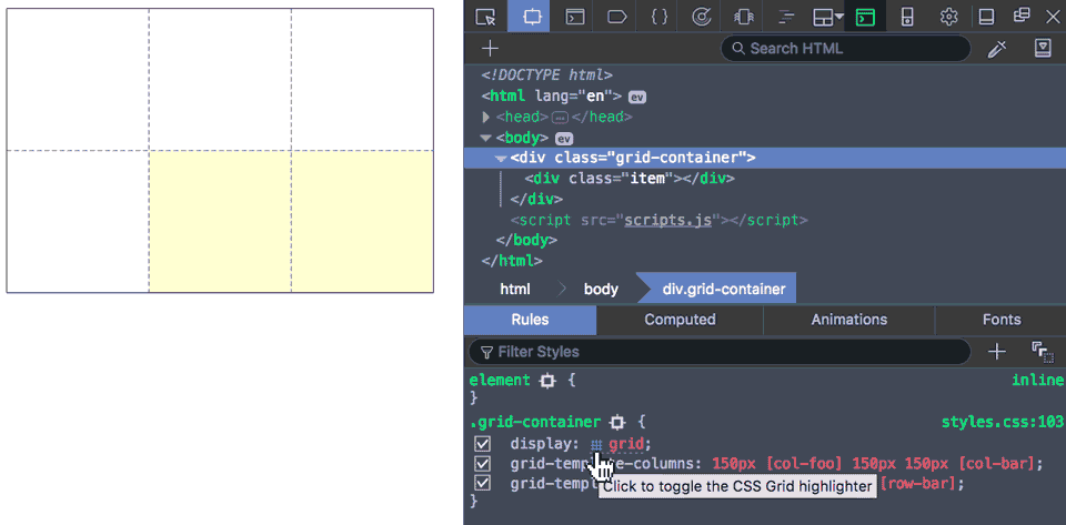
Helen Holmes first wrote about this feature with a short introduction video to CSS Grid on the Mozilla Hacks blog in December 2016. MDN has also published Examine grid layouts with a screencast on how to use the Grid Inspector tool.
Examples
Grid simplifies the code needed to create layouts on the web that were previously impossible, or required a lot of extra code to achieve.
Simple Responsive Grid Layout
A common approach to creating a responsive grid layout is to use media queries at appropriate breakpoints to vary the width of the grid items so content in each grid items is displayed in an optimal manner. For example, if we wanted 2 columns when the screen size was larger than 480px, 3 columns when the screen size was larger than 720px and so on, we would end up having to write multiple media queries.
With Grid, we can simply specify the minimum width of each grid item, then let the browser generate enough columns to fit the width of the container. The minmax() function also allows us to specify a fluid width for the maximum value, so in instances where there is excess free space in the grid container, the grid items can grow to take up that additional space. This means the grid items will always take up the width of the grid container.
The markup required for such a layout is quite simple, with all the grid items wrapped in a single grid container.
<div class="container">
  <div class="grid__item a">A</div>
                        ...
  <div class="grid__item m">M</div>
</div>
Using the auto-fill value within the repeat() notation tells the browser to generate as many columns as necessary to fit the grid items within the width of the grid container. In this case, we've set the minimum width of a grid item to be 15ch.
.container {
  display: grid;
  grid-template-columns: repeat(auto-fit, minmax(15ch, 1fr));
}
You can see how this works in the live example below. Try resizing the browser to see how the number of columns adjusts to the changing viewport size.
https://jsfiddle.net/huijing/r752j8j4/
Responsive Grid with Different Sized Items
Grid's auto-placement algorithm can place grid items even if they are not uniformly sized. In addition, we can specify whether we want the grid items to fill up in order or let the browser try to fill in blank spaces in the grid with items that can fit.
We can use the grid-auto-flow property to control which algorithm is being used.
https://jsfiddle.net/huijing/wvwcesnd/
Equal-Height Multi-Column "Holy Grail" Layout
The multiple equal-height layout is sometimes referred to as the "Holy Grail" layout because even though it is a common design pattern, there was no straight-forward way to implement it. The search of an optimal implementation was akin to searching for the elusive Holy Grail. Now that we have Grid, it may be time to retire that moniker.
This layout has the following characteristics:
- a fluid center with fixed with sidebars
- the center column with main content appears first in the source order
- any column can be the tallest and all columns will match that height
In addition, we will make this layout responsive, by adjusting the positions of each section on the grid as the viewport width becomes smaller.
With Grid, the amount of markup required becomes quite simple.
<div class="container">
  <header>...</header>
  <article>...</article>
  <nav>...</nav>
  <aside>...</aside>
  <footer>...</footer>
</div>
First, we need to create the grid structure to house all the content. Based on the diagrams, we will be using a grid with 3 columns and 5 rows. The first and last columns will be fixed at 8em, and the first and last rows will be fixed at 3em.
In order to achieve the requirement of having equal height columns regardless of the amount of content within each of them, we will make use of the grid-placement properties, grid-row and grid-column.
.container {
  display: grid;
  grid-template-columns: 8em auto 8em;
  grid-template-rows: 3em auto auto auto 3em;
}

header {
  grid-column: 1 / 4;
}

nav {
  grid-row: 2 / 5;
  grid-column: 1;
}

aside {
  grid-row: 2 / 5;
  grid-column: 3;
}

article {
  grid-row: 2 / 5;
  grid-column: 2;
}

footer {
  grid-column: 1 / 4;
  grid-row: 5;
}
The rest of the code can be found in the live example below. We use media queries to rearrange the layout at different viewport sizes.
https://jsfiddle.net/huijing/xv268anb/
Grids With Non-uniform Items
Even though the concept of a grid is orderly and uniform, there are some tricks we can employ to introduce an element of randomness to items laid out in a grid. The Cicada Principle was introduced by Alex Walker in his article The Cicada Principle and Why It Matters to Web Designers back in 2011. The gist of it is that using a pattern of prime numbers can help create the illusion of randomness.
The default alignment for the content within grid items behaves as if it is set to stretch. This means, the content will stretch to fit the edges of the grid item. We can also change their values to start, center or end.
For this example, we have a number of images and some corresponding text per grid item. We will create 4 equal width columns, but let the row height be determined by the height of the content. Each row will then take the height of the tallest grid item in that row. Because every grid item has varying content, we can apply different align-self values to “random” grid items using the nth-child selector.
https://jsfiddle.net/huijing/c980ud3q/
There are many more possibilities that are available with CSS grid. One of the more interesting examples is a CSS Mondrian Grid by Jen Simmons. There are also many other examples built using CSS grid on her site which can hopefully inspire your creativity when it comes to building your own layouts.
Grid is not hard. It just takes time to learn all the different things it can do. And once you do get the hang of it, the possibilities are endless.
Browser Support
[caniuse feature="css-grid"]Notes
The original Grid implementation that was introduced in Internet Explorer 10 was also included for Internet Explorer 11. This implementation was based on an earlier version of the specification which has since undergone drastic changes. It is possible to implement a Grid layout in IE10 and IE11 using the older syntax, however, there will be functionality that is not supported.
Further Reading
- CSS Grid Layout Module Level 1
- Grid by Example by Rachel Andrew
- CSS Grid Layout Examples by Igalia
- Basic concepts of grid layout by Rachel Andrew
- Deep Dive into Grid Layout Placement by Manuel Rego Casasnovas
- Grid Auto-Placement Is Ready by Manuel Rego Casasnovas
- CSS Grid Layout and positioned items by Manuel Rego Casasnovas
- Box Alignment Cheat Sheet by Rachel Andrew
- Things I’ve Learned About CSS Grid Layout by Oliver Williams
- The Experimental Layout Lab of Jen Simmons
- Learn CSS Grid by Jen Simmons
- Examine grid layouts by MDN