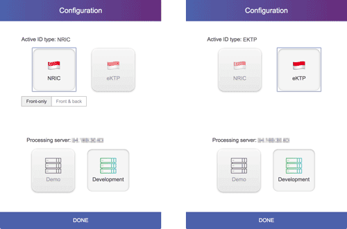
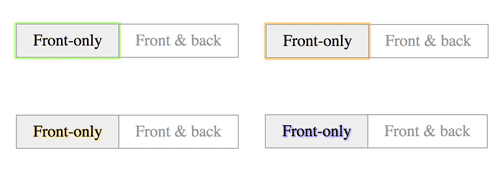
We can do quite a lot with CSS to create fancy radio buttons (or checkboxes, for that matter), and that’s awesome. I happened to be working on a Cordova-based demo application, which had a few boolean configuration options, which made sense to be implemented as radio buttons. Plain ole’ radio buttons seem a bit boring, but with a bit of CSS, it’s not too much trouble to spruce things up.
I had recently returned home from Web Directions Code in Melbourne, and there were a number of talks that focused on accessibility. As such, I was particularly cognizant of the fact that default radio buttons worked great with keyboard controls and whatever fanciness I was planned to come up with must not break that. Fortunately, it’s not rocket science to ensure keyboard navigation works with fancy radio buttons.
Today, we’re going to cover the different methods of hiding input elements, their effects on accessibility and how to ensure they remain navigable via keyboard after being styled. There will also be a small bonus section on layout, because after making our radio buttons pretty, we want them to go into the right place.
What we’re building

Behind all the styles, this page is made up of 3 sets of 2 radio buttons. The concept behind styling radio buttons hinges on the magic of HTML attributes, which allows us to link input elements to their labels. So you can hide away that default blue circle, spruce up the label element however you want, and still interact with the input element via the label.
Hiding the radio input
Most of us mess up the keyboard navigation portion of things when we hide the input element. There are several ways to make something invisible or hidden:
clip-path: polygon(0 0)display: noneopacity: 0visibility: hidden
This article on WebAIM discusses invisible content just for screen reader users, and is a pretty useful read. Of the four techniques I listed above, only option 2 hides the input in a way that doesn’t take up space.
The other 3 techniques render the element invisible, but they still take up the original amount of space they occupied. We’ll have to pair them with a position: absolute so they are taken out of the normal document flow, and the rest of your content isn’t disrupted.

For custom radios (or checkboxes), option 2 and 4 are not recommended because screen readers won’t be able to read the default radio element. This also prevents us from using the :focus pseudo-element on the hidden input, so those are out of the picture.
Which leaves us with option 1 and option 3. I sort of like option 1, because clip-path is fun. Clip-path creates a clipping region which defines what portion of an element is visible. This clipping region can be a basic shape or a url referencing a clipping path element.
In this case, using polygon(0 0) is still legitimate (according to the validator I checked), because the specification says:
At least three vertices are required to define a polygon with an area. This means that (for this specification) polygons with less than three vertices (or with three or more vertices arranged to enclose no area) result in an empty float area.
By defining a polygon with only 1 vertex, I’ve created an empty float area. An empty float area (where the shape encloses no area) has no effect on line boxes. Brilliant.
What’s not so brilliant is the sad state of affairs when it comes to browser support for clip-path.
That’s how I decided to go with option 3, a good ole’ opacity: 0 coupled with a position: absolute. Hidden but still focusable, well-supported across browsers. Just what we’re looking for.
Visual indicators on the labels
Adjacent sibling combinators only work forwards and not backwards, so the label has to come after the input element in the source order. Also, the input element must have an id attribute to link it to its label via the for attribute. The HTML for my spruced up radio buttons looks like this:
<input id="nric" type="radio" name="id-type" value="nric" checked>
<label for="nric" class="config-select">
  <span class="emoji" role="img" aria-label="Singapore">🇸🇬</span>
  <span>NRIC</span>
</label>

<input id="ektp" type="radio" name="id-type" value="ektp">
<label for="ektp" class="config-select id-config-wrapper">
  <span class="emoji" role="img" aria-label="Indonesia">🇮🇩</span>
  <span>eKTP</span>
</label>
And the default radio input was hidden like so:
input[type=radio] {
  opacity: 0;
  position: absolute;
}
To add the glowy blue halo around focused elements, the CSS is as follows:
input[type=radio]:focus + label {
  outline: rgba(77, 97, 171, 0.5) auto 3px;
}
For this particular instance, I chose to use one of the accent colours on the project for the outline, but you don’t necessarily have to use outline to indicate focus state. As long as you got the selector right, you can be free to change background colours, border colours, box shadows, gradients, anything you feel like.
Eric Bailey wrote a comprehensive post on all the different ways you could style your focus styles in his CSS Tricks article published earlier this year. He covers some of the newer CSS selectors like :focus-within and :focus-visible.
Laying out the toggles
This next part has nothing to do with accessibility, but just a quick run-through of how the spruced-up radio buttons were laid out on the page. Because, I just feel compelled to talk about layout in general.
As this was a Cordova-based demo meant to be installed on Android tablets, I had no way of knowing if the device was updated to a browser that supported Grid, so it was probably a good idea to start off with a base layout that used Flexbox.
The structure of the page was meant to look something like this:

There are 2 styles of radio buttons here, the big, rounded square ones and a smaller secondary set of rectangular ones. Only the first primary radio button has additional options attached, but not the second. So the primary radio buttons also trigger show/hide styling on the secondary radio buttons set.
If we add the secondary radio buttons set to the previous HTML, it’ll now look something like this:
<div class="nric-wrapper">
  <input id="nric" type="radio" name="id-type" value="nric" checked>
  <label for="nric" class="config-select">
    <span class="emoji" role="img" aria-label="Singapore">🇸🇬</span>
    <span>NRIC</span>
  </label>

  <div class="inline-radios nric-options">
    <input id="single" type="radio" name="front-only" value="true" checked>
    <label for="single" class="inline-radio">Front-only</label>
    <input id="double" type="radio" name="front-only" value="false">
    <label for="double" class="inline-radio">Front & back</label>
  </div>
</div>

<input id="ektp" type="radio" name="id-type" value="ektp">
<label for="ektp" class="config-select id-config-wrapper">
  <span class="emoji" role="img" aria-label="Indonesia">🇮🇩</span>
  <span>eKTP</span>
</label>
Showing/hiding the secondary radio buttons set can be done with CSS sibling selectors and pseudo-elements as well. Here the general sibling combinator, ~, is used instead of the adjacent sibling combinator, + used previously:
.nric-options {
  opacity: 0;
}

input[value=nric]:checked ~ .nric-options {
  opacity: 1;
}
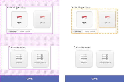
The general layout is flex-based, with the page layout laid out in the column direction, and the top-most set of radios laid out in the row direction. The figure below shows the 2 flex formatting contexts, the outer in purple and the inner in orange.

If you have Firefox Nightly installed, DevTools has a Flexbox inspector tool that provides a visual overlay on the page which shows the flex container and children within that flex formatting context. It’s similar to Firefox’s excellent Grid inspector tool, and you can customise the colour of the overlay.

A common design pattern for a mobile application is a full-width call to action button right at the bottom of the screen. Flexbox makes it relatively straightforward to have such a layout with its space distribution capabilities.
Setting the flex-direction of the flex container to column, and justify-content to space-between, will result in the first and last flex child flush against the edges of the flex container.
For the specific layout that I wanted, an additional margin: auto was applied to the sets of radio buttons, which distributed the amount of available space around each set equally on all sides.
Wrapping up
Customised radio buttons and checkboxes are a common design pattern found on the web, and it doesn’t take too much to ensure that your beautifully designed toggles are still navigable via keyboard.