You may have heard quite a bit of talk about a CSS feature called Grid this year. If you are someone who cringes when you hear the words CSS and grid in the same sentence, then I highly suggest you check out this new CSS module called CSS Grid.
Browsers render HTML elements as boxes according to the CSS box model and CSS grid is a new layout model that provides authors the ability to control the size and position of these boxes and their contents. The module introduces a series of properties that allow us to create grid structures and control the placement and sizing of grid items using CSS.
As Rachel Andrew has said many times before, “Grid works from the container in“ while “Other layout methods start with the item”. This way of thinking about Grid really stuck with me because I’m used to designing directly in the browser. Before the advent of CSS grid, it was expected that every HTML element was to be rendered one after another, and that was the mental model I’d settled upon.
After playing around with Grid for a bit, I realised my approach to designing layouts had changed. I found myself sketching on paper, thinking about the layout design in its entirety. By the time my fingers were doing their dance across the keyboard, I already knew exactly how my layout would look like.
One of the things I had to wrap my head around was the fact that the grid we define on the grid container is not visible. You can apply borders to your grid items, but you cannot apply a border to your grid lines to see them. This is when a DevTools function like Grid Inspector comes in really handy.
Brief history of Grid Inspector
I had first heard of a Grid Inspector tool when Jen Simmons tweeted about it back in September 2016. But the team at Mozilla had been discussing the development of a Grid Inspector tool since July 2015. Matt Claypotch AKA potch and Jen Simmons had worked on a Firefox add-on called the CSS grid inspector, which was released in April 2016. It gave the team some working code build upon, as well as a means of gathering feedback from a larger base of developers.
Although other browsers like Chrome and Internet Explorer each had their respective Grid implementations at the time, with Chrome’s behind a flag, and Internet Explorer using the original specification, Firefox was the only browser that was working on a Grid DevTool along with the Grid implementation itself.
The in-depth discussions by the team at Mozilla regarding the Grid Inspector tool covered features like having different colours for different grids on the same page, detection of grid gaps, display of line numbers and so on. This is a large reason why the Grid Inspector tool in Firefox has so many advanced features in the latest Nightly (58.0a1, at time of writing). The team had been thinking about and working on those features for more than a year.
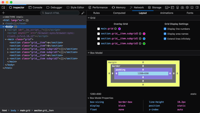
They have collectively been implemented into a stand-alone Layout panel, which also includes a rendering of the Box Model of a selected HTML element plus the CSS properties related to Box Model. This article will cover these useful features and how they can help when troubleshooting grids.
The Layout panel
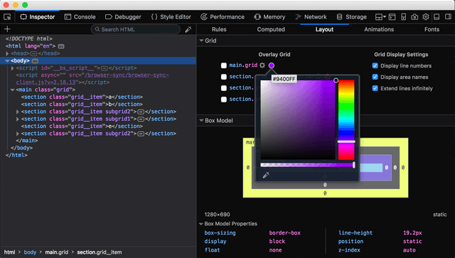
Overlay Grid
The first section you will see in the layout panel is Overlay Grid, which will show you all the elements on the page with display: grid applied. You will be able to turn on the grid overlay on each grid by checking their respective checkbox. For now, only 1 grid overlay can be displayed at any one time, but having multiple grid overlays is a feature on the roadmap.
Every additional grid will have a different colour from the default purple, but you are free to change the colours of your grid overlays by clicking on the coloured circle on the right of each grid element. The grid overlay will show all the grid tracks and grid gaps of the selected grid.
Once you select a grid, a rendering of the selected grid will appear in the space below in the colour of the grid overlay. This rendering will show you each section of the grid you defined and hovering over any section will highlight its corresponding area on the actual page. There will also be a tool-tip that shows you the line number of the row and column of the highlighted grid item.
Most of us would be in the Rules panel when examining the CSS on our site, and you can toggle the grid overlay from there as well. Select the element which has display: grid applied to it, and click on the waffle-like icon on the property. The options for display of line numbers or grid area names that have been set on the Layout Panel will be respected when the grid overlay is toggled in this manner.
Grid Display Settings
The next section on the panel is the Grid Display Settings, which allows us to toggle 3 options for now. The display of line numbers, the display of area names and the option to extend grid lines indefinitely.
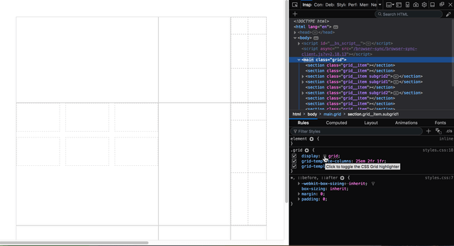
The basic premise of how Grid works is that you first define a grid, then proceed to place your grid items within that grid. You can either place those grid items manually or let the browser do it for you. The position of the grid items depends on their grid-row and grid-column values. Grid lines are referred to by their numerical index which starts from 1.
Once Display line numbers is active, the selected grid overlay will display the line numbers of the grid in the colour of each respective grid overlay. Each grid has their own numerical grid index which starts from 1, different grids will not share the same numerical grid index.
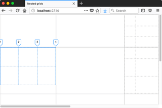
If your grid extends the width or height of the viewport, you will notice that the line numbers get cut off at the edges. The Mozilla team is aware of this issue and it is being tracked under Bug 1396666.
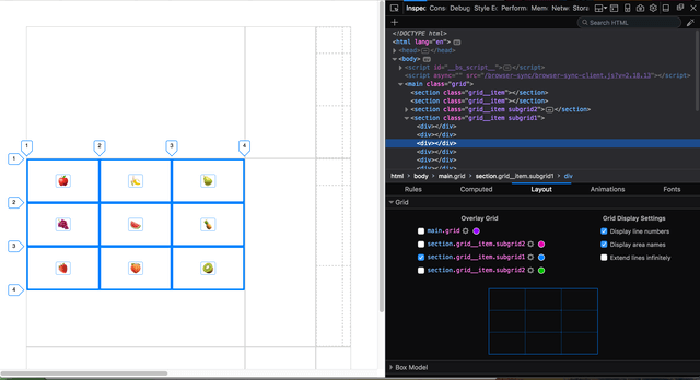
You can also define a grid using the grid-template-areas property, which gives us the ability to name the areas on our grids. The syntax for this property also provides a visualisation of the grid structure in the CSS itself, making it easier to understand the layout of the grid from your code.
Take the following block of CSS for example:
.subgrid1 {
  display: grid;
  grid-template-columns: 1fr 1fr 1fr;
  grid-auto-rows: 5em;
  grid-template-areas: "apple banana pear"
                       "grape watermelon pineapple"
                       "strawberry peach kiwi"
}
This creates a 3 by 3 grid and each section is named according to how they are laid out in the grid-template-areas property. If the sections are named, they will be displayed as a second tool-tip when you hover over the rendering of the grid in the layout panel.
We can also toggle display of the grid area names on the grid overlay by checking that option in Grid Display Settings. According to Mozilla, this feature was inspired by CSS Grid Template Builder, which was created by Anthony Dugois.
Fun fact. You can use emojis for grid area names and everything will work just fine.
The last option you can toggle is to extend grid lines indefinitely. By default, the grid lines on each grid are constrained to within the bounds of the grid container. But sometimes it can be useful to see how the grid aligns in the context of the entire page.
A better Box Model tool
The Box Model section under the Layout Panel shows a rendering of the dimensions of the selected element, its padding, borders and margins. In addition to that, it also shows the CSS properties that affect the position, size and geometry of the selected element, namely box-sizing, display, float, line-height, position and z-index. A convenience when it comes to troubleshooting layout-related CSS issues.
The computed value of the height and width of the selected element and its current positioning value is displayed below the box model outline. You can also directly manipulate the margins, borders and paddings of the element from the diagram itself.
If you use CSS lengths other than pixels, the DevTools will convert the values into pixels automatically based on the computed value, which is really nifty.
Grid Inspector plays well with transforms
There are many instances where Grid will be used in combination with other CSS layout properties, like transforms, for example. The Grid Inspector tool plays well with CSS transforms and the grid overlay will adjust to however the selected element has been transformed. You will be able to see how the Grid has been rotated, skewed, scaled or translated.
Help make the Grid Inspector tool better
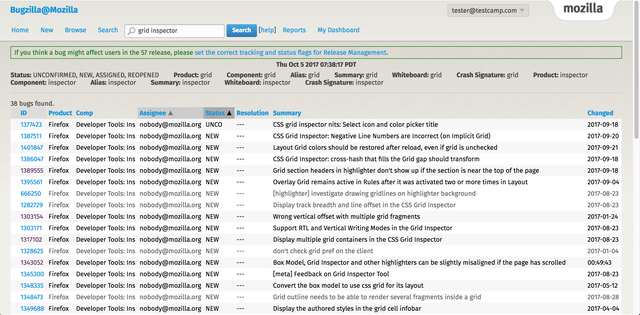
As with any other browser feature, the Grid Inspector tool will inevitably have bugs as the team are hard at work adding new features and polishing existing ones. If you do encounter any such issues, please raise an issue at Bugzilla, Mozilla’s bug tracking tool.
The metabug, which tracks all Grid Inspector related issues, is Bug 1181227. You can search for the term Grid Inspector to see the list of related bugs as well.
If you have any suggestions or feedback on the Grid Inspector tool, or the Firefox DevTools in general, Mozilla is on Discourse. Or you can also tweet at @FirefoxDevTools.