I’m currently a member of the Chinese Text Layout Task Force | 中文排版需求, and we have monthly calls to discuss issues and work related to the Requirements for Chinese Text Layout. There were a number of interesting things discussed in the most recent one, enough for me to want to write about them.
Mixed script typography
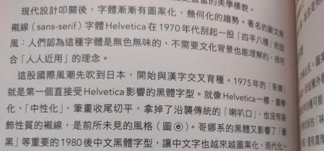
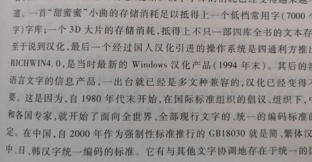
The first thing was a discussion around spacing between Han characters and non-Han characters. For the most part, whenever there is a mix of Han characters with other scripts, we would want some extra spacing between them.
Even though this is not explicitly documented in any national standards or guidelines, those of us who read Chinese have often seen that extra space in printed publications. The examples below are literally books I pulled out of my bookshelf.


Admittedly, because there is no official guidance on this, there are also situations where there is no space between Han and non-Han characters. The purpose of our task force is to have a comprehensive requirements document for browser implementers to better understand what the ideal presentation of the Chinese script on the web and digital media should be.
And so, when we saw this issue being raised in the CSS Working Group Github repository on text-spacing behaviour, we discussed it during our monthly call. For the most part, we discussed the amount of spacing required (1/4em versus 1/8em). And also, what the default behaviour of the text-spacing property ought to be.
I did share my experience with Shopify’s Chinese language websites (we have 4 of them!), whereby the content guidelines for authors was to have manually add the spaces via U+0020 for whenever our Chinese text finds itself adjacent to an English word. The thing is, the amount of space that U+0020 adds is a little too much.
So I also wondered out loud how plausible it would be for the browser to automatically adjust the width of the manually added spaces. And turns out, there is another Github issue related to this topic, which talks about making autospace a separate property rather than a value in text-spacing.
As I went through all the comments in the first issue, I was rather surprised at this comment made by “an English reader who has a bare acquaintance with Chinese text”, who mentions that he “had two professionals who come from journalism tell me that removing spacing looks better, with adding spaces being reserved for special use cases.”. ¯\_(ツ)_/¯
That being said, I do acknowledge said English reader’s concerns about ensuring legacy behaviour not be broken. That is the beauty of the web, and the fact that we even had a forum to discuss this issue in the open is what I love about web standards.
I won’t repeat the bulk of the discussion in those 2 issues and if you’re interested, please read through both of them on Github. It’s pretty interesting if you’re interested in Chinese typography.
The @font-face thing
I guess if you were here for the font-face thing, you must be wondering what the previous 500 words were all about. Well, thanks for scrolling all the way down, and even better if you actually read those 500 words prior.
Among one of the many other things we discussed that day, the issue of our font stack for the Requirements document is not ideal, and also, that the Noto CJK fonts had been renamed. The TL;DR is that for mixed typography, it is ideal to list the Latin-script fonts first (see Kendra Schaefer’s excellent write-up from 10 years ago which is STILL relevant today).
I think the reason we had originally listed the Chinese fonts first was that Chinese fonts are better optimized for Chinese punctuation marks, specifically quote marks. Generally, everyone in the call agreed that the Latin fonts should be listed first, but we definitely needed to take care of the fugly Latin glyphs in Chinese fonts issue.
And here is where the @font-face fun times come in! I had talked about this numerous times back when in-person conferences were an thing, that using unicode-range to create composite fonts is a very useful thing for cases like this. So I volunteered to make the pull request to update our fonts.
The 2 punctuation fonts declared for Simplified Chinese and Traditional Chinese are as follows:
@font-face {
  font-family: "Punctuation SC";
  src: local("PingFang SC"), local("Noto Sans SC"), local("Noto Sans CJK SC"), local("Heiti SC"),
    local("Microsoft Yahei");
  unicode-range: U+201C, U+201D, U+2018, U+2019; /* Unicode range for quotation marks */
}

@font-face {
  font-family: "Punctuation TC";
  src: local("PingFang TC"), local("Noto Sans TC"), local("Noto Sans CJK TC"), local("Heiti TC"),
    local("Microsoft JhengHei");
  unicode-range: U+201C, U+201D, U+2018, U+2019; /* Unicode range for quotation marks */
}
Simplified Chinese and Traditional Chinese display certain punctuation differently, for example, the full-width comma and period for Traditional Chinese is centred, while for Simplified Chinese they are in the bottom-left quadrant. See Bobby Tung’s article Best Practices for Chinese Layout for visual examples of this.
For the src, again, because CJK languages tend to have much larger character sets than the alphabetic scripts, we usually use system fonts for the body copy for better performance, as a font file is often more than 1mb. We can ask the browser to check the local machine for the specified font using local().
If you’re curious about the full font stack I proposed, it looks like this (with comments to explain why each font was chosen):
/*
-apple-system: iOS Safari, macOS Safari, macOS Firefox
BlinkMacSystemFont: macOS Chrome
Segoe UI: Windows
Roboto: Android, Chrome OS
Oxygen-Sans: KDE
Fira Sans: Firefox OS
Droid Sans: Older versions of Android
Ubuntu: Ubuntu
Cantarell: GNOME
Helvetica Neue: macOS versions < 10.11
Arial: Any
PingFang TC/SC: macOS
Noto Sans TC/SC: Ubuntu, Android
Noto Sans CJK TC/SC: Ubuntu, Android
Heiti TC/SC: macOS
DengXian: Windows
Microsoft Jhenghei / Microsoft Yahei: Windows < Vista
sans-serif: Fallback
*/

[lang="zh-hant"] {
  font-family: "Punctuation TC", -apple-system, BlinkMacSystemFont, "Segoe UI", Roboto, Oxygen-Sans,
    Ubuntu, Cantarell, "Helvetica Neue", "PingFang TC", "Noto Sans TC", "Noto Sans CJK TC", "Heiti TC",
    "Microsoft JhengHei", sans-serif;
}

[lang="zh-hans"] {
  font-family: "Punctuation SC", -apple-system, BlinkMacSystemFont, "Segoe UI", Roboto, Oxygen-Sans,
    Ubuntu, Cantarell, "Helvetica Neue", "PingFang SC", "Noto Sans SC", "Noto Sans CJK SC", "Heiti SC",
    "DengXian", "Microsoft YaHei", sans-serif;
}
Wrapping up
Anyway, that’s about it. If you’re curious to what else was discussed on the call, you can refer to our meeting minutes. The repository for the Requirements for Chinese Text Layout document is also open on Github at: https://github.com/w3c/clreq.