Back in 2020, I built Alex’s website. He has not changed it since then. That’s on him, not me. I think I first met him in 2017. It is now coming up to 10 years. We still keep in touch and are friends. Amazing.
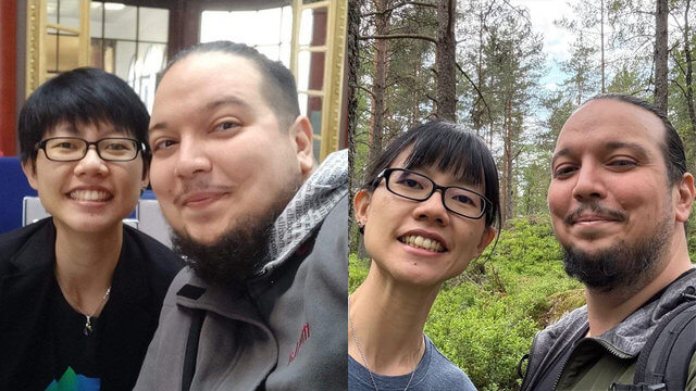
Well, Alex needs another website. This is not the second website I’m building for him, I’ve built more than that over the years. But I haven’t been building proper websites for a while, so a nice relaxing afternoon project is always a welcome break from adulting.
Alex has since moved on to do great things, and thus needs a professional website for his consultancy business, Panthera Studios.
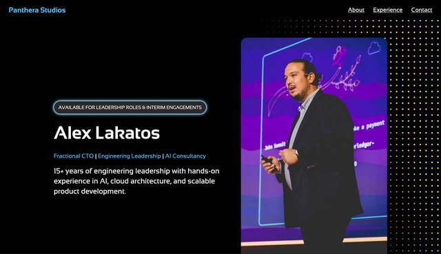
Honestly, this is not a bleeding edge, will-win-design-awards website. No, it’s just a single page of Alex’s work experience and core competencies. But what’s fun is the process I still use whenever I build a new website.
Fonts and colours
This is just my opinion, but fonts and colours are pretty much the skeleton and muscles of the website, everything else can be considered clothes. That is a terrible analogy. But if I were any good at analogies, I would be doing something else with my life, probably.
I went with Sansation by German designer, Bernd Montag, largely because I liked how the ‘t’ looked, and the overall feel of the letters. Of the reference sites Alex shared with me, it seemed that light on dark was the prevailing trend, so we also went light on dark, with a cyan-ish highlight colour.
A while back, I discovered the existence of Utopia, a fluid design system created by James Gilyead and Trys Mudford. I liked how it works, so that goes into the website as well.
This is probably a good time to mention that the site is built on Astro. Why Astro for a single page site, you might ask? Well, I’m doing that thing where you optimistically think there will be a future feature, in the event Alex decides to actually write down all the knowledge he has in that big ole’ brain of his, he can put that in this website, that is ready for that blog some time in the unspecified future.
Background effect
The most interesting part of this website is something created by the indomitable, Ana Tudor. She is an absolute magician with CSS and I am a massive fangirl. Subscribe to her Patreon if you feel like it.
Ana had explained how she created these animated CSS halftone effects, breaking down each bit of it and demystifying the magic (it’s still magic to me to know how to put it all together).
It involves blending 2 gradients together, applying a contrast filter, then adding animation on top of that. I’m not going to explain it better than she can, but basically I applied a variant of it to the body of the website.
I was very pleased to learn about a new property value I didn’t know before, and that is background-repeat: space. The MDN explanation is:
The image is repeated as much as possible without clipping. The first and last images are pinned to either side of the element, and whitespace is distributed evenly between the images.
The only thing that I can credit myself with is my knowledge of how CSS positioning works so I could actually get the background effect to be in the background of the site. You can right-click inspect on the website to see it, it’s just an additional decorative div within the body element.
Gentle neon effect
I guess the other fun thing is the mild neon effect on a handful of elements to add some visual interest to the page. Generally, CSS neon effects rely on stacking box-shadows (or text-shadows, if you’re doing it to text).
The stacking gives it that fade as you go further away glow effect. Depending on how far you want the glow to spread, adjust the blur radius (third value length value the syntax).
The key thing is to keep the first or first few shadows that are tightest to the box white, then put in the highlight colour on the outer shadows. I wanted a very light glow, so only 3 shadows.
box-shadow: 0 0 3px #fff, 0 0 7px #fff, 0 0 14px #51bef8Everything else
There’s really nothing else of note, the layout is standard responsive, with flex and grid. And the information is whatever Alex supplied me with. ¯\_(ツ)_/¯ And yes, it still renders fine on Lynx.
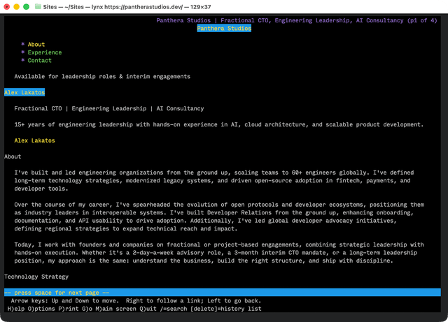
But it was a pleasant way to spend an afternoon, especially digging into those halftone animations. I love Ana Tudor 🫶.
I don’t know if building websites will become something like woodworking in the future, where it’s no longer relied on for mass market use, but rather considered bespoke, who knows. I’m just glad that I actually enjoy the activity and will continue to do it even if it’s no longer a viable means of income when AI takes over the world.
Well, the world is chaotic. Do stay safe, my friends.