It’s been a couple months since my last proper “ship-to-production” layout project (the last one being the React Knowledgeable website, subscribe to their YouTube channel if you haven’t ❤️). For me, there are numerous mental models for structuring a project’s CSS, depending on the purpose of the site, the stack it’s built on, the number of people working on it and so on.
There is no one RIGHT way of doing things because as mentioned, it depends on many factors. And it is my professional duty to make an informed choice that best suits the project at hand. That being said, I am human and I do have a personal favourite style. I annoyingly call it, Artisanal CSS.
**Proceeds to nimbly avoid Avocado Toasts and Quinoa Salads being thrown in my direction**
So my mate, Alex, decided to also migrate his site to Hugo and wanted a new theme. Apparently most people don’t like to build themes, I wonder why… 🤔 Anyway, I built my career on creating bespoke themes so this is totally my jam.
The process
Just kidding, there wasn’t really a process. It was more of a build and tweak kind of methodology. So the seed keyword here was: “Masonry”.
If your definition of the word is the building of structures from individual units, which are often laid in and bound together by mortar, then I suggest reading this CSS tricks article on Approaches for a CSS Masonry Layout
But the TL:DR explanation is a layout of unevenly-sized items without any excess gaps between items. And since each of the articles on the list would be a sort of card-style, CSS Multi-column Layout would work nicely for this.
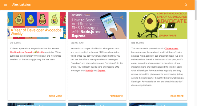
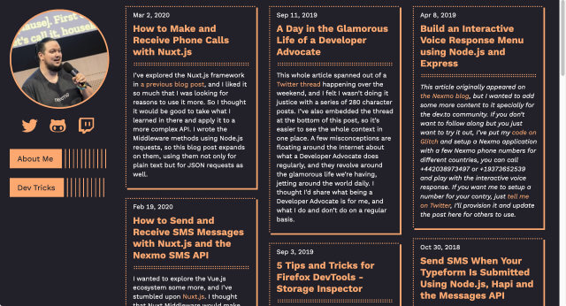
Here’s the before version of the home page:
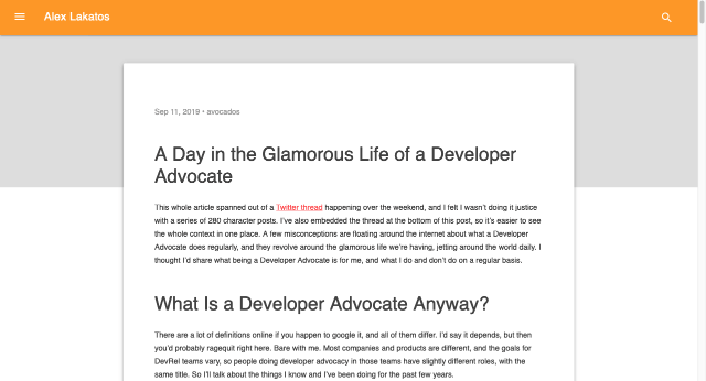
And one of the article pages:
When I cloned down the repo, Alex had already managed to get his content to render without any styles. A literal blank slate. Beautiful.
Alex also showed me a theme that he liked. Specifically the row of lines in the site header, and the double-dotted underlines for article titles. Also, the colour scheme of orange on dark. Good enough for me to go on.
Colours were already settled because I just grabbed them off the theme with Sip (my colour-picker app of choice). And I went with Elaine Sans by Wei Huang, which is a fork of Work Sans but with some whimsical modifications.
First pass layout
Multi-column is not too complicated to implement. Tell the browser how wide you’d like your columns to be, and let the browser take it away.
.post-list {
  column-width: 20em;
}

.post-list li {
  break-inside: avoid;
}
break-inside: avoid makes sure the cards don’t get chopped in half between columns. As for the double dotted underlines, I got a little help from the ::after pseudo-element.
.post-title {
  position: relative;
  border-bottom: 3px dotted $main;
  padding-bottom: 0.75em;
  line-height: 1.2;
}

.post-title::after {
  content: "";
  position: absolute;
  bottom: 2px;
  display: block;
  width: 100%;
  border-bottom: 3px dotted $main;
}
The rest of the styles were declaring basic colours, fonts, padding and margin adjustments, that sort of thing. And so we got our first pass.
Websites need headers, probably
It’s a start, I suppose. I work better with sketches, whether I draw them myself or someone else does it, no difference. So Alex sent over this sketch of what he had in mind.
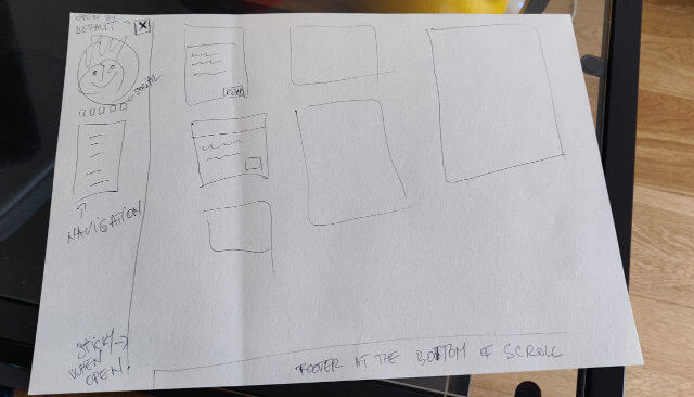
An excellent requirements document, if you ask me. There are even annotations for interactivity. I’d take this over a pixel perfect Photo-shop mock ANY DAY. Simply because it informs the general concept while giving me all the freedom to make adjustments as the viewport changes.
Such sketches are also low-fidelity enough that nobody is precious about them, which makes it great for iterating in quick succession.
It didn’t feel like the graduated lines would fit as a site title, but given that the header of the site was going to laid out as a left sidebar, it would work on links.
There is more than one way to achieve this effect, but they all make use of the ::after pseudo-element. I mean, you could use an image but that would make it tedious to dynamically change the length of the text if you decide you want to switch up the links one day.
A repeating linear gradient does the trick fairly well. You could try it with multiple positioned box-shadows of the pseudo-element styled to look like one graduated line, but typing out every position of each shadow got a bit tedious for me.
.nav-links li::after {
  display: block;
  content: " ";
  color: transparent;
  width: 100%;
  background-image: repeating-linear-gradient(
    90deg,
    $main,
    $main 2px,
    transparent 0,
    transparent 10px
  );
}
As for the card outline, I went with a mix of border and box-shadow because I felt there was still something more we could do with the dots.
.post-list li {
  border-top: 3px dotted $main;
  border-left: 3px dotted $main;
  box-shadow: 4px 4px 0 0 $main;
}
That would give you the dotted lines on the top and left, and a normal box-shadow effect on the right and bottom of each article card.
Extra tweaks and fixes
The broad overall structure of the site was in place, but things are far from done at this point because this is usually when I start doing my compulsive browser resizing exercise.
Let’s start with the site header, which is essentially a sidebar, right? It is of full-viewport length and fixed in place with positioning, which means there is a possibility of the layout breaking as the viewport height shrinks.
If you look at where I decide the breakpoint, it’s not a number I pulled out of a hat, it’s the height of the viewport where links don’t fit any more. And herein lies the un-scalability of this design.
@media screen and (max-width: 514px) {
  /* Some styles */
}

@media screen and (max-width: 799px) {
  /* Some more styles */
}

@media screen and (min-width: 675px) and (max-width: 799px) {
  /* Some other styles */
}

@media screen and (min-width: 800px) {
  /* You know where this is going */

  @media screen and (max-height: 665px) {
    /* Nested media queries, wuttt */
  }

  @media screen and (max-height: 400px) {
    /* Wooo moar tweaks */
  }
}
What happens when another link is added? I come back and change the breakpoint. Is this a “correct” approach? I can’t answer that. What I can say is that for a site like this, I don’t want to write the CSS once and call it a day.
Moar browser tests
Do you test your websites on IE11? I still do. How many people view the site on IE11? I have no idea. To me, it’s a matter of principle that the layout not be broken. Not broken doesn’t mean “looks exactly the same”.
@media screen and (min-width: 800px) and (-ms-high-contrast: none) {
  /* IE11 specific fixes */
}
I’ve made my opinion known before that I LOVE the fact that one layout can potentially have multiple looks depending on the context it is being viewed in. I appreciate this as a feature of the web medium. And I look upon it fondly.
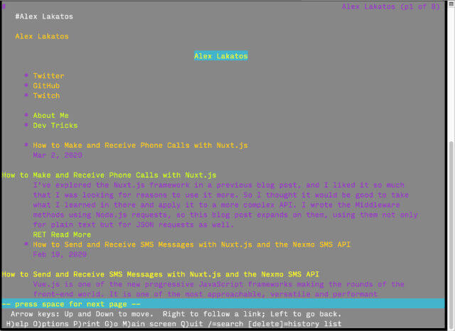
I also run the site through Lynx, just to check on the structure. For most static sites, this usually doesn’t yield too many issues (at least in my limited sample of tests), but it’s good to do a quick check.
Wrapping up
To me, such a design is a garden that needs to be tended and revisited, pruned and maintained, especially as content grows, or if more elements are added. Every content modification is an opportunity to make a new design decision.
Sometimes you won’t have to do anything, e.g. if a new article is added, not much needs to be done. But if a new section is added, maybe the design needs to be tweaked. I love that. I love the amount of care and consideration each of these decisions demand. I love that this is a project that is never final.
This is not industrial mass-produced CSS. This is customised CSS that only works well for this particular site. And that’s the way I like it.