Some people may be aware that I run the local CSS meetup in Singapore. A few more may know that we’ve recently celebrated 4 years of miraculous existence. I’ve always held the strong opinion that the Singapore tech community is one of the most unique and vibrant in the world.
This is the result of an amalgamation of factors, some of which were due to efforts by local community leaders, others simply a matter of good public infrastructure. But what we end up with is a highly conducive environment for sharing knowledge through tech meet-ups.
Community leaders like Michael Cheng, Winston Teo, Chinmay Pendharkar, Sayanee Basu, just to name a few, made a lasting impression on me when I first joined the Singapore tech community back in 2013. The community they built was and still is inclusive, welcoming and open.
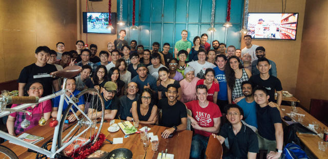
Earlier this year, I got to know Gao Wei, who is one of the most amazing human beings I’ve ever met. At the time she was running an internal sharing at Shopee called React Knowledgeable or <RK />. I am unable to spell the word “Knowledgeable” without thinking hard, even now, hence the title of this post.
But anyway, she decided to make it public in August this year, and so React Knowledgeable AKA <RK⚡️ /> was born. What does this have to do with me? Especially given that I clearly don’t do React (at least not since 2017). Well, I’m useless at many things, but I can CSS better than most people I know (and also design a little bit).
So my contribution to this endeavour is purely visual.
Look and feel
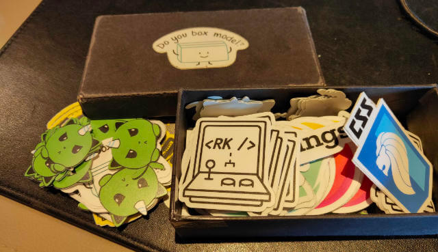
I guess Wei also figured out I’m fairly useless on the React/Gatsby front but she did ask if I could come up with a logo for RK. That I could do. The base concept was the wordmark “`
The website itself was typeset in IBM Plex Mono, which is a pretty nice monospace, but I thought having the same font in the logo and the website itself was a little monotonous. And it just so happened I came across Fantasque Sans Mono.
Personally, I have a soft spot for monospace fonts with a touch of handwriting-like style. And once I saw the glyph for “k” I was sold. Some people collect stamps, some people collect Pokémon, I collect fonts. Don’t judge.
I used to use Sketch but only had 1 license. Unfortunately I work on multiple machines, so I realised Figma was a good alternative, and it imported .sketch files beautifully.
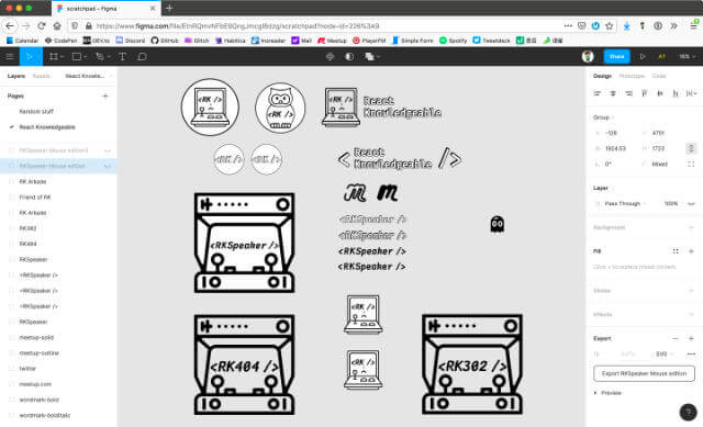
A couple of ideas got thrown around but eventually the arcade cabinet design won. There’s an in-joke to that, so go ask Wei if you’re in town and attend one of the meetups. Once you have a logo, you have to make stickers out of it. Another idea was to have limited edition speaker stickers for people who spoke at the meetup.
For that I thought a glitch effect on the word <RKSpeaker /> would be a fun effect to have inside the arcade cabinet frame. And that became the style for secondary graphics like the 404 page graphic or even the 302 page graphic (it’s a Gatsby bug/issue thing)
My favourite sticker supplier, GoodieSwag, handled the designs without issue, so if you’re based in Southeast Asia, consider giving them a try for all your sticker printing needs. I print all my stickers with them, FYI.
Site layout
The React Knowledgeable website is built with Gatsby, and is completely open source on GitHub, so anyone can contribute. Like I mentioned, I’m just the CSS monkey here. So let’s talk about the CSS.
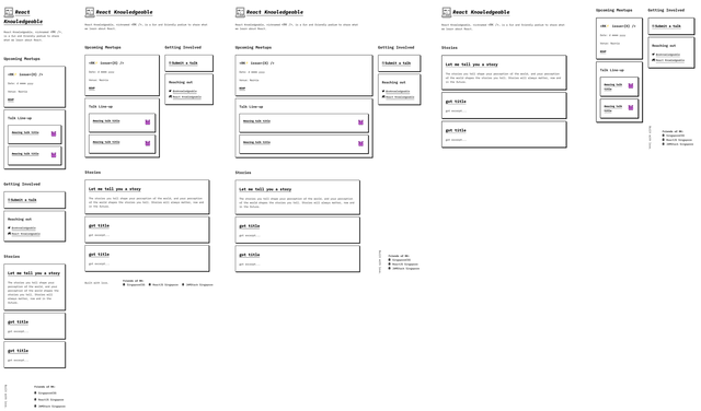
As of today (18 November 2019), the site’s layout has been modified a couple of times as content has been added, and additional features were introduced. The site was originally prototyped on Glitch before it got ported over to Gatsby, but I’ve kept the Glitch prototype updated, sort of like an archive of the site’s evolution.
The layout morphs quite a bit over different viewport widths because these breakpoints are not arbitrary values. Instead, they are based on content and how best to present all the content within the dimensions of available space.
For all those people who immediately complain about scalability and component reuse and what-not, I say, this is as hipster an endeavour as you will ever find on the web. It’s hand-crafted CSS. So you can take your Bootstrap defined components and breakpoints and shove it up your…
Anyway, a lot of Grid and Flexbox in play here, but not exclusively, because the “old-school” display modes also come in handy for certain components at particular viewport sizes as well. I never understood why people only want to use a single method or technique to do all the things. Why colour with 1 crayon when you can use the whole box?
.homePageLayout {
  @media (min-width: 1145px) {
    display: grid;
    grid-template-columns: auto minmax(20em, 30%);
    grid-template-rows: min-content min-content 1fr auto;
    main {
      grid-column: 1;
      grid-row: 2 / span 2;
    }
    aside {
      grid-column: 2;
    }
  }
}

.upcomingMeetupInfo {
  @media (min-width: 748px) and (max-width: 1144px) {
    display: grid;
    grid-template-columns: 1fr auto;
    grid-column-gap: 0.5em;
    h2 {
      grid-column: 1 / -1;
    }
    h3 {
      word-break: break-word;
    }
  }
}
I’m pretty fond of the footer, because it changes the most across the different viewports. Plus, it has a little bit of whimsy sprinkled on. Hopefully not too much that people with vestibular disorders are turned off by it. So there is a prefers-reduced-motion media query put in for that.
@media (prefers-reduced-motion: reduce) {
  .friendLink:hover .friendIcon {
    transform: scale(1.2);
  }
}
i can play around with this for i dont know how long.. got friend of many talents @hj_chen pic.twitter.com/rNB3iKA0nE
— ᴡᴇɪ 👩🏻🌾🐒 (@wgao19) July 16, 2019
The latest edition of the site introduced a new block of content for past talks, so we now have a multi-column implementation for that bit as well.
.topicListing {
  column-width: 20em;
}
.topicCard {
  padding-bottom: 2rem;
  break-inside: avoid;
}
.topicIntro {
  display: -webkit-box;
  /* autoprefixer: off */
  -webkit-box-orient: vertical;
  /* autoprefixer: on */
  -webkit-line-clamp: 3;
  overflow: hidden;
}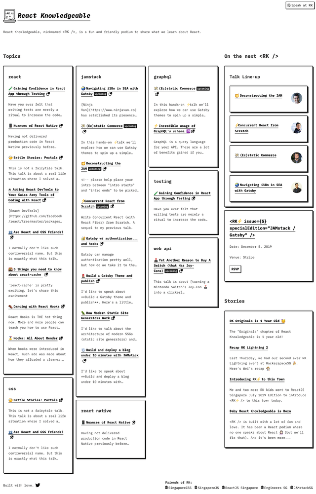
Again, all the code is open-source on GitHub, or you can also take a peek at the Glitch project to see how it’s done.
The website is constantly being updated with new features, like a custom RSVP function (serendipitously similar to the QueerJS website, clearly great minds think alike) and a custom GitHub authentication function. Kudos to Thomas Chia for working tirelessly on it. It’s almost 2020 and websites are still cool, my friends.
Wrapping up
The premise behind this meetup is to have an inclusive and welcoming environment for people to share knowledge and things they find interesting, and I love that. I also love that Singapore has a support structure that allows a burgeoning new meetup to find its feet in almost no time at all.
Anyway, if you’re ever in town when one is happening, just drop by and check it out. You won’t regret it. Also, follow React Knowledgeable on all the things (basically just Twitter and GitHub for now).