I have a soft spot for stone engravings and whenever I get the chance to travel to a location that has some sort of cemetery or burial ground that is open to the public, I will go check it out. This will probably become a series, so here’s the first entry.
I went to Argentina for vacation last year and it was splendid. One of the places we went was the Cementerio de la Recoleta in Buenos Aires. Originally the garden of Basílica Nuestra Señora del Pilar, it became the city’s first public cemetery back in 17 November 1822, and was designed by French engineer, Próspero Catelin.
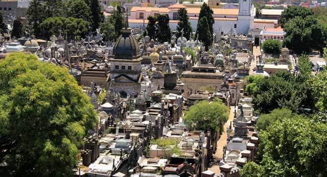
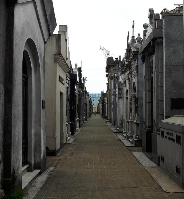
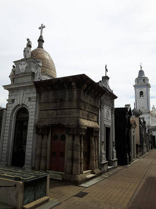
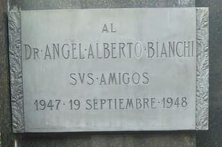
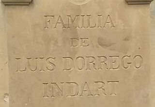
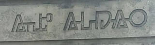
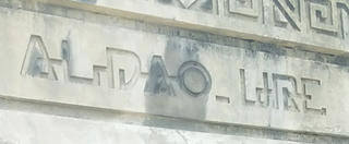
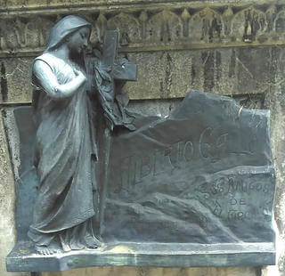
This isn’t just any ordinary cemetery, in fact, it’s the grandest final resting place I’ve ever seen thus far. The entire cemetery is laid out like a city, with ornate mausoleums lining the “streets”, each with their own unique architectural style. There were plenty of angels and crosses, even gargoyles, adorning the crypts. And what caught my eye were the wide range of font styles used for engraving plaques, or directly etched into the facade itself.
The cemetery itself had modest beginnings when Próspero Catelin was brought in to work on it, introducing the cemetery’s city-style streets and blocks. The Recoleta district was transformed from a working class area to an upper-class neighbourhood after a terrible yellow fever epidemic in 1870. Recoleta, which was on a higher terrain, had less of the disease-carrying insects, but only the upper-class families had the means to move there.
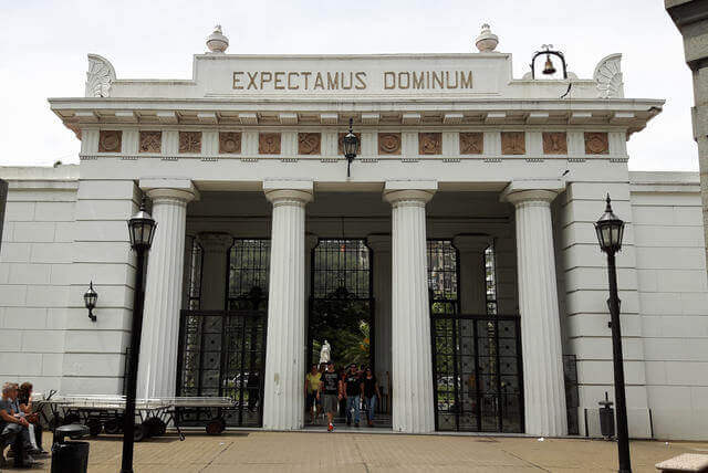
However, as victims who died from the epidemic were not allowed to be buried there, the cemetery gradually fell into disrepair. In 1881, the cemetery was renovated and remodelled by Italian architect Juan Antonio Buschiazzo to a neoclassical style, including the grand front entrance with Doric columns. From then on, the mausoleums started to get grander and more elaborate as the city’s elite started to move in.
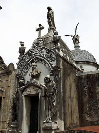
Most of these tombs are architectural masterpieces, many adorned with crosses, statues of winged angels, some with cathedral-style domes and spires. There were various different architectural styles ranging from Neo-Classical to Baroque to Art Nouveau to Modernist. The entire cemetery was laid out like a city, with blocks, walkways and sidewalks that allowed access to each mausoleum.
Typographic observations
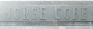
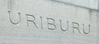
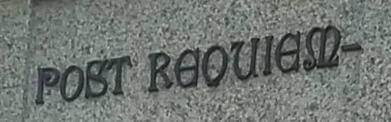
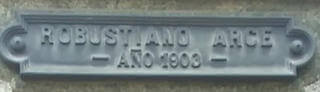
Serifs on stone engravings seem like the most natural combination, like wine and cheese or tea and mooncakes. There have been several theories proposed on the origins of serifs. The inking theory suggests serifs were added to repair extra ink instances on straight lines, while the carving theory posits that widening the ends of straight lines on engravings compensates for the illusion of bulging in the middle.
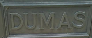
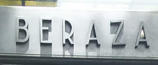
And tombs, being mostly made of some kind of stone, have serif inscriptions in spades. But again, Recoleta has such a diverse range of styles that are evident from just the serifs alone. I also noticed more classical designs had text engraved into the stone, while engravings in relief tended to appear on the more modern designs.
The modern designs tended to use more metals in the designs of the tombs themselves as well. I’m not too familiar with the craft of engraving, but I would think that in relief takes more effort in terms of finishing? Somebody please enlighten me on this.
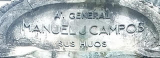
Shallow engravings usually showed up on dark stone finishes, probably so the lighter tone of the original stone would provide enough contrast for the letters.
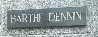
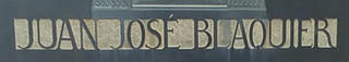
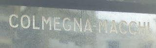
Here are a few more serif styles.
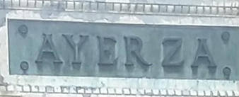
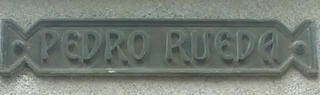
Flourishes weren’t all that common though. I guess they might come across as too over-the-top for a tomb? But what do I know? This one actually doesn’t look like an engraving, rather, it seems like bronze letters set into marble.
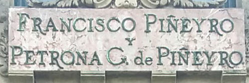
Some of the serifs I considered “fancy”, because I don’t have a better word to describe them 😔, but the letter forms are more stylised on these.
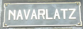
Speaking of relief engraving, there were more of them in sans than in serif. After all this, I really want to meet someone who does engraving, or knows someone who does. I have so many questions! So far, I’ve managed to find a website for hand engravers, called iGraver, but it’ll be nice to chat with an engraver in person.
Is it easier to do relief engraving for sans-serifs? Does it boil down to the tools being used? Or is it a design thing, where sans-serifs are suited for modern materials?
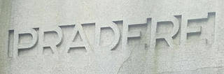
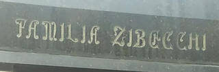
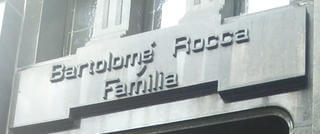
I also came across a few unique typefaces that really stood out. I guess a tomb can be considered an artistic expression to commemorate those who have passed, which is why every tomb is so unique.
Wrapping up
As a Chinese person, visiting the cemetery is an annual affair. For me, it’s actually more of a family gathering than the Chinese New Year, as we see much of the extended family during the Qing Ming festival. But it’s a very different feeling, visiting a Chinese cemetery versus a European (might be more accurate to say Catholic?) one.
I really like wandering around cemeteries by myself, there’s a reverent silence that is a stark contrast to the bustle of daily life that puts me in a pensive mood, as well as a chance to appreciate how different cultures commemorate those who have passed.