I’ve been using CSS grid to build layouts for quite a while now, and all my designs to date involved either a handful of explicitly placed individual grid items, or 100% automatic placement. I hadn’t had to design the gaps between the grid before, but then one fine day in March, I found a HTML periodical table on WebsiteSetupOrg.
It looks different now than when I first saw it, because the version I saw spelt out HTML and I was totally into that. Upon my usual right-click inspect, I noticed that the layout wasn’t using Grid, but my Grid-infused brain thought it could, so I decided to recreate the design using a Grid layout.
I had plans today, but then I got distracted and made a periodic table of HTML elements.
— HJ Chen @ ImageCon 🇺🇲 (@hj_chen) March 18, 2019
Inspiration from @RobMening's project, based on idea by @joshduck. Also referenced a lot from @MikeRiethmuller's implementation#csshttps://t.co/lkcXrzIU75 via @CodePen
Grid manual placement
One of the best parts of using Grid for layout is the ability to place grid items exactly where you want on the grid you designed. Most of the planning for such designs would go into the actual grid itself.
But as a quick recap to how this works, let’s look at a relatively simple 3x3 grid, with 3 grid items on it. The Firefox grid inspector is turned on so we know which lines to assign our pieces to.
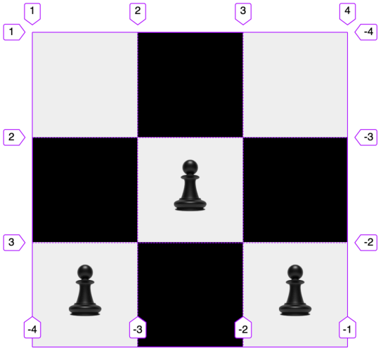
Actual visual styling aside, this is how the grid code looks like:
.grid {
  display: grid;
  grid-template-columns: repeat(3, 24vmin);
  grid-template-rows: repeat(3, 24vmin);
}

.grid__item:first-child {
  grid-row: 3;
}

.grid__item:nth-child(2) {
  grid-row: 2;
  grid-column: 2;
}

.grid__item:nth-child(3) {
  grid-row: 3;
  grid-column: 3;
}
grid-row and grid-column are shorthands to set the start and end line their respective dimensions. Grid items by default will only take up a single grid cell, so it works fine even though I only specify the start line without the end line for either property.
The concept behind manual placement of grid items is that you can position your item on the grid based on row and column numbers. No need for overly complicated positioning rules and calculations.
Grid automatic placement
If we have a large number of grid items and we don’t really want to explicitly place them all, there is a 5-step algorithm browsers use to determine how to place grid items that do not have an explicit grid position defined. Assume flow direction is row for the following explanation.
Step 0: Generate anonymous grid items
If there any contiguous sequence of child text runs, which means a bunch of text without any tags around them, the browser will wrap it up in an anonymous block container grid item.
Let’s talk a bit about anonymous items here. Everything on a web page is a box. There are many different types of boxes, but a box is still a box. So if you have some stuff that isn’t associated with any element, like a run of text, the browser will generate anonymous boxes for them.
From the specification, it says:
Anonymous boxes are generated in certain circumstances to fix up the box tree when it requires a particular nested structure that is not provided by the boxes generated from the element tree.
Below, we have an example of a p block element containing anonymous text interspersed with em and strong:
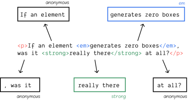
The browser will establish the p element as the containing block for the 5 inline boxes, of which 3 of them are anonymous. Anonymous boxes only exist in the box tree and inherit properties through their box tree parentage.
Step 1: Position anything that’s not auto-positioned.
Step 2: Process items locked to a given row.
For each grid item with an explicit grid-row-start and grid-row-end value, put the item on the earliest column-start line which:
- doesn’t cause overlap with any occupied grid cells
- and is past the previous grid item placed this way.
If the packing is set to dense, then ignore the second bit.
Step 3: Determine the columns in the implicit grid.
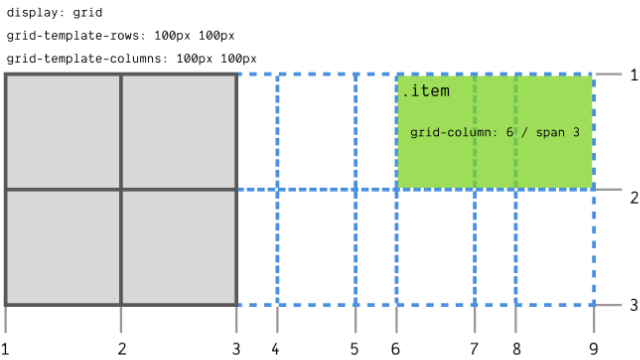
To create columns of the implicit grid, the browser will start off from the explicit grid columns. Then, for all items with a defined column position, add implicit columns to the start and end of the implicit grid to accommodate them.
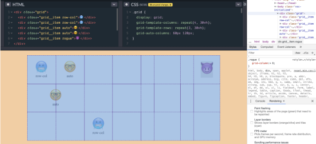
The example above is a 4x3 explicit grid, but the .rogue grid item has been placed on grid column 8, which resulted in the generation of 4 more implicit columns after the explicit grid.
If the largest column span among all items without a defined column position exceeds the column count of the implicit grid, add more columns to the end to accommodate that column span.
Step 4: Position the remaining items.
There is something called an auto-placement cursor, which we don’t see, but it determines the current “insertion point” in the grid. This point is specified as a pair of row and column grid lines.
If there are any items left over after the previous steps have run, there are 4 possible scenarios that will affect the placement of these left-over items.
When the grid packing is the default value of sparse, and the grid item has a defined column position:
- Set the cursor’s column position to that column-start value. If this is less than the previous column position of the cursor, increment the row position by 1.
- Increment the cursor’s row position until the grid item does not overlap any occupied grid cells, creating implicit rows as necessary.
- Set row-start value of the grid item to the cursor’s row position and row-end value based on its span from its row-start value.
When the grid packing is the default value of sparse, and the grid item is automatically positioned on either axis:
- Increment the cursor’s column position until the grid item does not overlap any occupied grid cells, or until the cursor’s column position plus the grid item’s span overflows the implicit columns generated in step 3
- Once an appropriate cursor column position is found, set the grid item’s row-start and column-start to the cursor position. Otherwise, increase the cursor’s row position, creating implicit rows as necessary, and set the cursor column position to the start-most column on the implicit grid.
When the grid packing is the default value of dense, and the grid item has a defined column position:
- Set the cursor’s column position to that column-start value. Set the cursor’s row position to the start-most row in the implicit grid.
- Increment the cursor’s row position until the grid item does not overlap any occupied grid cells, creating implicit rows as necessary.
- Set row-start value of the grid item to the cursor’s row position.
When the grid packing is the default value of dense, and the grid item is automatically positioned on either axis:
- Set the cursor’s row and column position to the start-most row and column lines of the implicit grid.
- Increment the cursor’s column position until the grid item doesn’t overlap any occupied cells, or until the cursor column position plus the grid item’s span overflows the implicit columns generated in step 3.
- Once an appropriate cursor column position is found, set the grid item’s row-start and column-start to the cursor position. Otherwise, increase the cursor’s row position, creating implicit rows as necessary, and set the cursor column position to the start-most column on the implicit grid.
Building the layout
The target design I had in mind looked like this when plotted onto a 20x10 grid:

But wait, if you look a little closer, you’ll notice something is not quite aligned properly.

You know what this means? More columns, that’s what. This is the part of the design phase I call grid planning. For something like that, you can either go analogue (which is how I like to do it), or import the image into any program that lets you draw lines over it.
From there, you can figure out the least possible number of rows and columns that you can get away with, while still having your every one of your grid items aligned to a grid line.

So 40x10 it is.
Building the grid
Can’t have a grid of elements without some markup. For this, you could choose to flow your markup either row or column, you can affect the direction the grid items are laid out with the grid-auto-flow property. I’m going to go with the default of row. So the markup assumes a left-to-right, top-to-bottom order.
Now, let’s create a grid with 40 columns and 10 rows.
.elements {
  display: grid;
  grid-template-columns: repeat(40, 5ch);
  grid-template-rows: repeat(10, auto);
}
Positioning the elements
We also want each grid item to span 2 grid horizontal grid cells.
.element {
  grid-column: span 2;
}
Now is when the diagram comes in handy, because you can figure out which columns you want to “push” the rest of the grid items in the row to recreate the letters, HTML, on the grid.

There are 5 “full columns” of grid items in the design. Instead of plotting each grid item, we can make use of our newfound understanding of auto-placement to ”push” out the required whitespace between grid items with CSS classes. Then for the more specific positions, we can just target those with specific classes instead.
.col5 {
  grid-column: 9 / span 2;
}
.col8 {
  grid-column: 15 / span 2;
}
.col11 {
  grid-column: 21 / span 2;
}
.col15 {
  grid-column: 29 / span 2;
}
.col20 {
  grid-column: 39 / span 2;
}

.h1 {
  grid-column: 27 / span 2;
}
.h4 {
  grid-column: 24 / span 2;
}
.h3 {
  grid-column: 25 / span 2;
}
.html {
  grid-column: 20 / span 2;
}
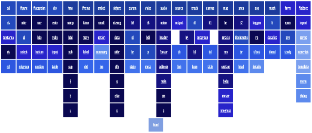
If I’d set the grid-auto-flow value to dense, then the auto-placement algorithm would have packed the grid items without explicit grid column positions into the spaces and we’d end up with something like this:
Fallbacks and narrow viewports
By now, I’ve already gotten used to catering for browsers which don’t support grid, as well as for viewports in which my target design simply just won’t work. I’m going to walk through my thought process for this as well.
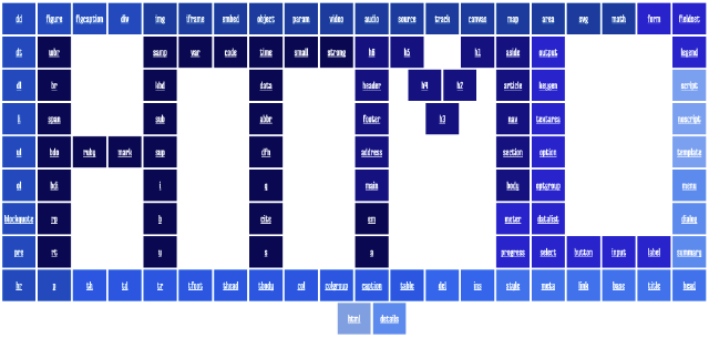
After doing some window re-sizing, I found that the design warped at widths below 1280px, so that was the basis for the min-width media query. The positioned grid items only kick in when the viewport width is more than 1280px wide.
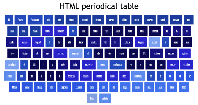
Any smaller than that, all the elements are auto-placed by the algorithm, so it looks like a standard grid of HTML elements. In this case, I didn’t need to fix how many columns the grid ought to be. Instead I let the browser figure it out with the help of the auto-fit keyword.
To ensure I didn’t have any funky whitespaces on either edge of the grid, I made the colunn width a range between 10ch and 1fr, which made the elements always take up the full width of the viewport no matter how the size changed.
.elements {
  display: grid;
  grid-template-columns: repeat(auto-fit, minmax(10ch, 1fr));
  gap: 0.2em;

  a {
    padding: 1em 0;
  }
}And then, the browsers that don’t support Grid. I chose to fallback to a flex-based layout, but you can also go for floats or inline-block, if you’d like to. The gist of the matter here is the feature query.
All the grid-related code gets wrapped up into a feature query like so, including the media query:
@supports (display: grid) {
  .elements {
    display: grid;
    grid-template-columns: repeat(auto-fit, minmax(10ch, 1fr));
    gap: 0.2em;

    a {
      padding: 1em 0;
    }
  }

  @media screen and (min-width: 1280px) {
    .elements {
      grid-template-columns: repeat(40, 5ch);
      grid-template-rows: repeat(10, auto);

      a {
        grid-column: span 2;
        margin: 0;
      }
    }

    a.col5 {
      grid-column: 9 / span 2;
    }
    a.col8 {
      grid-column: 15 / span 2;
    }
    a.col11 {
      grid-column: 21 / span 2;
    }
    a.col15 {
      grid-column: 29 / span 2;
    }
    a.col20 {
      grid-column: 39 / span 2;
    }

    a.h1 {
      grid-column: 27 / span 2;
    }
    a.h4 {
      grid-column: 24 / span 2;
    }
    a.h3 {
      grid-column: 25 / span 2;
    }
    a.html {
      grid-column: 20 / span 2;
    }
  }
}
The base styles, which live outside the feature query, will take care of the browsers that do not have Grid support. And if you want to test how this looks, comment out the entire feature query block.
.elements {
  font-family: "Medula One", serif;
  display: flex;
  flex-wrap: wrap;
  justify-content: center;

  a {
    padding: 1em;
    flex: none;
    margin: 0.25em;
  }
}
For browsers that do not support feature queries, that is essentially what happens anyway because the browser will ignore the entire block within the feature query.
Sprinkle on some JavaScript
Okay, here I want to give credit to Mike Riethmuller, who created a really nice version of the HTML periodic table as well. It’s much prettier than mine, PLUS, it has a definition feature.
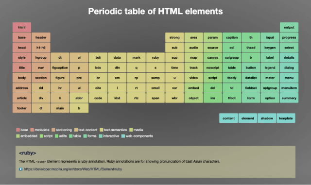
There was also a legend, as the elements were classified into several categories. When you hovered over the category name, the relevant elements would be highlighted as well. Very nice, and I wanted to do the same for my periodic table too.
The displaying of definitions wasn’t too tricky. It made use of the :target pseudo-class, so when you clicked on any of the elements in the table, its definition would be displayed below the table. You have to match the anchor link on the element to the id of the element containing its definition so the URL fragment matches up.
Take this markup, for example:
<a href="#ruby" class="txt-lvl">ruby</a>
<div id="ruby">
<dt><a href="https://developer.mozilla.org/en/docs/Web/HTML/Element/ruby"><ruby></a></dt>
<dd>
<p>
The HTML <code><ruby></code> Element represents a ruby annotation. Ruby annotations are
for showing pronunciation of East Asian characters.
</p>
<p>
<a class="moz-link" href="https://developer.mozilla.org/en/docs/Web/HTML/Element/ruby"
>https://developer.mozilla.org/en/docs/Web/HTML/Element/ruby</a
>
</p>
</dd>
</div>You’d make it work with the following CSS:
div {
  padding: 1em;
  text-align: left;
  display: none;
}

div:target {
  display: block;
}
The JavaScript bit comes in for the hover highlight function. And what it does is add a CSS class to the body element so the relevant elements in the selected category get a background colour change.
Array.prototype.forEach.call(document.querySelectorAll(".legend li"), (li) => {
  li.addEventListener(
    "mouseenter",
    function () {
      document.body.classList.add("hover-" + this.className);
    },
    false
  );
  li.addEventListener(
    "mouseleave",
    function () {
      document.body.classList.remove("hover-" + this.className);
    },
    false
  );
});
I had 11 categories so I cheated and used Sass to generate the CSS needed for this:
$colours: (
  root: #7b9de1,
  scripting: #749eef,
  int-elem: #5186ed,
  meta: #2b6dec,
  edits: #155eea,
  tab-data: #024ee0,
  grp-cont: #0242bc,
  emb-cont: #00369c,
  forms: #0202ca,
  sections: #000080,
  txt-lvl: #010151,
);

@each $class, $colour in $colours {
  .#{$class} {
    background-color: #{$colour};
    color: white;
  }

  .hover-#{$class} {
    .#{$class} {
      background-color: #fdb35f;
      color: black;
    }
  }
}
Wrapping up
And that’s pretty much it. This ended up a longer post than I expected but I hope it shed some light on some of the CSS techniques used to implement this HTML periodical table. If you’d like to dig into the code yourself and tweak it around, here’s the CodePen:
See the Pen HTML periodical table (built with CSS grid) by Chen Hui Jing (@huijing) on CodePen.
Happy CSS-ing!