I was at JSConf China earlier this year, which happened in Shanghai from 19–20 Oct. There was fairly decent representation from Singapore I would say.
Wei (whom I probably mention every second blog post I write) was the opening keynote for Day 2, and it was one of the best if not THE best talk of the conference IMHO.

We also had Yong Jun (another good friend of mine), who gave a workshop on the rather interesting topic of scrolly-telling. He works in the graphics department for Singapore Press Holdings and has lots of experience creating interactive graphics and visualisations.
Yong Jun had developed an open-source scrolly-telling library that he used for a lot of his projects and it uses position: sticky for “snapping” content into place.
During the workshop, he posed the question of why just applying position: sticky alone on an element doesn’t work. And this gave me the idea to do another CSS property deep dive 🤓.
CSS is a team sport
CSS layout is not just one individual CSS property or even module. Everything on the web is a box. And the layout of these boxes are determined the following:
- box dimensions and type
- positioning scheme (normal flow, float, and absolute positioning)
- relationships between elements in the document tree
- external information (e.g., viewport size, intrinsic dimensions of images, etc.)
From this bit of information alone, we can pick out the following CSS modules (including those in draft status):
- CSS Display Module Level 3 (CR)
- CSS Box Model Module Level 3 (WD)
- CSS Positioned Layout Module Level 3 (WD)
- CSS2.1 section 9.5 Floats (REC)
The point I’m making here is, if you’d like to be fully equipped to build any layout you can imagine with CSS, I suggest understanding these different CSS modules and how they interact with each other. It definitely helped me out when I did so.
In all fairness, I really dug into all of it when I was preparing for my CSS Day talk back in 2018, which was pretty much 45 minutes about boxes. All talk details on Notist.
Positioning schemes
After boxes are generated, the way they are laid out depends on which positioning scheme they fall into:
- Normal flow
- Floats
- Absolute positioning

Normal flow is the default, where boxes are laid out one after another, and will not overlap or intrude into each others’ space. All boxes will be on the same stacking context as well.

Boxes that are floated are considered out-of-flow. When a box is floated, it is first laid out according to normal flow, but then is taken out the flow and shifted as far to the left or right as possible (depending on the float value).
Content will then flow along the side of the floated box. But the floated boxes still remain on the same stacking context as the non-floated ones.

An absolutely positioned box is completely removed from normal flow altogether, and its position is assigned with respect to its containing block.
The positioning algorithms used to calculate the position of a box on the page is determined by the position and float properties. I’ll try my best to explain this in a way that makes sense. But first, let’s look at them individually.
The position property
There are several values for this property, with sticky being added in Level 3 of the Positioned Layout Module, and currently supported in most major browsers even though it is still in a working draft status.
position: static
The default position value of any box. This results in the box being laid out in normal flow and the properties of top, bottom, left and right (also known as box offset values) will have no effect because the box is considered not positioned.

position: relative
Applying a position of relative to a box makes it positioned, and now the top, bottom, left and right values will have some effect.
The box will initially be laid out according to normal flow, then depending on the aforementioned box offset values, will be offset relative to its normal position.

If there are other non-positioned boxes next to this positioned box, they will not be affected even if offset values are present. This means there may be the possibility of overlap.
Also, if the offset causes the box to have overflow, this may result in scrolling, which would affect layout. When a box becomes relatively positioned, it becomes the new containing block for its children.
position: sticky
A sticky positioned box works similarly to that of a relatively positioned box. The difference is that the offset is computed to the nearest ancestor with a scrolling box, or the viewport if none such ancestor exists.
This ties in to Yong Jun’s original question of why applying position: sticky alone on a box is insufficient to achieve the sticky effect. The box, without any offsets, behaves as though it was in normal flow, because it is.
Only when the offset values are something other than auto will the box start to behave differently from a relatively positioned box. The wording in the specification comes across slightly cryptic to me, but my understanding is that there is an intersection between the sticky box and its containing box when you apply a box offset value.

This intersection is called a sticky-constraint rectangle and is used to contain the location of the sticky box. The specification uses the term “projects above/below/outside” but I’m not sure if my understanding is the same as what the specification authors intended.

What I do know is that when you define an offset value, the offset will never push the sticky box outside its containing block, but the sticky box is free to move within the containing block as the page is scrolled, hence the perception of it being pinned to the relevant edges.
position: absolute
An absolutely positioned box is explicitly offset with respect to its containing block, and the box does not participate in the normal flow at all. Its later siblings will not know about its existence in the greater layout.

Contents of an absolutely positioned box do not flow around any other boxes and may overlap other boxes, and depending on the stack level of the boxes, content may be obscured by the overlap.
position: fixed
A fixed position box behaves similarly to an absolutely positioned box. The key distinction is that the containing block is always the viewport.

Box offset values
Traditionally, the box offset values most developers are familiar with are top, bottom, left and right. And I don’t think it’s a generalisation to say that most developers from the West don’t give a second thought to writing modes that are anything other than horizontal top-to-bottom.
But when you use a writing mode that is right-to-left, for example, or vertical writing, then these physical values of top, bottom, left and right make less sense. For example, the top of your content may not be the physical top of the browser viewport.
As someone who grew up exposed to writing systems in different directions from the Western default, this was not hard for me to wrap my head around, but that may not be the case for many folks from the West.
Naming is always hard, especially when it does not exactly correlate with real life / usage expectations / metaphors. At least the terms used are consistent with other CSS properties. You need to know how block and inline behave and have some imagination.
— Ecaterina Moraru (@evalica) November 7, 2019
This is why I appreciate it when influential folks in our industry start talking about these lesser known aspects of web development, especially on the internationalisation side of things, because they have a wider reach and can help something considered obscure become more mainstream.
Logical box offset values
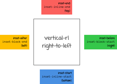
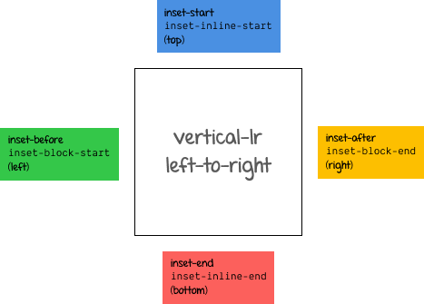
The matrix of writing directions and their corresponding values for a box’s physical sides and logical sides are as follows (the table has been lifted from the specification as of time of writing):
| writing-mode / direction | |||||||
| horizontal-tb | vertical-rl | vertical-lr | |||||
| ltr | rtl | ltr | rtl | ltr | rtl | ||
Edge |
top |
inset-block-start | inset-block-start | inset-inline-start | inset-inline-end | inset-inline-start | inset-inline-end |
right |
inset-inline-end | inset-inline-start | inset-block-start | inset-block-start | inset-block-end | inset-block-end | |
bottom |
inset-block-end | inset-block-end | inset-inline-end | inset-inline-start | inset-inline-end | inset-inline-start | |
left |
inset-inline-start | inset-inline-end | inset-block-end | inset-block-end | inset-block-start | inset-block-start | |
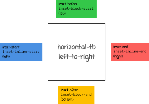
The logical top of a container uses inset-block-start, while the logical bottom of a container uses inset-block-end. The logical left of a container uses inset-inline-start, while the logical right of a container uses inset-inline-end.
This is probably easier to visualise with a diagram (or live code if your browser supports it). The following is for horizontal-tb:
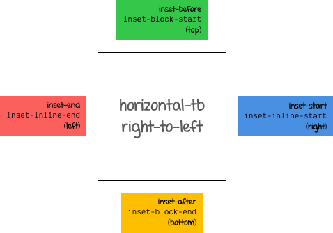
The following is for vertical-rl:
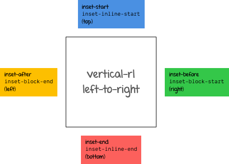
The following is for vertical-lr:
Wrapping up
I suggest opening this CodePen in a full browser window and playing around with the examples and CSS values to get a feel of how everything fits together (or you could select the 0.5x option in the embed).
See the Pen Understanding CSS positioning by Chen Hui Jing (@huijing) on CodePen.
There are plenty of useful resources that cover CSS positioning, so if my explanation doesn’t work for you, try someone else’s article or the specification directly. It is definitely worth the effort in the long run to figure out this important aspect of CSS layout for yourself.
- CSS Positioned Layout Module Level 3 Working Draft
- MDN: Positioning
- CSS Position Sticky - How It Really Works!
- 5 Things You Might Not Know About the CSS Positioning Types
- Advanced Positioning (slightly older article so no
stickyin here) - CSS Positioning 101 (slightly older article so no
stickyin here)