About year ago, I wrote about the findings from an exercise in attempting to typeset Chinese vertically on the web. What came out of that was a bare-bones demo that allowed you to switch between writing modes using the checkbox hack.
I met Yoav Weiss a little while back and we chatted a little about the Responsive Images Community Group because I mentioned how I thought it would be nice if there could be some media query for writing-mode with the picture element so I didn’t have to do some mildly hackish transforms on my images when I switched modes. And he suggested I write it up as a use-case for responsive images.
But when I reopened this demo that I hadn’t touched in a year, my face went from 🤨 to 😱 to 🤬 to 😩 within the first 5 minutes (what can I say? I have an expressive face 🤷). So for catharsis, I’m going to write down my play-by-play of trying to figure out who (i.e. browsers) broke what and hopefully how to mitigate it, for now.
Post is long, use links to skip.
Brain dump structure
- Initial findings
- Code time
- Layout switching
- Handling image alignment
- Winning solution?
- Further reading
- Issues and bug list
Initial findings
I’m only looking at the browsers I have immediate access to. Because I have other things to do with my life 🙆.
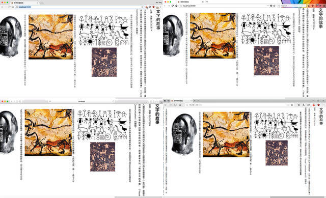
Chrome (64.0.3278.0 dev)
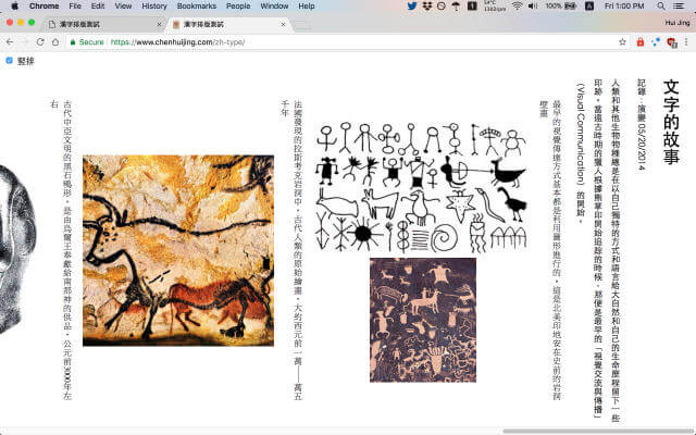
Okay, this looks perfectly fine. I was sort of exaggerating when I said everything was broken. All the text and images are accounted for, no major rendering problems in vertical writing mode. Good job, Chrome.
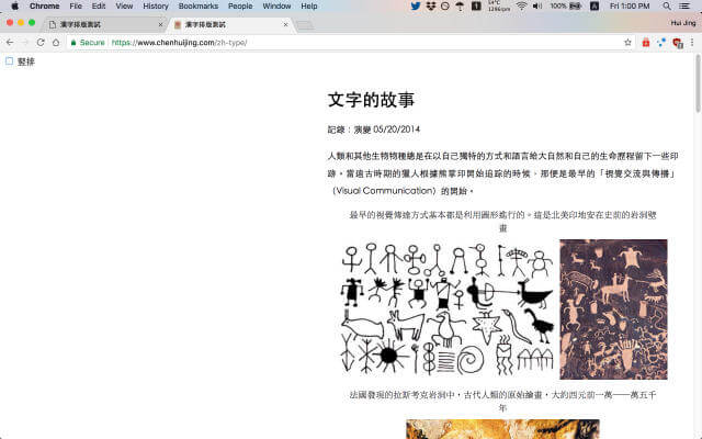
Toggling the switcher kicks things over to the right though. I remember that trying to horizontally centre something in vertical writing-mode was really painful, so this must have been some hack I tried in the first pass that didn’t go so well.
It definitely worked at near the beginning of the 2017 because I made this screencast for my Webconf.Asia slides. Pretty sure it was using Chrome at the time. It’s amazing what a few months will do to a demo. My senior once mentioned a phrase called “code rot”, I wonder if this is it.
Firefox (59.0a1 Nightly)
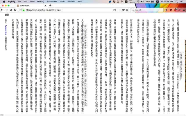
Oh boy, this is just. I have no words. I use Firefox Nightly as my default browser, so hence my initial reaction of ZOMG EVERYTHING IS BROKEN. Because everything IS broken here. Look at it, look at the infinite horizontal scrollbar, what’s happening?!

Let’s toggle…wait, where is my checkbox?! Sigh. This might take a while. Anyway, at least I tied the checkbox to the label so we can still click the label to toggle. Well, it’s definitely NOT centred, but not too broken either. 2 browsers and already a world of difference.
Safari Technology Preview 44
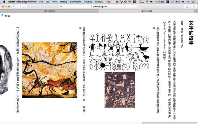
Hey. Hey, hey hey. This looks surprisingly UN-broken. Even the height is correct. Safari, I may have misjudged you. What exactly is the Safari rendering engine again? Oh right, WebKit.

Oooo, this is kind of, sort of, in the centre of the page. Without looking at the code, I’m sure I tried some weird translate thing to shift the entire content block, hence the inconsistent behaviour in every browser. But this has been a pleasant surprise.
Edge 16.17046
I’m on Windows 10 insider fast ring release so I think my Edge is probably a higher version than most people have installed. No matter, I can check my phone too (yes I use a Windows phone, go ahead, judge me).
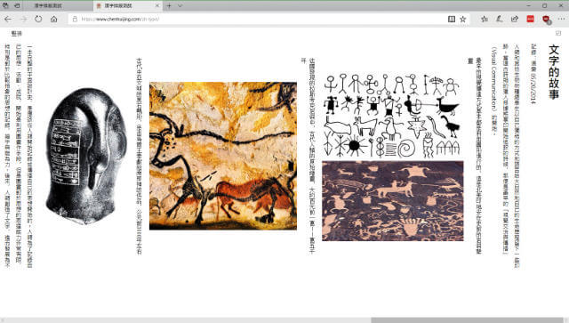
Anyway, this doesn’t look too broken either. Just that the checkbox is a bit off. Big plus is that the scroll-wheel works! All the other browsers don’t let me scroll horizontally with my scroll-wheel. I don’t know if this is a Windows thing or an Edge thing though.

Vaguely semi-centred as well. I really have to check that transforms code soon. I might have an inkling as to what’s going on with the checkbox as well now. Ah, but no vertical scroll with the scroll-wheel, this is getting interesting. Also, notice that the scrollbar is on the left instead 🤔.
Edge 15.15254


Pretty much the same as Edge 16. I’m reasonably confident that Edge on Windows phone uses the exact same rendering engine, in this case EdgeHTML, as the desktop version, but somebody please correct me if I’m wrong.
iOS 11 WebKit
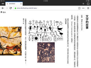

Even though I have a plethora of browsers installed on my iPad, I know that the rendering engine powering all of them is still WebKit, because Apple has never allowed third-party browsing engines. And as already demonstrated on the desktop version, it’s one of the better behaving ones.
Code time
Alright, now that we’ve established the baseline of destruction, it’s time to pull off the dust covers and look at whatever weird code I have under there. To be fair, there isn’t much of it, given how bare-bones this demo is, so that’s good.
I also want to shout-out (for the umpteenth time) Browsersync, which is my top development tool, especially when it comes to building and debugging for multiple browsers on multiple devices. I wouldn’t be doing a lot of this if I didn’t have Browsersync.
Some background
The implementation of the switcher could have gone 2 ways, one with JavaScript to toggle classes, or with the checkbox hack. I often lean toward the CSS-only solution and so decided to go with the checkbox hack. This demo is simple enough such that there wasn’t much interference in terms of keyboard controls, I mean, you could tab and toggle as per any other checkbox.
I really need to study up on accessibility to determine if I’m screwing things up for screen-readers, but that’s for another day. Priority of today is dealing with the layout problem.
The checkbox hack, if you haven’t tried it before, involves making use of the :checked pseudo-selector and sibling or child selectors. You can “hack” state with CSS using this method.
The caveat is that the input (usually the checkbox element), which is what toggles the :checked state, must be at the same level or higher than the targeted element whose state you wish to toggle.
<body> <input type="checkbox" name="mode" class="c-switcher__checkbox" id="switcher"
checked> <label for="switcher" class="c-switcher__label">竪排</label> <main>
<!-- All the markup for the content --> </main> <script
src="scripts.js"></script> </body>
And herein lies the complications. Having a mixture of different nested writing-modes on the same page really screws up the browser. I’m no browser engineer, but I have enough rudimentary knowledge to know that rendering things isn’t trivial. But I’m a stickler for punishment, so onwards with the pain!

In the original demo, I set the default writing-mode to vertical-rl on the body element, then used the checkbox to toggle the writing-mode of the main element. But it seems like everyone (browser rendering engines) handles nested writing-modes differently, as seen by the catalogue of screenshots above.
Debugging 101: Reset to baseline
Remember, this is a brain dump entry, sorry if you’re bored. First thing I did was to remove all styles and start from scratch. Again, this works because the demo was barebones to begin with. Context is everything, folks.
html {
  box-sizing: border-box;
  height: 100%;
}

*,
*::before,
*::after {
  box-sizing: inherit;
}

body {
  margin: 0;
  padding: 0;
  font-family: "Microsoft JhengHei", "微軟正黑體", "Heiti TC", "黑體-繁", sans-serif;
  text-align: justify;
}
This has almost become the de-facto starting point of all my projects. Set everything to border-box, and usually I’ll add in margin: 0 and padding: 0 to the universal selector block as my baseline reset. But for this demo, I’ll let the browser keep its spacings and just reset the body element.
This demo is almost purely Chinese, so I put in only Chinese fonts in my font stack and left the system sans-serif as the fallback. For most cases though, it is a general consensus to put your Latin-based font of choice first. The reasoning being, Chinese fonts will have support for basic Latin characters, but not the other way around.
When the browser encounters any Chinese characters, it won’t find them in the Latin-based font family, so it will fallback to the next in line until it finds a font that does. If you list the Chinese font first, the browser will use the Latin-based characters found in the Chinese font, and sometimes these glyphs aren’t that polished and don’t look so good, especially on Windows.
Next are some aesthetic styles that don’t really affect layout much (does line-height count? 🤔)
img {
  max-height: 100%;
  max-width: 100%;
}

p {
  line-height: 2;
}

figure {
  margin: 0;
}

figcaption {
  font-family: "MingLiU", "微軟新細明體", "Apple LiSung", serif;
  line-height: 1.5;
}
This is a reasonably decent baseline to start with. So now we can start investigating writing-mode behaviour.
The implications of vertical-rl
The default value for writing-mode is horizontal-tb on every single element, and it is an inherited property. If you set a value for writing-mode on an element, this value will cascade down to all its children and beyond.
If we set the writing-mode to vertical-rl on the main element, all the text and images are rendered correctly for every browser. Firefox has this slight vertical overflow of 15px and I suspect it’s due to the scrollbar, but I can’t be sure. Other browsers have no vertical overflow at all.
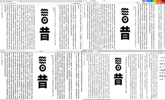
The issue with having the main element in vertical writing mode, but the document itself being in horizontal writing mode means that the content starts on the left and we end up seeing the end of the article on first load instead.
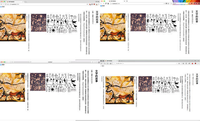
So let’s move things up one level, and set writing-mode: vertical-rl on the body element instead. Chrome, Safari and Edge render the content from right-to-left, which is what we want. However, Firefox still shows the end of the article, although this did fix the scrollbar overflow issue. This looks most relevant to Bug 1102175.
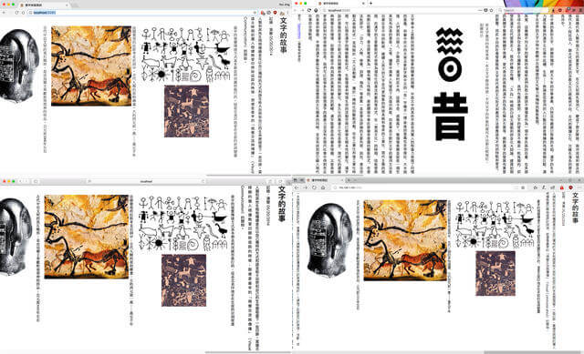
And lastly, if we apply writing-mode: vertical-rl to the html element, Firefox finally comes around and reads from right-to-left. Also, no funny overflowing, just vertical right-to-left goodness.
IE11 supports writing mode but with the older syntax defined in an earlier version of the specification which uses -ms-writing-mode: tb-rl. This works fine, but based on my current markup, which uses the main element that is not supported by IE11, the switcher fails. Even applying display: block on the main element doesn't fix it. I could replace main with div for better support. Let me think about it.
Layout switching
There are known flexbox bugs in Firefox when it comes to vertical writing so I’m going to split this debugging task into 2 parts, the first is just pure layout. Figuring out the different methods of getting the writing mode switcher to work without any funky overflowing.
The second part will be related to centring the images in the figures, which is what got me into this mess. Aside from centring, I also wanted to have some sort of image orientation. Which was what led me to revisit this demo in the first place: my RICG use case write-up. #mildlysidetracked
Solution #1: JavaScript
Let’s talk about the cop-out solution first. Since the problem arises from nesting mixed writing modes, maybe stop using them? Based on our observations from above, a JavaScript event listener to toggle CSS classes on the html element could potentially solve a lot of the weird rendering issues. Okay, code time 🤓.
The 2 classes I want to toggle between are uncreatively named vertical and horizontal. Since I already have the checkbox, might as well make use of it to be the class toggler.
document.addEventListener(
  "DOMContentLoaded",
  function () {
    const switcher = document.getElementById("switcher");

    switcher.onchange = changeEventHandler;
  },
  false
);

function changeEventHandler(event) {
  const isChecked = document.getElementById("switcher").checked;
  const container = document.documentElement;

  if (isChecked) {
    container.className = "vertical";
  } else {
    container.className = "horizontal";
  }
}
Centring the content block went quite well. Because there wasn’t any funny nesting of writing modes nor flexbox involved, a straight-forward auto margins centring worked perfectly in all the browsers, even Firefox.
.vertical {
  writing-mode: vertical-rl;

  main {
    max-height: 35em;
    margin-top: auto;
    margin-bottom: auto;
  }
}

.horizontal {
  writing-mode: horizontal-tb;

  main {
    max-width: 40em;
    margin-left: auto;
    margin-right: auto;
  }
}
Fun fact, when in vertical writing mode, we can use margin-top: auto and margin-bottom: auto to vertically centre things! But trust me when I say centring things horizontally is more painful than you’d expect. You’ll see when we get to the next part with the checkbox hack.
Accidental TIL: Microsoft Edge adheres to the ‘Assignment to read-only properties is not allowed in strict mode‘ ECMAScript5 standard but Chrome and Firefox allows for a strict quirks mode, most likely for code compatibility. I initially tried to use `classList` for toggling class names, but it's a read-only property. `className` isn't read-only though. Related reading in the links below.
Solution 2: Checkbox hack
The mechanics behind this technique is similar to using JavaScript, except that instead of using a CSS class to change state, we make use of the :checked pseudo element. Like we discussed earlier, the checkbox element has to be at the same level as the main element for this to work.
.c-switcher__checkbox:checked ~ main {
  max-height: 35em;
  margin-top: auto;
  margin-bottom: auto;
}

.c-switcher__checkbox:not(:checked) ~ main {
  writing-mode: horizontal-tb;
  max-width: 40em;
  margin-left: auto; // this doesn't work
  margin-right: auto; // this doesn't work
}
Layout code the same as .vertical and .horizontal, but alas, the results are not. Vertical centring is good, looks exactly the same as if we used JavaScript. But horizontal centring is skewed to the right. The auto margins don’t seem to be doing anything in this dimension.
But if you think about it, this is actually ”correct” behaviour because we can’t centre things vertically in horizontal writing mode with this method either. Why is this? Let’s check the specifications.
All CSS properties have values, Once your browser has parsed a document and constructed the DOM tree, it needs to assign a value to every property on every element. Lin Clark wrote a brilliant code cartoon explaining how a CSS engine works, you have to read it! Anyway, values. From the specification:
The final value of a property is the result of a four-step calculation: the value is determined through specification (the “specified value”), then resolved into a value that is used for inheritance (the “computed value”), then converted into an absolute value if necessary (the “used value”), and finally transformed according to the limitations of the local environment (the “actual value”).
Also, from the specification, the calculation of heights and margins are determined by a number of rules for each of the different types of boxes. And if both top and bottom values are auto, their used values are resolved to 0.
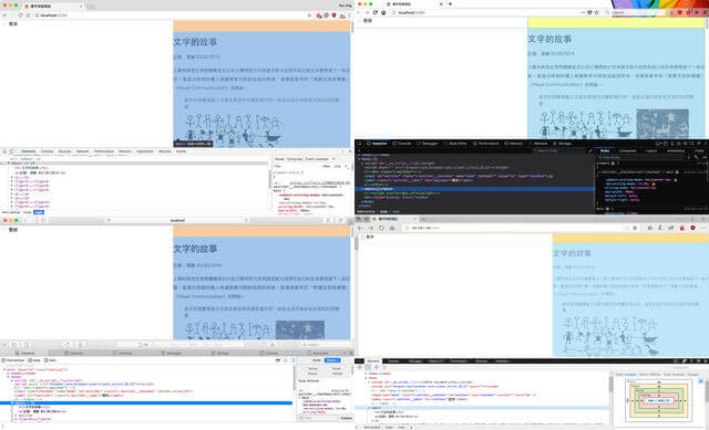
When we set the writing mode to vertical, the “height” seems to become the horizontal-axis when it comes to calculating these values. I say seems because I’m honestly not 100% sure how it really works. And it dawned on me that the JavaScript solution is actually magic!
Nah, I’m kidding. It’s really because we didn’t mix writing-modes when using the JavaScript solution, so the respective dimensions that resolved to 0 were not the ones that affected the centring we wanted to achieve. Maybe re-read that sentence a few times 🤷.
To horizontally centre our main element when vertical writing mode is toggled, we’ll need to use the good ol’ transform trick.
.c-switcher__checkbox:not(:checked) ~ main {
  position: absolute;
  top: 0;
  right: 50%;
  transform: translateX(50%);
}
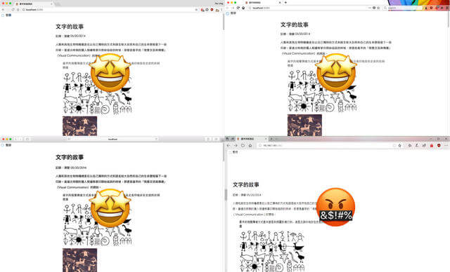
This works for Chrome, Firefox and Safari. Unfortunately, it was kind of wonky on Edge, things are skewed to somewhere in the middle of the page and to the left. Time to file a bug with Edge. Also, the scrollbar appears on the left instead of the right.
Handling image alignment
Okay, moving on. When in vertical writing mode, I wanted the figures with 2 images to display stacked and while in horizontal mode, be side-by-side when space permits. Ideally, the figures (image and captions) would be centre-aligned in their respective writing modes.
Old school properties
Now that we’re operating on a clean slate, let’s just try the most basic of centring techniques: text-align. Images and text are, by default, inline elements. Apply text-align: center to the figure element, and, oh my god, it worked 😱!
Images on both horizontal and vertical writing mode have been successfully centred with no issues. I’m now very concerned about my state of mind a year ago when I was building this. Clearly flexbox was unnecessary for my intents and purposes. I reached for the new shiny first and it bit me in the ass.
I am shook. I need a drink 🥃.
On horizontal writing mode, nothing much needed to be added. Just a simple margin-bottom: 1em for some breathing room between figures. I did need to rotate the portrait orientation images to landscape for space reasons, and did that with a rotate transform.
.vertical {
  figure {
    margin-bottom: 1em;
  }

  figcaption {
    max-width: 30em;
    margin: 0 auto;
    display: inline-block;
    text-align: justify;
  }

  .img-rotate {
    transform: rotate(-90deg);
  }
}
Thing is, when you rotate an element, the browser still recognises it’s original width and height values (I think), so for my demo, when the viewport gets real narrow, it triggers a horizontal overflow. Maybe there’s a fix for that, or I’m doing things wrongly. Advice welcome.
This is specifically the use case I will be writing up for the RICG. The idea being, if there was some sort of media query for writing-mode, I could define a portrait image and a landscape image using the srcset attribute then serve the appropriate image accordingly.
For vertical writing mode, we generally want the text to be justified, or at least aligned top for those semi-orphaned characters on short lines. And for breathing room, the margin is applied to the left instead of the bottom.
.vertical {
  figure {
    margin-left: 1em;
  }

  figcaption {
    max-height: 30em;
    margin: auto 0.5em;
    display: inline-block;
    text-align: justify;
  }
}
We can pretty much call it a day now. It’s done. This is the target end result already. I want to add that this works exactly the same for both the JavaScript implementation and the checkbox hack implementation, except for the Edge bug I mentioned earlier.
Using flexbox for centring
I suspect I chose to use flexbox for centring, though I honestly can’t remember what exactly why I thought it was good idea. Clearly I didn’t need flexbox for any of this. Should have done a brain dump then, huh?
But taking a look at my original code, I realised that I had applied a display: flex to the image wrapper div for those images that were supposed to stack. This made the images themselves flex children, and somehow messed up the rendering in Firefox while using a vertical writing mode 😩.

When using this approach, things look fine and dandy for the versions of Chrome, Edge and Safari I tested (refer to list above) whereby the images were centre-aligned on both vertical and horizontal, and that is nice. But they’re not in Firefox, like literally, the images aren’t visible on my page when vertical writing mode is toggled. It’s fine in horizontal though.
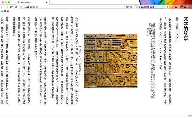
I had wrapped the images that were supposed to do the stacking thing in a div that had display: flex applied, and this somehow messed up the rendering in Firefox while in vertical writing mode. I suspect this behaviour is related to the following bugs: Bug 1189131, Bug 1223180, Bug 1332555, Bug 1318825 and Bug 1382867.
In the meantime, I’m kinda intrigued by this effect that images, which are flex children, have in vertical writing mode on Firefox. It’s like the browser just went nope 🧟♀️🙅💩.
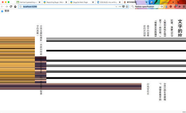
Vertical writing mode aside, I had a conversation with Jen Simmons some time back about flexbox implementation across different browsers and she found that shrinking images are handled differently across all the browsers. The issue is still being discussed among the CSS working group so stay tuned for updates.
This shrinking issue is related to the concept of intrinsic sizing, specifically the intrinsic aspect-ratio of images. The CSS working group had quite a long discussion about this because it’s not a trivial issue.
One interesting observation was that on Firefox, the flex container width capped out at the width of the viewport, but not so for other browsers. When the total width of the images within the container exceeded the viewport width, on Firefox, the images would shrink to fit, but on all other browsers, they just overflowed and you got a horizontal scroll 🤔.
To circumvent this issue for now, I made sure none of my images were flex children themselves. All the images, whether or not they were doubles or singles, were wrapped in an additional div. The display: flex property was applied onto the figure element, which made the figcaption and image wrapper div the flex children instead of the images themselves.
.vertical {
  writing-mode: vertical-rl;

  main {
    max-height: 35em;
    margin-top: auto;
    margin-bottom: auto;
  }

  figure {
    flex-direction: column;
    align-items: center;
    margin-left: 1em;
  }

  figcaption {
    max-height: 30em;
    margin-left: 0.5em;
  }

  .img-single {
    max-height: 20em;
  }
}

.horizontal {
  writing-mode: horizontal-tb;

  main {
    max-width: 40em;
    margin-left: auto;
    margin-right: auto;
  }

  figure {
    flex-wrap: wrap;
    justify-content: center;
    margin-bottom: 1em;
  }

  figcaption {
    max-width: 30em;
    margin-bottom: 0.5em;
  }

  .img-wrapper img {
    vertical-align: middle;
  }

  .img-single {
    max-width: 20em;
  }

  .img-rotate {
    transform: rotate(-90deg);
  }
}
The checkbox hack implementation works exactly the same way. My takeaway from this exercise is that browsers need to work very hard to calculate the dimensions of elements, especially those with intrinsic aspect-ratios.
How about Grid?
We’ve already come so far from what was necessary for this layout, so I considered attempting to use Grid for the image alignment. We could try making each figure a grid container and maybe make use of fun properties like grid-area and fit-content to make things line up.
Unfortunately, 10 minutes into the attempt, I broke my brain. The grid inspector tool in Firefox didn’t seem to match the elements on my page, but maybe it’s because there are too many things on there.
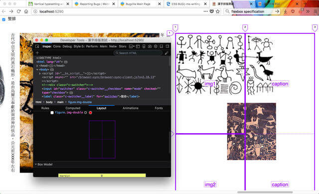
I need to create a simplified test case for using grid with vertical writing mode and that will be a much simpler demo and separate write-up (probably with corresponding bug reports).
Winning solution?
The currently active implementation of my stand-alone demo is the checkbox hack without flexbox solution. I’m retaining the checkbox hack version to track the Edge bug. But the flexbox solution, if you don’t mind the extra wrappers, works fine as well. The markup for the JavaScript implementation also looks nicer, because you can wrap the toggle in a div and style that.
But at the end of the day, there are so many ways to achieve the same end result. It’s fine to copy code from elsewhere, but the trouble comes when something does go wrong and you can’t figure out why. You don’t have to write everything from scratch, but make sure there’s no “magic” that you can’t decipher.
Just saying 😎.
Further reading
- Assignment to read-only properties is not allowed in strict mode
- Inside a super fast CSS engine: Quantum CSS (aka Stylo)
- CSS Writing Modes Level 3
- CSS Flexible Box Layout Module Level 1 Editor’s Draft
- CSS Intrinsic & Extrinsic Sizing Module Level 3
Issues and bugs list
- Firefox Bug 1102175: <body> with writing-mode: vertical-rl doesn’t align children to the right
- Firefox Bug 1189131: flex align-items center displaces text when writing-mode is vertical-rl
- Firefox Bug 1223180: Flex + vertical writing-mode: flex items / text disappear
- Firefox Bug 1332555: [writing-mode] Vertical writing-mode child results in wrong intrinsic size for the parent and thus the child doesn’t fit later when reflowed
- Firefox Bug 1318825: [css-flexbox] Vertical-writing-mode flex item in horizontal flex container has wrong width
- Firefox Bug 1382867: Layout problem with writing-mode and flexbox
- CSSWG Issue #1322: [css-flexbox] Non-interop with shrinking images
- Chromium Issue 781972: Images don’t keep aspect ratio when resizing