One of the biggest things in version 66 of Firefox was the ability to animate grid rows and columns when using Grid layout. This feature had been written into the specification for a while now, but browser vendors took some time to support it.
Since then, there have been a trickle of articles (links to all below) and CodePens centred around animating CSS grid, like this cool airline entertainment system layout by the one and only, Olivia Ng:
I think the ability to animate grid rows and columns is amazing, and am slightly disappointed that people aren’t going nuts at a rate I expected. Oh well, never mind. They’ll catch on eventually.
So in the mean time, I need to play my part and continue to shine the spotlight on this great new feature that will soon make its way to more browsers.
Understanding what can be animated
To be fair, me just saying animating grid rows and columns is possible is not the entire story. We can’t go around animating all the things because there are some scenarios where the animation will not work. You know what this means? It’s specification time!
The relevant specification to refer to here is the CSS Grid Layout Module Level 1. If this is your first foray into specification reading, don’t worry about the length of the document. Specifications, especially the more recent ones, are very comprehensive because the editors put a lot of thought and effort into not being ambiguous.
If you scroll all the way down to the Property Index, you will see a table of properties and one of the columns is Animatable. Every CSS property has this style of definition if you peek into some of the other specifications as well.
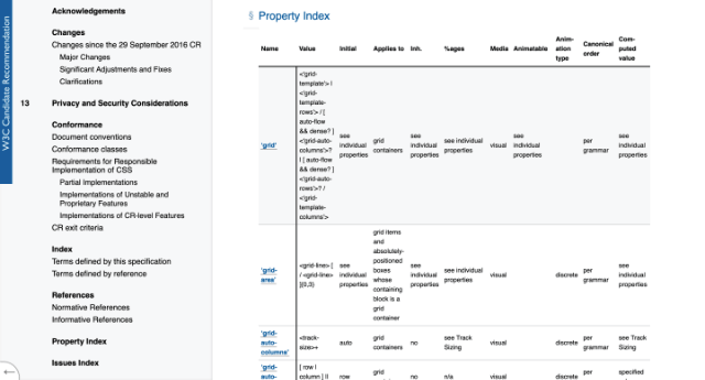
Only grid-template-columns and grid-template-rows can be animatable. (Note that gap will be covered separately because it is no longer limited for grid layouts, flexbox have gap support as well) You’ll see that it isn’t that straight-forward. The criteria is if the values are expressed:
as a simple list of length, percentage, or calc, provided the only differences are the values of the length, percentage, or calc components in the list
Let’s try to understand what’s happening here. It says we can animate grid rows and columns which are a simple list of length, percentage or calc values.
Animations with CSS involve the usage of key frames. Computer animation in general has to make use of interpolation to fill in frames between the key frames so the animation is smooth.
So if you started with 2 columns and ended up with 3 columns, there is insufficient information for the computer to know how to create a smooth animation between these 2 states.
In very simplified terms, the number of rows and columns during the start of the animation must match with that at the end for them to be animatable.
Depending on what you are using to trigger the animation, sometimes certain values for the grid-template-rows or grid-template-columns may not animate.
For example, if your grid adjusts when it hits a certain viewport size, using the auto-fit or auto-fill keyword for either axis will probably result in a different number of rows or columns between the start and end states.
Animate with transitions
Using transitions is one way to animate your grid rows and columns. If your design adjusts the grid structure to cater to different viewports, as long as the number of rows and columns remain the same throughout, you’ll see the rows and columns animate to their new sizes.
If you use grid-area to shift your grid items around, the items themselves will “jump” to their new position, but the row and column sizes will still animate. You can see this if you open the following CodePen on full screen and adjust the width of the viewport.
Animate with keyframes
Under most circumstances, you would probably choose to use CSS animations to animate your rows and columns. More versatile and you can do a bit more with keyframes. The following CodePens illustrate this beautifully:
If you are on Firefox, open DevTools and turn out the grid overlay to see how the logo is being moved around the screen. This CodePen was created by Andrew Harvard.
It’s a rather interesting implementation because the logo itself is aligned to the bottom-right corner of the grid cell. The sizes of the rows and columns are animated over 5 keyframes to achieve that nice bouncing effect.
This CodePen by Michelle Barker also animates over 5 keyframes, changing the size of the rows and columns at each keyframe. But if you look at the code, you’ll see that the total number of rows and columns always remains the same throughout.
Animating gaps
The earliest animatable property in CSS grid was actually the grid-gap property (and its individual long-hand properties grid-row-gap and grid-column-gap). This was highlighted and demonstrated by Manuel Matuzovic way back in 2017.
Since then, the specification has been revised and the grid-* series of gutter properties are now legacy and will continue to be handled and supported accordingly by browsers. The unprefixed gap property is now the standard because then other layout modes can use them too.
The following CodePens demonstrating the animation of grid-gap should work in most browsers except Safari, it seems. But maybe you’re reading this in future and everything is supported. We can only hope.
Wrapping up
As of time of writing, only Firefox 66 and above supports the animation of grid rows and columns, but it shouldn’t take long for the other browsers to catch up. Hopefully this adds another dimension when we are designing layouts that utilise CSS grid and I can’t wait to see what everyone else comes up with.