Back in 2016, during my first ever conference talk (albeit a sort of lightning talk) at CSSConf.Asia 2016, I said that “I just like to CSS.” I wasn’t lying, CSS is really my hobby. And for most of 2017, I’ve been ‘collecting’ interesting layouts I come across and trying to build them on the web.
I’ve developed an opinion (methodology? system? concept? English is so hard…) on building layouts on the web over the years. Unlike most of my web developer heroes, by the time I was elbow-deep in web development, responsive web design was the norm. In fact, I’ve only ever built one fixed width layout in my career. And because of this, I don’t think static.
When I see an interesting layout (usually on print), my mind immediately starts picturing how it would morph if the size of the canvas changed. It’s a pretty fun exercise, and then I’ll sit down and try to build it, which is still fun, but with a touch of pain and frustration (as is normal for our line of work 🤷)
Web designs SHOULD morph
Designing layouts on the web requires interpolative thinking, on multiple levels. Web layouts can and most probably should morph as the viewport size changes. Our job is to make sure the layout is most effective in the space it has to perform in.
While preparing the talks for my Southeast Asia CSS roadtrip, I built a number of layout demos. One of my favourites is based off the following design from The Yellow Issue by Kiyoshi Stelzner:
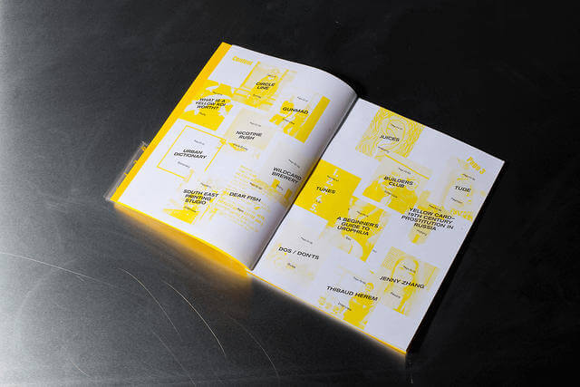
This layout works nicely in a landscape orientation on the web, but as the viewport narrowed, things started to break down. But that’s what media queries were for, right? But instead of regular old width-based media queries, I tried the aspect-ratio media query instead. Because I was sizing my grid with flexible units, relative proportions were important.
This particular layout involving overlap, vertical white-space and transforms would only work well on landscape mode, so I arbitrarily set the baseline aspect ratio to 1/1, and it turned out pretty well. Note that you must use a ratio (number/number) value, otherwise it won’t work.
See the Pen Grid layout with overlaps by Chen Hui Jing (@huijing) on{" "} CodePen.
The demo is more fun in a standalone window, so this is the self-hosted version.
Viewport units can be challenging to use because everything is relative to the viewport, not particular containers within the layout, so scaling can be tricky sometimes. It’s a flexible unit, and would work well with the aspect-ratio media query for situations where we want to keep proportions.
Deutsche Gitter
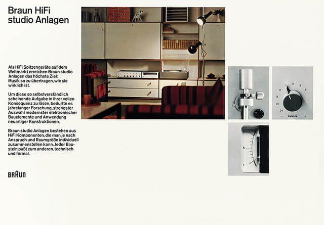
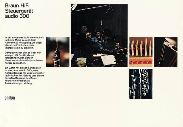
It might just be a coincidence that the layouts which catch my eye are for German publications, but grid-based design of the Swiss Style did emerge from Germany, the Netherlands and Russia in the 1920s. Josef Müller-Brockmann and Karl Gerstner published mostly in German anyway (I think).
But Dieter Rams is legit German, and his work at Braun is pretty iconic, IMHO. So when I came across two posters for Braun HiFi, which were designed by Wolfgang Schmittel, I just had to remake them for the web.
See the Pen Braun HiFi studio Anlagen by Chen Hui Jing (@huijing) on{" "} CodePen.
See the Pen Braun HiFi Steuergerät audio 300{" "} by Chen Hui Jing (@huijing) on{" "} CodePen.
I highly suggest viewing them on Full Page view on CodePen. Admittedly, there are a few outstanding kinks I need to work out but the premise is that when the design hits a particular aspect-ratio, the grid rearranges itself through modifications on the grid-template-areas property.
The grid items themselves are assigned their respective grid-area which can apply regardless of layout being applied. I find this approach really convenient and takes much less code than manually placing the items via their grid-row and grid-column properties per media query.
OMG, object-fit
Can I just rave a bit about how well this “supplementary” CSS property works with CSS grid layouts? It’s background images but for content images. Support is really quite decent. Look, we’ve all established that Internet Explorer will never get any new features, so for the IE family, just fallback the entire layout, it’s a trade-off I think is acceptable.
But looky here, Opera Mini supports object-fit!
With object-fit, I could make the images fill up the entire grid area they were allocated to so the layout was on point and lined up no matter how I morphed the viewport. No awkward white spaces where the image didn’t quite fill up properly.
CSS is a team sport
This is my latest quotable CSS quote. I’ve come to the conclusion that CSS is ultimately a holistic technology, in that, even though you can use properties in isolation, the full power of CSS shines through when used in combination.
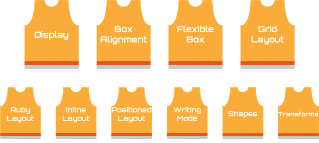
Sure, doing layout on the web usually starts off with using the display property. But we definitely use a whole suite of properties that number more than players on a basketball team. I call the above, Team Layout, and it isn’t even an exhaustive list of layout-related properties.
Wrapping up
Anyway, this was a little CSS-ing to distract myself from more pressing responsibilities and life in general. Should this become a series? Like, welcome to another segment of “Let’s web-ify that”? Who knows…🙃, ping me with your thoughts.
Or not.
Whatever.
You do you, my lovelies 🍸.