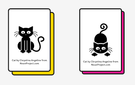
Card-style components are pretty much still a thing these days, and there are many ways to make a bunch of identical rectangles look prettier. I’m quite fond of the pop art, or maybe it’s more of a comic book style art direction that uses thick bold outlines and bright colours.
So the look and feel we are going for looks something like the image below:

Specifics of the design for the larger shadow are as follows (extracted from Figma):
/* Card */
height: 240px;
width: 160px;
left: 260px;
top: 0px;
border-radius: 8px;

position: absolute;
width: 160px;
height: 240px;

background: #ffffff;
border: 4px solid #1f1f1f;
border-radius: 8px;

/* Shadow */
height: 240px;
width: 160px;
left: 274px; /* Indicates shadow is offset on x-axis by 14px */
top: 14px; /* Indicates shadow is offset on y-axis by 14px */
border-radius: 8px;

position: absolute;
width: 160px;
height: 240px;

background: #ffd700;
border: 4px solid #1f1f1f;
border-radius: 8px;
To summarise in words, the card has a solid 4px border and a border-radius of 8px, and the card’s shadow too has a solid 4px border with 8px border-radius and is offset from the card by 14px on both the x and y axes.
At first, I thought this would be quite easy, because I had used multiple box shadows before to great satisfaction (see Codepen below, specifically the pattern of dots on the first 3 albums):
See the Pen Tycho Album Artwork - Scroll Snap by Chen Hui Jing (@huijing) on CodePen.
My idea was to use 2 box shadows to create the coloured shadow and the border for the coloured shadow.
But first, let’s review box-shadow
The full syntax for the box-shadow property can take 2-4 length values, an optional colour and an optional inset keyword. The length values represent the x-offset, the y-offset, the blur-radius and the spread-radius, in that specific order.
Here’s the bit that will probably make you check the documentation if you do not use box-shadow often:
- If you use 2 length values, they mean the x-offset and the y-offset respectively, while the other 2 values default to 0.
- If you use 3 length values, they mean the x-offset, the y-offset and the blur-radius respectively, while the spread-radius defaults to 0.
- If you use 4 length values, they mean the x-offset, the y-offset, the blur-radius and the spread-radius.
Multiple box shadows are also possible, as long as you separate each box shadow with a comma like so:
div {
  box-shadow: 4px 4px coral, 6px 6px olive, 8px 8px dodgerblue;
}
Attempt 1: box-shadow but not quite right
Okay, so we’re trying to do a card with a solid 4px border and a border-radius of 8px, and a shadow which also has a solid 4px border with 8px border-radius and is offset from the card by 14px on both the x and y axes.
My first attempt looked like this:
.card {
  height: 300px;
  width: 200px;
  border: 4px solid black;
  border-radius: 8px;
  box-shadow: 18px 18px 0 0 gold, 18px 18px 0 4px black;
}You might have noticed that the border-radius on the shadow does not match that of the card. This is because the second shadow that I added for the black border which used a 4px spread-radius expanded the shadow beyond the original size of the card.
Now, if there were no rounded corners on the cards, this wouldn’t be an issue at all, but it is what it is. And this discrepancy in border-radius was a little too visible for this approach to be acceptable.
Attempt 2: positioned pseudo-element
Onto the next try! There are more tricks up my card shadow sleeve. Let’s go with the pseudo-element approach then. The gist is to style the pseudo-element to look exactly like the card except with a different background colour and positioned below the card.
.card {
  position: relative;
  background: white;
  transform-style: preserve-3d;
}

.card::before {
  content: "";
  position: absolute;
  height: 100%;
  width: 100%;
  border: 4px solid black;
  background-color: gold;
  bottom: -18px;
  right: -18px;
  border-radius: 8px;
  transform: translateZ(-1px);
  box-sizing: content-box; /* Only if you have some reset that makes everything border-box */
}The interesting part here was the transform: translateZ(-1px) on the card and the transform: translateZ(-1px) on the pseudo-element shadow. This is to ensure that the card shadow always renders behind the card itself.
I did try using just z-index: -1 but somehow it worked in Codepen but not on this live example above. I probably need to dig into the root cause but let’s use the transform trick for now.
Attempt 3: box-shadow with inset
A colleague of mine felt that the pseudo-element could be simplified with box-shadow, and when I told him the issue I ran into, he proposed this alternative:
.card {
  box-shadow: 14px 14px 0 -4px gold, 14px 14px 0 0 black;
}
Since my problem was that the shadow border was growing beyond the original size of the card, that meant that the border should be the “limit” of the card shadow. Its spread radius should be 0. This meant that we ought to use a negative value for the solid colour needed in the card shadow.
And voila! Problem solved. Code became much shorter again, and all is well with the world.
Wrapping up
Honestly, it did not occur to me to use a negative value for the box-shadow at all. But now that I know about this approach, I cannot unsee it. It’s nice to discover new techniques on established CSS properties. Especially when so many new things are on the horizon.
Also, I just came back from CSS Day 2022 and boy was it inspiring to meet my favourite CSS folks in real life. Trust me when I say I was more inspired in the first 3 hours of the conference than I had been since COVID started and things shut down.
Anyhoo, I might have some mildly spicy opinions and ideas in the upcoming posts, so stay tuned if you feel like it, I guess? 🌶️