As I start preparing for a couple talks I will be giving for 2019, I realised that my first talk for 2019 (at CSSConf China) will end up being my 50th slidedeck built with Reveal.js. I’d used this presentation framework since I first started giving talks, and wrote about the basics back then.
After 50 iterations, my slides these days are pretty heavily customised so I thought it’d be nice to write up some of the things I do to them. With them. Whatever.
In that earlier article, I included a very brief paragraph on creating your own theme. Although Reveal.js has been updated multiple times over the past 3 years, the basic gist of things remain the same. I still stand by my original suggestion to delete the bundled themes, and customise off simple.scss.
As of v3.7.0, the css folder looks something like this:
css/
|-- print/
|   `-- …
|-- theme/
|   |-- source/
|   |   `-- …
|   `-- template/
|       |-- mixins.scss
|       |-- settings.scss
|       `-- theme.scss
`-- reveal.scss
There are a number of preset theme files and I suggest using simple.scss as the base for your custom theme. Within the template folder there are 3 scss files contain base styles and variables that are imported into the theme stylesheets in the source folder.
Note that what I’m describing is the structure that this framework provides out the box. You are completely free to change things up but you may need to modify the Gruntfile.js because that’s what handles the compilation of source files.
This is what my custom theme file looks like:
/**
 * Custom theme for Reveal.js presentations.
 * Copyright (C) 2018 Chen Hui Jing, https://www.chenhuijing.com/
 */

// Default mixins and settings -----------------
@import '../template/mixins';
@import '../template/settings';
// ---------------------------------------------

// Include theme-specific fonts
@import url('../../lib/font/magnetic-pro/magnetic-pro.css');
@import url('../../lib/font/magnetic-pro-black/magnetic-pro-black.css');

// Theme template ------------------------------
@import '../template/theme';

// ---------------------------------------------
// Customised styles for this presentation
.reveal {
  …
}
The presentation itself by default loads 2 stylesheets, reveal.css and THEME.css, the latter being a customised theme file generated from .scss files from the source folder. These stylesheets are referenced in the index.html file like so:
<!DOCTYPE html>
<html>
  <head>
    <meta charset="utf-8" />
    <meta
      name="viewport"
      content="width=device-width, initial-scale=1.0, maximum-scale=1.0, user-scalable=no"
    />
    <title>Your awesome presentation</title>
    <meta name="description" content="A short description of what the talk is about" />

    <link rel="stylesheet" href="css/reveal.css" />
    <link rel="stylesheet" href="css/theme/jing.css" />
    <link rel="stylesheet" href="lib/css/zenburn.css" />
  </head>
</html>
If Sass is not your thing, then you can add your own custom CSS file and reference it directly as well. Reveal.js is highly customisable.
Creating custom layouts
Now that basic setup is somewhat covered, I’m moving on to some of the fun stuff I tend to do with my presentations. By default, the content on the slides are centred on the page, but now that we have Grid, placing items on the page has become much easier.
Taking a cue from presentation software which generally offers a number of templates to choose from for laying out different types of slides, we can create several layouts that we apply via CSS classes instead. For example, I have a layout class for a 2-column layout that looks like this:
.l-double {
  display: grid;
  grid-template-columns: 1fr 1fr;
}
I have a couple other layout classes for patterns that occur multiple times throughout my slides, and there are also instances where I make one-off adjustments with inline CSS on the individual slides as well.
For me, my slides serve as a tool to help me get my points across when I’m giving a talk, so I often think of them as single-use. Could I have wrote up proper CSS classes for one-off layouts? Sure. But I’d rather spend more time writing the content itself. But that’s just me. You do you.
Another layout class I have is for multiple items in a row:
.l-multiple {
  display: flex;
  justify-content: space-around;
}
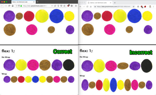
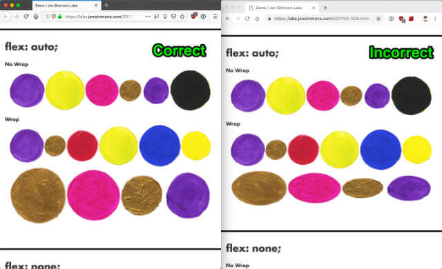
I want to take this chance to highlight a bug in Blink that has been left open for the longest time, Chrome doesn’t preserve aspect ratio for flexed images in auto-height flex container, and does annoy me quite a bit. I had started to learn Flexbox a couple years back when Chrome was still my main browser and learnt the wrong thing because I thought this bug was expected behaviour.
It’s not.
flex: 1
Anyway, I’ve since learnt to double check odd behaviour by going straight to the specification, then checking across browsers to see who’s implementing it accordingly. My main browser is now Firefox. Just putting it out there. 🤷
flex: auto
The best way to see the aforementioned bug in action is to load up Jen Simmon’s flex shorthand examples page in Firefox (correct), Chrome (incorrect), Safari (incorrect) and Edge (correct) for comparison.
Hacking the <style> tag
I also end up wanting to show code examples in my presentations, though I try my best to keep the code short, displayed in a large font size with appropriate syntax highlighting. Sometimes, to better illustrate the effect of the code, I’ll pair the code with an image or better still, a video clip of what the code does.
One of the advantages of using a HTML framework like Reveal.js is the ability to add some live-coding to the slides themselves. I “borrowed” this technique from Una Kravets after seeing her slides from The Power of CSS Talk.
There’s nothing quite like seeing the effects of a code change happening live on the slides themselves, at least for me. And after poking through Una’s code, which she so kindly put up on Codepen, I could see that it involved using the contenteditable attribute on the style tag.
<style contenteditable="true">
  /* Put CSS here and watch your page update as you type */
</style>
With some additional styles, we could make the markup above into an editable code block that applies valid CSS rules onto the page. Some people might raise the validity of doing this, but I consider it a bit of a grey area.
The current HTML specification states that the style element can only be used in 2 contexts, where metadata content is expected, or in a <noscript> element that is the child of a <head> element. In other words, <style> tags should only show up in the <head> of a page.
BUT, in the HTML5.2 specification, one more context is specified: in the body, where flow content is expected. So officially, this approach is invalid HTML now, but it will be valid in future.
The only style required is a display value that generates a box (basically, any valid value except none). But it’s probably a good idea to pretty it up a bit more, so let’s throw in some color and padding.
style {
  display: block;
  background-color: #2d2d2d;
  color: #ccc;
  padding: 1em;
  white-space: pre;
  width: 100%;
  overflow: auto;
}
I’ve added a live-code block below so you can mess up this page however you like to test it out. I also suggest inspecting the element with DevTools to work out which styles are doing what.
Live-coding CSS on presentation slides
So far, I’ve used 2 layouts for live-coding on my slides, a 2-panel and a 3-panel. The 2-panel will consist of the markup I want to target on the left, and the CSS to be applied on the right. The markup for this layout looks like this:
<div class="livecode livecode-2p">
  <div class="result"></div>
  <div class="code"><style class="code-editor" contenteditable="true"></style></div>
</div>
And for the 3-panel:
<div class="livecode livecode-3p">
  <pre class="markup"><code></code></pre>
  <div class="result"></div>
  <div class="code"><style class="code-editor" contenteditable="true"></style></div>
</div>
Reveal.js comes with the syntax highlighting library, highlight.js, which is enabled by default. So as long as you loaded zenburn.css, anything with <pre> and <code> will have styles applied to them.
Most of my styles are layout-related. I always run my slides in Firefox Nightly on stage, so I don’t mind using many of the newer CSS properties. Though it is a good idea to run through the whole deck before going on stage, just to make sure things aren’t broken. You never know.
.livecode {
  display: grid;
  grid-gap: 0.5em;
  margin: 0;
  padding: 0;

  .result {
    max-height: 100%;
    overflow-y: scroll;
    width: 100%;
    border: 1px dashed $headingColor;
  }

  .code {
    text-align: left;
    width: 100%;
    font-family: "Dank Mono", monospace;
    font-size: 75%;
    color: #efdcbc;
    background-color: #3f3f3f;
    padding: 0.5em;
    border-radius: 0.25em;
    overflow-y: scroll;
  }
}

.code-editor {
  display: block;
  height: 100%;
  white-space: pre-wrap;
}
I’m using Grid, so the .livecode class sets that up, then I have 2 different classes that specifies the grid and item placement for each layout respectively.
.livecode-2p {
  grid-template-columns: 50% 50%;
  grid-template-rows: 1fr;
  max-height: 65vh;
}
.livecode-3p {
grid-template-columns: 50% 50%;
grid-template-rows: max-content 1fr;
grid-template-areas:
"a b"
"a c";
max-height: 70vh;
.markup {
grid-area: b;
}
.result {
grid-area: a;
}
.code {
grid-area: c;
}
}Depending on the example you’re trying to demonstrate, there may be additional styling tweaks and overrides to ensure your example works as expected, because Reveal.js itself has quite a lot of styles. But if you’re going to be live-coding CSS on stage, I’m going to make the assumption the cascade is not an issue for you.
Wrapping up
I’d received some feedback after my talks that being able to see the effects of CSS I’m explaining in real-time helps in understanding, so I wanted to share exactly how I did up my slides. Another thing I’ve started to experiment with is to ditch slides altogether and do the presentation with Firefox DevTools.
We’ll see how that turns out 😬. Happy CSS-ing, my friends!