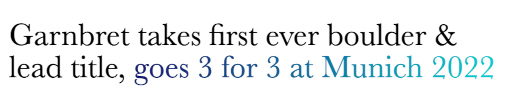
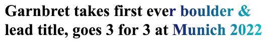
Before we get into all the hacking and unorthodox ways of doing things, let’s talk about background-clip: text properly. If you want an image or a gradient applied to a run of text, like so:
You can achieve such an effect without having to use an image. There is CSS you can apply to your text to make it that fancy. You would need to wrap the bit to be bling-ed up in a span so you can CSS it properly:
<h1>
  Garnbret takes first ever boulder & lead title,
  <span class="highlight">goes 3 for 3 at Munich 2022</span>
</h1>
background-clip: text will make a background image or gradient be clipped to the text in the foreground. The text to be fancy-fied needs to be transparent so the background can show through. And the CSS will look like this:
.highlight {
  background-image: linear-gradient(to right, midnightblue, darkturquoise);
  background-clip: text;
  -webkit-background-clip: text;
  -webkit-text-fill-color: transparent;
}
If you check MDN, there will be a warning on the -webkit-text-fill-color entry saying this is a non-standard implementation. But I still prefer to use this rather than setting color: transparent because when you encounter a browser who does not support background-clip, you won’t end up with transparent, invisible text.
According to Introducing Text-Stroke from the Webkit blog:
text-fill-color – This property allows you to specify a fill color for text. If it is not set, then the color property will be used to do the fill.
After analysing the browser support matrix for background-image and background-clip: text, I concluded that any fallbacks I need to write will only need to apply to IE11. Do you even need to care about IE11 anymore, I hear some people wondering?
This is a choice you have to make. I’m merely sharing with you an approach to take if you want to.
There are actually 2 browsers that do not support background-clip: text, IE11 and Opera Mini if it is using the Presto rendering engine (if you have no idea about Opera Mini, might I suggest reading We need to talk about Opera Mini).
But because Opera Mini does not support background-image: linear-gradient() nor -webkit-text-fill-color, it conveniently just renders the text in black.
IE11, on the other hand, does support background-image: linear-gradient(), which means the text ends up looking like this:
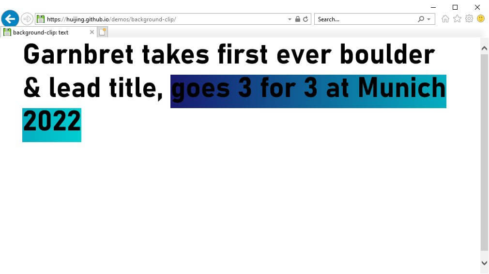
Quite a colour contrast failure, to be honest. But a relatively low effort fix is available to us. It’s a lovely bit of CSS known as feature queries. I recommend reading Jen Simmons’ Using Feature Queries in CSS or maybe Cascading Web Design with Feature Queries.
The code will look like this:
@supports (background-clip: text) {
  .highlight {
    background-image: linear-gradient(to right, midnightblue, darkturquoise);
    background-clip: text;
    -webkit-background-clip: text;
    -webkit-text-fill-color: transparent;
  }
}
IE11 actually does not support @supports, which works out fine because it just means this entire code block gets ignored and the text is rendered in black, without any bells and whistles. Just like how Opera Mini handled it.
Update on the fallback bit!
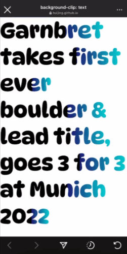
Someone pinged me to say that the text was not rendering right on iOS Safari 15.2.1 and after digging into the problem, I am fairly confident that it was due to this Webkit bug that was fixed and shipped in 15.5.
Turns out, the people who were trying to use background-clip: text supported iOS by adding -webkit-box-decoration-break: clone; as a workaround. Based on my understanding of the box-decoration-break property, it tells the browser how to render elements that have been broken up into fragments.
The unfortunate side-effect of this fix is that my gradient hack doesn’t work exactly as intended because the gradient is then applied onto each line independently with this property turned to clone.
I could hack feature queries to target those Webkit browsers before 15.5 by using the contain property which was released in 15.4. As you can see, we are really mucking around in hack-land right now. But the code would now look like this:
@supports (-webkit-background-clip: text) {
  .highlight {
    display: inline;
    background-image: linear-gradient(
      to right,
      black 0%,
      black 63.5%,
      midnightblue 63.5%,
      darkturquoise
    );
    background-clip: text;
    -webkit-background-clip: text;
    -webkit-text-fill-color: transparent;
  }
}

@supports not (contain: size) {
  .highlight {
    -webkit-box-decoration-break: clone; /* For Webkit versions earlier than 15.4 */
  }
}
This might be an overkill solution but I just wanted to exhaust all possibilities because I like doing such things. Unfortunately, it seems like the 15.4 browsers will fall through the crack and still bug out because it doesn’t fall into my fallback coverage.
I did some investigation around iOS version usage numbers and found that the data showed adoption of newer versions is fairly high.
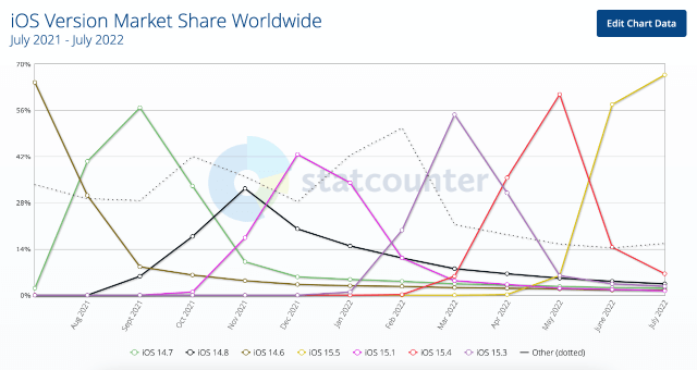
So over time, the number of people impacted by the bug will continue to drop and I can actually get away with this?
The actual hackiness
Now that we’ve covered the scenario where you have all the control over your markup and styles, let’s add some constraints. Because sometimes, you’re using some existing framework or component library that does not allow you modify the markup as you please.
For my case, it wasn’t an impossibility to modify the markup, but it required making changes to the component itself which was used in many different places and I didn’t really want to go down a testing rabbit hole just for this fancy, one-off design pattern. At least, not this time.
So the problem I was facing now is that I could not wrap my target line of text in a span with my special fancy text CSS class. The markup was stuck looking like this:
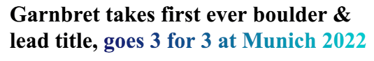
<h1>Garnbret takes first ever boulder & lead title, goes 3 for 3 at Munich 2022</h1>After seriously trying to rewrite that specific part of the component to allow custom markup, and realising it would end up being much bigger than I expected. Plus, I am really not that good at Ruby. You know what I’m actually good at? CSS. 😈
I’ll state up front that I personally think this is REALLY a hack. And under normal circumstances, I would not do this at all, but life is about constraints. After weighing the pros and cons of this approach, it was deemed reasonable for my rather specific scenario.
The hack was to apply the gradient to the entire line of text but make the front part a solid colour with a hard stop where the text was supposed to start looking fancy.
.highlight {
  display: inline; /* this trick only works for inline elements */
  background-image: linear-gradient(to right, black 0%, black 62%, midnightblue 62%, darkturquoise);
  background-clip: text;
  -webkit-background-clip: text;
  -webkit-text-fill-color: transparent;
}
The entire line had to be an inline element though, otherwise the gradient would apply across multiple lines if the text gets broken up.
I’m pretty glad I did a deep dive into the display property all those years back. But the gist of it is that inline-level elements run like a stacked daisy chain rather than a rectangular block, so the gradient is applied to the entire length of the text from the first character to the last, rather than the length of the box.
It works pretty well, to be honest, BUT there are a tonne of caveats that come with it. Because this is a very fragile implementation. If the ratio of black text to gradient text changes, the code will need to be modified. Even if the font-family changes, which will cause the length of the text to change, you might need to modify the gradient percentage values.
For my case, the line in question was English-only. The copy was final. And the font was explicitly declared (as opposed to something up to the browser’s interpretation like font-family: serif). Also, the page would only be live for a set period of time (it was not a “permanent” page so to speak). So the caveats were, acceptable.
If we had needed to translate the line, I might have been able to use a language-targeted selector to customise the gradient for each language. But it would have made a hacky method even hackier?
:lang(zh) {
  .highlight {
    background-image: linear-gradient(
      to right,
      black 0%,
      black 62%,
      midnightblue 62%,
      darkturquoise
    );
  }
}
Wrapping up
I’ll admit, even though the code was all of 4 lines, I literally sat still at my desk without moving for quite a while just thinking about what I could do if I couldn’t touch the markup. The gradient stop approach came to me when I was getting more coffee.
I guess the moral here is to not sit at your desk when you need a new idea? Anyway, after reading some of my previous writing, I think I’m a worse writer now, so no satisfying conclusion for this post. ¯\_(ツ)_/¯