Some of you might know that I run the CSS meetup, Talk.CSS in Singapore together with my best mate, Wei. If you didn’t, you do now. Perhaps you have inferred that I really do love CSS. But you know what else I love? The 90s. More specifically, computing in the 90s.
I wrote about this before, on how the first computer I remember was a 486 in my living room and how I spent hours playing computer games running on MS-DOS and Windows 3.1. So it was inevitable that I would get on real well with Kheng Meng, retro computing enthusiast and co-organiser of the Hackware meetup.
We had worked together before at the inaugural Super Silly Hackathon back in 2017 and found out that we made a pretty good team. Being a hardware man and not really a web developer, I’ve never had good reason to get Kheng Meng to come for Talk.CSS.

That changed when I had another one of my many hare-brained schemes. Knowing that Kheng Meng was fully capable of setting up a working version of Windows 3.1, complete with networking capabilities and whatever applicable software I wanted, I asked him to set me up with an original version of Internet Explorer 3.
Why Internet Explorer 3
Internet Explorer 3 was released on August 13, 1996 and shipped with Windows 95 OSR 2. This was pretty much the era of the first browser wars. IE3 is notable for being the first commercial browser that supported Cascading Stylesheets (CSS).
It was also a major upgrade from IE2, which was essentially built on the Spyglass Mosaic source code. There were still portions of Spyglass code in Internet Explorer at this point. This was also when JScript (Microsoft’s implementation of JavaScript) was first supported.
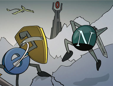
Of course, the term “supports“ is a fairly subjective term as I would soon learn. I don’t actually use any JScript or JavaScript in this experiment, but maybe a future iteration will, though I’m not sure if it’ll be quite as fun for me.
Self-imposed requirements
The point of this experiment was to build a website on a single codebase that still looks decent on any browser. To be fair, “any“ is a pretty tall order, and so is “decent”, so I put out the disclaimer that this experiment would either end up being spectacular, or fail spectacularly.
Regardless of end result, I figured it’d be a relatively amusing talk to do at Talk.CSS #39, and the only shot I had of getting a non-web developer, hardware guy like Kheng Meng to come to the CSS meetup.

Note that there is no desire to make the website look the same in every browser, because that’s missing the point. Personally, I find it fascinating that a single codebase can give you different results in different browsers. I can literally feel the disdain from functional programming aficionados everywhere.
You say bug, I say feature. Be like water, as Bruce Lee says. Applies to web design, IMHO.
Hardware and sysadmin stuff
Kheng Meng had done this back in 2016 for the Hackware meetup, and that’s where I met him properly for the first time. So I was certain that I’d have a working copy of the original Windows 3.11 with networking capabilities on hand.
All I needed was for him to install me a copy of Internet Explorer 3. He also never thought he’d see the words “very advanced” used when referring to Internet Explorer 5 in 2019.

Given that we were presenting at Talk.CSS, where all talks would be recorded, the AV setup was a tad more complicated than normal. Just a tad. What’s a few more machines and cables, right?
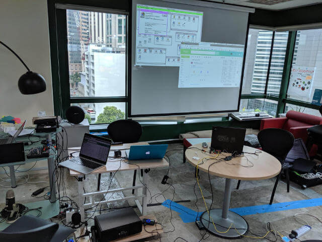
Contributing to the mess of cables was the not-so-straightforward problem of getting the machine connected to the Internet. The initial attempt of doing it via a PCMCIA/Cardbus network adapter failed because the IBM’s Cardbus slot DOS drivers did not work.
Time for Plan B. In this case, a Parallel Port network adapter (we used a Xircom Pocket Ethernet PE3-10BT) connected to a Wifi-Ethernet bridge. Sprinkle on some manual DNS configuration and voila, the magic of the Internet.
There was also the issue of protocols. Even though IE3 supported HTTPS, it uses SSL3, which is sort of a deprecated protocol given its security issues. Anyway, rather than deal with all that certificate stuff, I went with HTTP and hosted my pages on Surge, where HTTPS is opt-in and not forced.

Although I refused to check my actual project page on IE3 until the meetup itself, I did throw up a test page just to make sure things could load. It wasn’t pretty, but things worked. In addition to IE3, Kheng Meng tossed in Netscape Navigator 4.08 and Opera 3.62, making it a 90s browser exhibition.
The process
To be fair, Kheng Meng did offer to loan me the actual machine for testing purposes but because I specialise in doing things that sound like a good idea at the time (except they’re really not), I turned him down. It would be like a Code in the Dark, except without the shitty EDM music and the stress of a countdown.
As an aside, little did I know I would end up hosting the Code in the Dark session for JSConf.Asia. It had been a long day, I got snarky near the end. Ask me about it, if you want.

Remember that I wanted a single codebase that would function for the latest Nightly builds all the way back to the browsers of ‘96. So there was some planning involved, for the design and the resultant markup. I was thinking, nothing too fancy, just a single web page about the project and Internet Explorer 3.
But I also wanted to use modern CSS effects for the new browsers, like gradients, blend modes and layout models like grid. The challenge was to spruce up the IE3 version as much as I could with what limited CSS was available.
Thinking about markup
Trust me when I say I almost succumbed to the wiles of HTML tables when dealing with this project. And to be fair, if you look at the code, I did use a couple HTML tables, simply to test out how I could use modern CSS to modify it.
It’s definitely not best practice to do it this way, I reckon, but that’s why this is an EXPERIMENT. One of the things I had to figure out was how the browser would react to unsupported HTML elements. My assumption was they’d simply be ignored.
According to the specification,
…authors could always use non-standard elements in their documents, with application-specific behavior added after the fact by scripting or similar…
After the fact, I learned that the reason HTML5 Shiv existed was to deal with legacy versions of Internet Explorer back till IE6. John Resig explained that IE doesn’t know how to render CSS on elements that it doesn’t recognise.
Upon some digging, I found this post by Sjoerd Vissche which explained if you want CSS rules to apply to unknown elements, using
document.createElement(elementName);would let the CSS engine know about this element.
Update:
Nicholas Stimpson has kindly pointed out that document.createElement(elementName) changes the HTML parser to recognise the element and add it into the browser’s internal object model.
The fact that the CSS worked on the elements was a consequence of the parsing change. The significant difference being that JS is also able to manipulate the elements created.
For my case, I’m happy for the legacy browsers to ignore the modern elements so I can leave them alone for the baseline version of the web page.
There was a failed bit of markup involving conditional comments for IE, which I’m wondering if it’s because I’m using it for the audio tag or what, but I had to CSS hack that bit instead.
<!--[if !IE]> --> <audio controls class="annoying"> <source src="audio/tetoroika.mp3"
type="audio/mpeg"> </audio> <!--
<![endif]-->
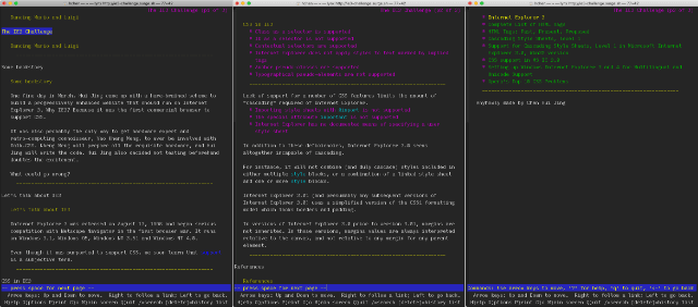
I still like checking to see how the site looks in Lynx though.
Thinking about CSS
Now this was the meat of the project. The first version of CSS didn’t give us much to play with. But if that was all there was, life would have been easy.
No, turns out when IE3 claims to support CSS1, they are using that term rather loosely. Even the W3C had additional information explaining the “holes in the CSS implementation”.
Braden N. McDaniel published a full reference for authors who wanted to use CSS on their own web pages to be viewed with IE3, because it was truly a hole-y implementation.
Apparently there was a version of IE3 for the Macintosh as well, and Eric Meyer wrote up a similar document listing which properties are supported and which are not.
Some of the missing functionality includes:
emvalues (i.e. length units relative to a font size) are not supported. This is important in order to write style sheets that scale from one resolution to another.- There is no documented way for users to supply their personal style sheets.
margin(the compound property) andmargin-bottomare not supported- the
paddingproperties are not supported - the
borderproperties are not supported - pseudo-elements are not supported (but pseudo-classes are!)
I also love the bugs like these:
- Line spacing is also added to the last line of a formatted element – that’s why there is so much space around the headlines. Spacing should only be added between lines
- vertical spacing sometimes act weird after lists
Given these constraints, I chose not to go too crazy and went with a conservative single page design divided up into sections. With <hr> elements. Vanilla is also a flavour, my friends.
Code overview
The whole thing is on GitHub if you want to take a look. And I’ll just go through some bits that may or may not be interesting. I did not have high hopes for this project, as you can see from some of my commit messages. ¯\_(ツ)_/¯
Baseline styles
body {
  color: white;
}

table {
  text-align: center;
  width: 100%;
}

td p,
td li {
  width: 100%;
}

h1 {
  color: purple;
  text-align: center;
}

h2 {
  color: black;
}

img {
  text-align: center;
}

a {
  color: yellow;
}
a:visited {
  color: silver;
}

p,
li {
  font-size: 120%;
  width: 640px;
  margin: 0 auto;
  text-align: left;
}

p span {
  text-align: right;
  color: green;
  font-size: smaller;
}

section > div {
  text-align: center;
}

footer p {
  text-align: center;
}
As you can see, no CSS classes. Why not, you might be asking. Because according to the Support for Cascading Style Sheets, Level 1 article, “Class as a selector is supported”. But that wasn’t the case for me.
Disclaimer, I did have a Windows 95 VirtualBox instance with IE3 installed, so maybe this isn’t really building blind like you do Code in the Dark. Let’s call it building with severe myopia.
No matter, a big reason why the design was so vanilla was because I did not want to resort to inline styles, as that would make the CSS for newer browsers really screwed up. Do not !important all the things. Please. Also, non-supported elements are automatically ignored by the browser (I think).
This next bit is because Internet Explorer evolved over the years and started getting better at actually supporting CSS, like the display property. Also, the audio element came into play by IE9. I had chose to include a <bgsound> tag as a joke, because if it didn’t work, nobody would know.
It did.
<bgsound> is supported in EVERY version of IE. I had added the audio element for non-IE browsers to recreate some of that background music so many websites of the 90s tended to have. So for IE9–11, I wanted to hide it away and let <bgsound> work its magic.
@media \0screen\, screen\9 {
  .blend {
    display: none;
  }

  .lg-title {
    margin-top: 1em;
  }
}

@media screen and (min-width: 0\0) and (min-resolution: +72dpi) {
  .blend {
    display: none;
  }

  .lg-title {
    margin-top: 1em;
  }

  audio {
    display: none;
  }
}
Pretty much most of the rest of the code are wrapped up in feature queries. If you’re familiar with the @supports rule, you might have come across this matrix in some form or another.
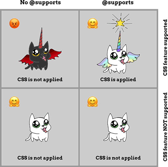
IE11 (and before) falls into the first quadrant when it comes to many of the newer CSS features. This is where you, as the web designer, have to make an executive decision that users of these “in-between” browsers will experience a slightly less fancy version of your website. I don’t think that’s a bad thing.
Each CSS feature and related styles are in their own @supports block, because I thought it’d be neater that way. These are just a couple to illustrate what I mean:
@supports (display: contents) {
  table,
  tbody {
    display: contents;
  }
}

@supports (animation-name: pulse) {
  .pulse {
    animation: pulse 3s ease-in-out infinite;
  }

  @keyframes pulse {
    50% {
      color: greenyellow;
    }
  }
}
The reason for display: contents was because I wanted to see how much I could un-table-ify HTML tables which were used for layout. Turns out, you sort of can, but again, generally bad practice, don’t do it.
The unsightly reveal
And here we go. Kheng Meng had stole a peek before the event started and from his expression I knew the end result was BAD. But on the plus side, <bgsound> worked like a charm. So we kept it on and used it as a “heartbeat” to make sure the computer hadn’t crashed.
The IE3 version looked TERRIBLE. 🤣 Okay, specifically the IE3 version on Windows 3.1 looked like a pile of poop. The Windows 95 VirtualBox version looked slightly better somehow. I need to research why that is.
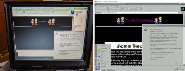
Here’s how the full page looks like for both versions:
The Netscape version did not fare much better. But the Opera version was surprisingly on par with the Windows 95 version. Sort of.
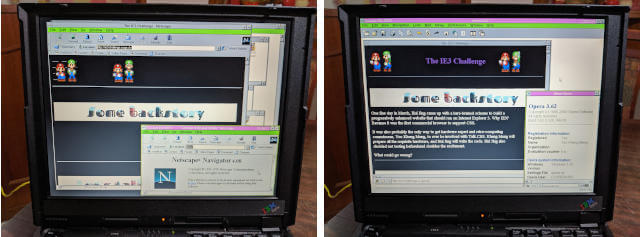
And the corresponding full pages:
And while we’re at it, here’s how it looks on IE11.
And finally, the “modern browser edition”. It’s just Firefox Nightly, tbh. You can pretty much see for yourself at http://ie3-challenge.surge.sh/. Feel free to play the background track with the audio element on the top right.
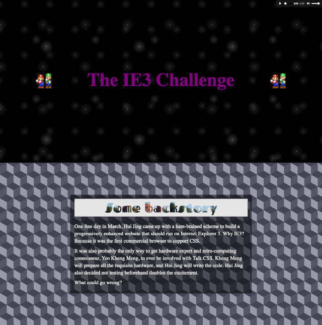
Wrapping up
If you made it till this part of the article, wow, thanks. Like, seriously. This project doesn’t benefit your life in any way at all, so I appreciate your time.
Fun fact, on the day of the talk, my “modern” work computer, which is a 2017 13-inch MacBook Pro, literally died in the middle of the presentation. Twice. (╯°□°)╯︵ ┻━┻
The IBM Thinkpad 390e worked beautifully from start to finish.