This is my second “Fun with CSS” post, maybe this should become a series. But anyway, I had watched the video of Ethan Marcotte’s talk at An Event Apart called Laziness in the Time of Responsive Design, and was fascinated by his progressive enhancement demo. It starts at around the 48 minute mark where he starts covering animation.
Design the transaction not the interface.
In the context of his demo, the transaction was to make a choice and submit it. This could have been achieved with a form consisting of a simple set of radio buttons and a submission button. It is key that the transaction works in all scenarios, while the interface can differ. I highly recommend watching the entire talk, definitely lots to take away from it. The end result of the demo was really cool, and I wanted to recreate it, just for kicks.
Wasn’t as straightforward as I thought, largely because the code snippets in the presentation were focused only on the key parts of the implementation, but to get the entire thing to work required some more effort. I also took a lot of Harry Roberts’s guidance on how to structure CSS to heart, especially after I watched CSS for Software Engineers for CSS Developers. So this experiment took me around 2 days, and a lot of that time was spent just thinking about how to structure my CSS classes and HTML. ¯\_(ツ)_/¯
Basic HTML structure
My usual workflow starts off with plain HTML elements, without classes or even wrapper divs for that matter. Personally I’m not a big fan of infinitely nested HTML to begin with, so I’m really scrooge-y about adding them.
<main>
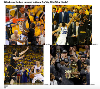
<h1>Which was the best moment in Game 7 of the 2016 NBA Finals?</h1>
<form action="#" method="POST">
<label>
<input type="radio" name="moment" value="block" />
<img src="https://www.chenhuijing.com/filerepo/block.jpg" alt="The Block" />
<span>The Block</span>
</label>
<label>
<input type="radio" name="moment" value="shot" />
<img src="https://www.chenhuijing.com/filerepo/shot.jpg" alt="The Shot" />
<span>The Shot</span>
</label>
<label>
<input type="radio" name="moment" value="stop" />
<img src="https://www.chenhuijing.com/filerepo/stop.jpg" alt="The Stop" />
<span>The Stop</span>
</label>
<label>
<input type="radio" name="moment" value="feelz" />
<img src="https://www.chenhuijing.com/filerepo/feels.jpg" alt="The Feelz" />
<span>The Feelz</span>
</label>
<button type="reset">Cancel</button>
<button>OK</button>
</form>
</main>I went back-and-forth for a bit on whether I wanted the label to wrap the input element or use a for attribute with an id but eventually settled on wrapping everything up in the label element. It matters to link the label to its respective input from a semantic perspective as well to ensure a larger target for selection.
The progressive enhancement for my experiment is definitely not as robust as it could be, as I admittedly skipped straight to browsers that support flexbox and border-radius. Maybe one day when I have more time on my hands, I’ll modify the code so it can run on really old browsers.
Intermission time…
Speaking of really old browsers, I recently attended the Vintage Computing edition of Hackware, which is a monthly meet-up for hardware developers and enthusiasts.
And my brilliant friend, Kheng Meng managed to get Windows 3.1 running on modern hardware, it was brilliant. We realised that IE5 does not support HTTPS, rendering many websites unusable. Guess who works perfectly? Google.com! 👏 for backward compatibility.
Add a little style…
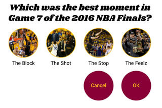
Okay, so the basic version in the video was a row of radio buttons with images in the labels, plus some styles for the buttons at the bottom. I simply didn’t feel like writing extra styles for that so I skipped straight to the big round image-as-selectors version. #imalazygudetama
In hindsight, the work needed from style-less to slightly-more-enhanced styles was a little more work that I expected. But it did give me a good chance to refresh my knowledge on CSS properties.
First things first: generic styles
Something I always do, and in this case Codepen does it by default, is set up some basic resets, and normalise box-sizing to border-box with my go-to snippet below. For my own projects, I customise the resets to what I actually use (because I’m OCD) rather than taking a pre-written reset stylesheet verbatim.
html {
  box-sizing: border-box;
}

*,
*::before,
*::after {
  box-sizing: inherit;
}
Tossed in some overall alignment and padding styles, because somehow I like things centred. Also used some custom webfonts (yes, I know performance things, I only used 2 fonts and 1 weight each, don’t judge me…)
@import "https://fonts.googleapis.com/css?family=Shrikhand|Yantramanav";

main {
  padding: 1em;
  font-family: "Yantramanav", sans-serif;
  max-width: 65em;
}

h1 {
  font-family: "Shrikhand", cursive;
  font-size: calc(3vw + 1em); /* we'll talk about this line later */
  line-height: 1.2;
  margin-bottom: 0.5em;
}
ITCSS (or at least I try to)
ITCSS is the CSS architectural style I aspire toward, though it still doesn’t come easy to me. I’ve bookmarked More Transparent UI Code with Namespaces and refer back to it constantly. It’s a long article but really worth your time to read through and understand the principles behind this style of architecting your CSS. Admittedly I don’t think I have gotten everything down pat, so please ping me if you have suggestions on how to make my code better 😌.
O is for object
I considered each of my label-wrapped radio buttons objects. By definition, an object may be used in any number of unrelated contexts to the one you can currently see it in. I thought about this for a long time, and in a larger project, I would classify the options as components. But for this case, additional content would simply be more questions, so a different context would probably be 3 options instead of 4.
In terms of scalability, I probably should have gone with components, but I guess that’s why we refactor code, no? Anyway, buttons are objects too, resulting in the following 2 classes: o-option and o-btn.
The nested elements in the labels were name-spaced with double underscores:
o-option__img
o-option__input
o-option__txt
Here’s the end markup for the options (I only show 1 for brevity), which includes additional classes for other purposes. I was trying to go for the single responsibility principle here, so you’ll see multiple classes per element quite often.
<div class="l-flex-parent c-4options u-margin-bot" id="js-options">
  <label class="l-flex-1_4 o-option js-option">
    <input class="o-option__input" type="radio" name="moment" value="block" />
    <img
      src="https://www.chenhuijing.com/filerepo/block.jpg"
      alt="The Block"
      class="o-option__img"
    />
    <span class="o-option__txt">The Block</span>
  </label>
</div>
Since the labels are all linked to their respective radio buttons, we can safely hide them away. But we can still utilise the pseudo-class :checked to indicate when an option is selected. In this case, the ordering of my elements within the label starts with radio element, then image, then text. So I used the adjacent sibling selector to target the image, and the general sibling selector for the text. Yes, it would still work if I used the general sibling selector for both elements. Somebody please tell me if there are performance implications or any browser bugs with regards to these 2 types of sibling selectors 🙏.
.o-option__input {
  opacity: 0;
  position: absolute;
  pointer-events: none;

  &:checked + .o-option__img {
    border-color: #860038;
  }

  &:checked ~ .o-option__txt {
    color: #860038;
  }
}
I used vw as the unit because I wanted the images to resize nicely as the screen size changed. A maximum limit of 200px was included, otherwise it just got ridiculous at larger viewport widths. Other stylistic concerns include the 50% border radius for round images and the 4px border in Cleveland Cavalier team gold.
.o-option__img {
  width: 20vw;
  height: 20vw;
  max-height: 200px;
  max-width: 200px;
  margin-bottom: 1em;
  border-radius: 50%;
  border: 4px solid #fdbb30;
}
The buttons also needed their own wrapper, because the styles I used require a parent div to work. Don’t get too confused by the name spacing of classes, I’ll cover it a bit more later.
<div class="l-flex-parent u-flex-end c-actions" id="js-actions">
  <div class="l-flex-1_4">
    <button class="o-btn c-action js-btn" type="reset">Cancel</button>
  </div>
  <div class="l-flex-1_4">
    <button class="o-btn c-action js-btn">OK</button>
  </div>
</div>
Styles for the buttons were also similar, in that, they too would be big and round. Browsers apply default font-size styling to buttons, for example using Chrome on Mac, there is this line: font: 11px BlinkMacSystemFont; and using Opera on Windows 10, there is font: 13.3333px Arial;. Point being, if you don’t explicitly set the font-size and font-family for your buttons, they may not look like you expect.
.o-btn {
  width: 20vw;
  height: 20vw;
  max-height: 200px;
  max-width: 200px;
  font-size: calc(1em + 1.5vw);
  font-family: inherit;
  border-radius: 50%;
  border: 0;
  outline: 0;
  background-color: #860038;
  color: #fdbb30;
  cursor: pointer;

  &:hover {
    background-color: #fdbb30;
    color: #860038;
  }
}
Update: thanks to @maxlibin for pointing out my missing & on the :hover pseudo-class
For most cases, setting both properties to inherit should make the text in your buttons match the rest of your site. In my quest for making this a responsive project, I chose to use vw as my unit of choice, tempered with a base size of 1em. I’d love to be more scientific about this but did I mention my penchant for sloth? I can, however, refer you to Precise control over responsive typography by Mike Riethmuller.
Again, some reset-related styles to get rid of the border and outline (yes accessibility concerns, I might just remove that outline reset). And some hover styles, which switched the background colour and text colour when people hovered over the buttons.
L is for layout
The layout used a 4-column grid, with the buttons aligning to the right. The thing about using flexbox is sometimes you end up having more parent divs than if you didn’t. But then I think back to this quote by Rachel Andrew from her talk at Fluent Conf:
Flexbox for 1 dimensional layout
CSS Grid is for 2 dimensional layout
I would have done things differently using Grid, especially for the enhanced animation version, but for now, flexbox it is. The basic version is not all that complicated.
.l-flex-parent {
  display: flex;
}

.l-flex-1_4 {
  flex: 0 0 25%;
}
U is for utility
I was first introduced to the concept of utility classes when I read Harry Roberts’ article back in 2015. But I only really caught on when he published The Importance of !important: Forcing Immutability in CSS earlier this year.
If it’s permanent styling, formalise it and code it right into your CSS. If it’s short-term or one-off styling, use a utility class.
This was really the line that flipped a switch in my brain. Before that I was always confused on whether to add certain CSS properties to a component’s styles or create a separate utility class. Keeping with the guideline that utility classes should be very specific and do only one thing well, these are the utility classes I used.
.u-flex-end {
  justify-content: flex-end;
}

.u-txt-center {
  text-align: center;
}

.u-centralise {
  margin-left: auto;
  margin-right: auto;
}

.u-pos-relative {
  position: relative;
}

.u-margin-bot {
  margin-bottom: 2em;
}
C is for component
In the non-animation version, there really wasn’t much use for component-specific styles. I considered the option set a component, and the button set another component. So we now also have c-4options and c-actions classes. I tend to use plural forms for parent divs so I can re-use the singular for child elements. What can I say? Naming is hard.
Because components are defined as a concrete, implementation-specific piece of UI, the styles should be context-specific. So buttons have both the o-btn and c-action class, where the object styles would apply regardless of where you see my buttons, but the component styles are specific to when they are used in the context of being form controls.
Now that we got that out of the way, time to add in the animation bits.
Enhance with animation
We only want the animation-related styles to apply on browsers that support animation, and we can do that using a tool called Modernizr. If you don’t know what Modernizr is, it is written in JavaScript and detects if certain features are available on the browser your site/app is currently running on. You can customise your Modernizr build by only selecting the features you’ve used instead of the entire plethora of HTML, CSS and JavaScript features available out there.
Codepen includes a number of popular JavaScript libraries and you can quick add Modernizr from the JavaScript section of your Pen’s settings. The extent of the JavaScript used on this project is simply to add and remove CSS classes. All the heavy lifting is done with CSS animations.
if (window.Modernizr.csstransforms3d && window.requestAnimationFrame) {
  doc.className += " has-animation";
  window["hasAnimation"] = true;
}
If the browser supports animations, the script will add a has-animations class to the HTML element. Because I used SASS, I nested all the animation-related styles inside the .has-animations class. All the CSS in this section are the nested bits.
From a layout perspective, the buttons section becomes positioned directly beneath the options section. The key to this animation is the z-index property. What we want is that when nothing is selected, all 4 options are clickable and sitting on the topmost layer, while the buttons hidden away below them. When something is selected, 2 classes are triggered. The parent wrappers for options and buttons both get an is-active class and the selected option gets an is-selected class.
.c-actions {
  position: absolute;
  top: 0;
  right: 0;
  left: 0;
  z-index: -1;
}

.c-action,
.is-active .o-option:not(.is-checked) {
  transform: scale(0);
  opacity: 0;
  z-index: 0;
}

.o-option,
.c-action {
  transition: transform 0.4s ease-in-out, opacity 0.4s ease-out;
  transition-delay: 0.1s;
}
We make use of the :not pseudo-class to target all the options which weren’t selected and make them hidden, like the buttons originally were when nothing was selected. Transforms and opacity are the 2 properties which can be safely animated, and we do that by adding a transition property to the options.
.is-active.c-actions {
  z-index: 1;
}

.is-active .c-action {
  opacity: 1;
  transform: scale(1);
}

.is-active.c-4options {
  z-index: -1;
  .is-checked.o-option:nth-child(1) {
    transform: translateX(100%);
  }
  .is-checked.o-option:nth-child(3) {
    transform: translateX(-100%);
  }
  .is-checked.o-option:nth-child(4) {
    transform: translateX(-200%);
  }
}
When the .is-active selector is in play, the buttons need to be on the topmost layer, and only the selected option should be visible. The nth-child selectors come in very handy here, because the selected option will always appear second from the left, while the other options remain constant. Depending on the source order of the option, the relevant translation rule will kick in and shift the option to the second position every time 😎.
I added in a logo image just to fill in the blank space in the first position after an option was selected, and it lives in the buttons wrapper. I think if I were using Grid I would have been able to specify the I wanted the logo in the first column, while the Cancel and OK buttons were in the third and fourth columns respectively. But you can’t do this simply with flexbox so I cheated and used translate to kick it to the left instead. ¯\_(ツ)_/¯
The stuff I said I would talk about later
Remember that line all the way up the the post that looked something like:
font-size: calc(3vw + 1em);I got this idea from Mike Riethmuller, who has wrote about this topic quite extensively on his own blog as well as for Smashing Magazine. He gets around the issue of CSS not having a minimum font size property with the calc() function.
An issue with using purely viewport units for your font-size is that there will be a point where the font size becomes unacceptably small. Using a calc() expression allows us to set a minimum size (in the above example, 1em) to prevent that.
Wrapping up
See the Pen Fun with CSS: NBA edition by Chen Hui Jing (@huijing) on{" "} CodePen.
The entire demo is on Codepen, so feel free to do whatever you want with it. This post definitely turned out much longer than I anticipated, largely because I ramble a lot #selfaware. But I did learn a lot from building it, especially the ITCSS structuring portion. I mean, I could have chucked everything into large monolithic components and still got everything work, BUT I DIDN’T.
The moral of the story is, the best way to learn something is to write a blog post about it AND imagine that it’ll be read by a lot of people (even if you know odds are only 10 people will). That way you’ll feel obliged to actually do some proper research and put in a decent amount of effort to clean up your code 😈.