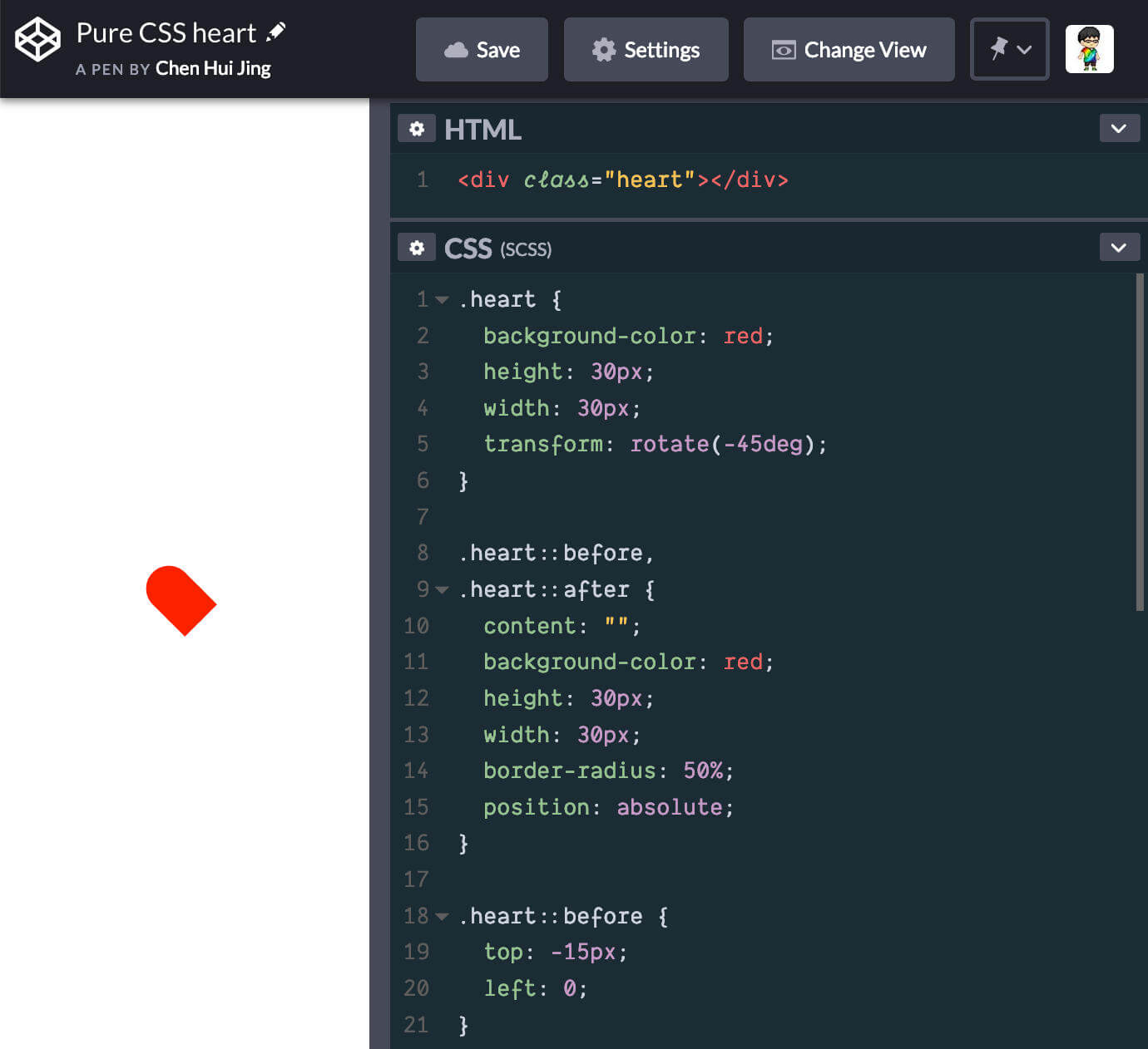
I’ve been helping to mentor a Coding Girls initiative called 30 days of CSS and one of the first projects involved creating a heart shape from pure CSS. The code is fairly short, and makes use of the ::before and ::after pseudo-elements.
<div class="heart"></div>
.heart {
  background-color: red;
  height: 30px;
  width: 30px;
  transform: rotate(-45deg);
}

.heart::before,
.heart::after {
  content: '';
  background-color: red;
  height: 30px;
  width: 30px;
  position: absolute;
  border-radius: 50%;
}

.heart::before {
  top: -15px;
  left: 0;
}
But if we follow the code exactly as above, we will soon realise something is wrong. I cannot say for sure, but I’m suspecting the tutorial wasn’t meant to be published as it was. Here’s the result of what the code looks like if we followed along exactly.
The fix requires the addition of one more rule-set:
.heart::after {
  left: 15px;
}
But for a code walkthrough targeted at beginners to CSS, there’s quite a lot to unpack from this example alone. So let’s break it all down.
The element
Most of us never give it a second thought, but <div> elements are among the most common things we will ever see on the web, so let’s get to know it a little better. The <div> element is classified as flow content, and has no special meaning.
In the specification, it is highlighted that authors use the <div> element when no other element is suitable, as use of more appropriate elements provide better accessibility for readers and easier maintainability for authors.
When it comes to how the element is visually laid out on a web page, as with any element in the document, there is a process of box generation according to the visual formatting model. A key property determining the nature of the box generated by an element is its display property.
There is nowhere in the specification, either for HTML or CSS that determines what this value should be for a <div> element. The initial value of display in the CSS specification is inline. I don’t know about you, but when I first learnt web development, I read that block-level elements included, <p>, <div>, <ul> and a whole list of others, while anything that was not on the list was inline-level.
Turns out, this is behaviour determined by the user-agent stylesheet of the browsers we use. If we refer to the specification on CSS Cascading and Inheritence Level 3, there is a section explaining how the cascade is prioritised. Under normal circumstances, author declarations will take precedence over user declarations which, in turn, take precendence over user agent declarations.
Fun fact, we can view the user-agent stylesheet for Firefox fairly easily via DevTools. If we go to the Computed tab and filter for the display property with the <html> element highlighted, odds are we will see the source of this style is from a file called html.css. Click on that and we should end up opening a file at the following url: view-source:resource://gre-resources/html.css. For the other browsers, some digging is required online for Chromium and Webkit.
Because the <div> element has its display set to block, we are able to apply width and height properties to it. Applying a width and height to inline elements has no effect. The width of an inline element is determined by the rendered content within it, while the height of an inline element is based on the font used.

The background refers to the background of the content, padding and border areas, while margins will always be transparent. One thing to note is that background properties are not inherited, but because the initial value of background-color is transparent, the background colour of the parent element tends to be visible unless the child elements completely fill up the parent element and have their own background colour set.
Pseudo-elements
The ::before and ::after pseudo-elements in this example are used to form the rounded tops of a heart shape. Pseudo-elements, according to the specification, represent abstract elements of the document beyond those explicitly created by the document language.
Pseudo-elements may also provide authors a way to refer to content that does not exist in the source document. This is specifically applicable to the ::before and ::after pseudo-elements.
The use of double semi-colons, ::, is to distinguish between pseudo-classes (single colon) and pseudo-elements. However, for compatability with older browsers, the single semi-colon syntax is still valid. There are more pseudo-elements than ::before and ::after but with regards to this code example, I will only talk about these 2.
Let’s use the <div> element with the .heart CSS class in this explanation. As mentioned, ::before and ::after pseudo-elements are used to insert generated content before or after an element’s content. The .heart::before and .heart::after pseudo-elements are children of the .heart element.
<div class="heart">
  ::before
  If there was any text content, it would be here
  ::after
</div>
Inspecting the .heart element with DevTools will reveal the above structure. If there were text content within the .heart element, it would exist at the same level as ::before and ::after, situated between the two. In order to generate content, the pseudo-elements must have the content property assigned. The content can be an empty string, e.g. ''.
The display property is non-inheritable. Given the initial value of display is inline, unless explicitly set, the ::before and ::after pseudo-elements will be inline elements. However, we can always change this value by setting the display of the pseudo-elements to something else, e.g. block or inline-block.
The border-radius property
This is the go-to property for creating rounded corners. Before this property came along, it was a huge hassle to have rounded corners on the web. The most common usage setting a single value for the border-radius property.
But border-radius is actually shorthand for all four border-*-radius properties (top, right, bottom, left). Each individual border-*-radius can take 2 values, the former for the horizontal radius and the latter for the verical radius.

Both fixed units (e.g. px and rem) and relative units (e.g. %) can be used. When we use percentages, the horizontal radius will be a percentage of the width of the border box while the vertical radius will be a percentage of the height of the border box.
With that in mind, to form a perfect circle, we would set a border-radius: 50% on an element that has an equal height and width. In this example, we could have set border-radius: 15px to create our perfect circles as well.
Positioning
The pseudo-elements also have their position set to absolute. In the absolute positioning model, a box is explicitly offset with respect to its containing block. For the example we are using, this means the offset of the 2 pseudo-elements is relative to the .heart element.
Within normal flow, width and height have no effect on inline elements, but once an inline element has been positioned absolutely, it behaves like an absolutely positioned block element, which means we can set its width and height properties.
Because we have assigned a fixed height and width of 30px for the .heart element and its pseudo-element children, we can offset the circular children halfway out of the parent square on adjacent sides to form the heart shape.
For this example, we will go with the top side and the right side. Offsetting the ::before pseudo-element up the top requires a top: -15px negative value while offsetting the ::after pseudo-element out the right side will require a left: 15px.

Transforms
Transforms are a rather interesting CSS property to explore. The visual formatting model describes a coordinate system, within which, elements are positioned. Transforms allow us to modify this coordinate space, allowing us to translate, rotate and scale the elements in question. These effects, however, are applied after the elements have been sized and positioned.
This means that the rest of the elements within the document recognise the original size and position of the element within the normal flow of content, not its transformed size and/or position. So there may or may not be instances of overlap/underlap between the transformed element and the rest of the content.
Other than the transform property itself, which allows a wide variety of 2d and 3d transforms, there is also the transform-origin property that determines the starting point for these transformations. The default value of transform-origin is 50% 50%, which means the transformation’s starting point is the centre of the element.
For this example, only one transformation is being used.
.heart {
  transform: rotate(-45deg)
}
This rotates our red square 45 degrees in the anti-clockwise direction. In the first screenshot of this article, if I had left the red square without adjusting it to the centre of the screen, we would have found the top edges of the square spilling out of the viewport on the left and top respectively.

If you’re interested in a more detailed explanation of 2D transforms, I wrote something up a while ago, but it’s still relevant.
The :hover pseudo-class and transition property
Pseudo-classes are keywords added to a selector that specifies a special state of the selected element. For example, :hover occurs when your mouse is moved over the element, :first-child occurs when the element is the first child element within a parent element.
If we wanted our heart to change colour when the cursor hovers over it, we would need to set a different background colour for the .heart:hover selector, as well as its child elements. Currently, it is not possible to apply a pseudo-class like :hover to pseudo-elements. However, we can apply the :hover on the .heart element, then trigger the effect on the pseudo-elements.
/* This is valid */
.heart:hover,
.heart:hover::before,
.heart:hover::after {
  background-color: maroon;
}
/* This is NOT valid */
.heart:hover,
.heart::before:hover,
.heart::after:hover {
  background-color: maroon;
}
For grouped selectors, as long as 1 of the selectors is invalid, the whole block is invalid. This means if you chose to group the selectors as shown above, the second block of code will be completely invalid, even though .heart:hover is a proper selector.
For a smooth transition between the 2 colours, we can use the transition property. The transition property is a shorthand for the four individual transition properties of transition-property, transition-duration, transition-timing-function and transition-delay.
The syntax for the transition property is as follows:
transition: <single-transition>#
where <single-transition> = [ none | <single-transition-property> ] || <time> || <timing-function> || <time>
What this means is that the <single-transition> can occur 1 or many times, where multiple values are comma-separated. The <single-transition> represents at least 1 or more of the individual transition properties listed above. Because there are 2 time values involved, the first value that can be parsed as a time will always be assigned as the transition-duration while the second time value will be transition-delay.
/* property name | duration */
transition: background-color 1s;

/* property name | duration | delay */
transition: background-color 1s 3s;

/* property name | duration | timing function */
transition: background-color 1s ease-out;

/* property name | duration | timing function | delay */
transition: background-color 1s ease-out 3s;
Although it is possible to not have a single time value for the transition property, it does not make sense to do so, because the end result is an abrupt change rather than a transition between states, as the initial values for both transition-duration and transition-delay are 0s. The default value for transition-property is all, which implies all animatable properties will be transitioned when their values change.
Specific to this heart example, it is safe to just animate the background-color property on hover, so we can add the following to the .heart element and its 2 pseudo-element children.
.heart {
  transition: background-color 1s;
}

.heart::before,
.heart::after {
  transition: background-color 1s;
}
By choosing not to include a transition-timing-function, the transition will take on the initial value of ease.
Final code
A pure CSS heart that changes colour when a cursor hovers over it may only take less than 30 lines of CSS, but every line has a part to play. The collective power of CSS properties used in combination is what allows us to create so many interesting designs on the web.
Why not try your hand at creating some pure CSS art as well? It might give you a clearer understanding of what your CSS properties of choice can really do.