When the concept of responsive design came about, developers and designers have been trying to find ways to deal with the issue of responsive images. It’s honestly a hard problem to solve, because we’re serving the same website, with the same image sources, across a wide range of device widths. Do you want a blurry, pixelated image on a large display? Or do you want to load a huge (but oh so pretty) image on your mobile phone? Talk about being stuck between a rock and a hard place.
Loads of smart people, namely the Responsive Issues Community Group (RICG) have been working together to solve this problem. Which is why we now have the <picture> element and the srcset and sizes attributes being drafted into the HTML 5.1 specification. Because we cannot predict where and how users are going to view our websites, we need the browsers themselves to pick the best image for the situation. That’s what the proposed solution is trying to do. With reference to the HTML5.1 working draft (as of 9 July 2015), the new specification will address the following issues:
- Device-pixel-ratio-based selection
- Viewport-based selection
- Art direction-based selection
- Image format-based selection
The specification introduces 2 new attributes to the <img> element, namely srcset and sizes. srcset lets us declare a set of image sources, which browsers will serve according to certain conditions we specify using descriptors. There are x descriptors and w descriptors.
Fixed-width images
With the introduction of retina screens, it became necessary not only to take into account the resolution of the screen but the pixel density of those screens as well. Retina screens, 4K displays, UltraHD, all these displays have way more pixels packed into them compared with a standard resolution display of the same size. More pixels = sharper image quality.
The following method works best for fixed width images. If, for some reason, you have an image that will always display at a certain width regardless of screen size, then this is the way to go. The browser would be choosing which image to load based its device-pixel-ratio.
The srcset attribute is basically lists the pool of source images from which the browser can pick to load. It’s a comma-separated list. The x descriptor indicates the device-pixel ratio of the image. Depending on what environment (viewport) the browser is operating in, it will utilise this information to select the appropriate image. For any browsers that don’t understand srcset, they will simply load the image declared in the src attribute.

<img src="crest-255.jpg"
     srcset="crest-383.jpg 1.5x, crest-510.jpg 2x"
     width="255" alt="USWNT crest">
As mentioned above, an example of when a fixed width image is used could be a site’s logo, which remains the same size regardless of viewport width. Images which are content-related, however, would usually be responsive, in that their sizes would change depending on the viewport width. For those types of images, there’s a better method.
Fluid-width images
For fluid-width images, we use srcset with the w descriptor and sizes. The w descriptor tells the browser the width of each image in the list. The sizes attribute is also a comma-separated list of 2 values. As of the latest specification, if the srcset has any images using the w descriptor, then the sizes attribute must be present as well.
There are two values in the sizes attribute. The first value is a media condition. The second value is the source-size-value, which determines the width of the image at that particular media condition. One important thing to note is that you cannot use percentages as the source-size-value, the only relative CSS length you can use is vw.
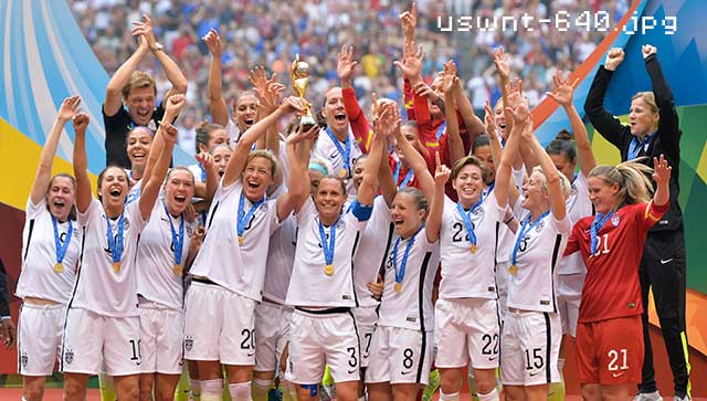
<img srcset="uswnt-480.jpg 480w,
             uswnt-640.jpg 640w,
             uswnt-960.jpg 960w,
             uswnt-1280.jpg 1280w"
    sizes="(max-width: 400px) 100vw,
           (max-width: 960px) 75vw,
           640px"
    src="uswnt-640.jpg" alt="USWNT">
For the above example, I’m telling the browser that for viewport widths up till 400px, make the image 100% of the viewport width. At viewport widths up till 960px, make the image 75% of the viewport width. And for everything above 960px, make the image 640px. If you’re unfamiliar with vw, Tim Severien wrote a great article explaning viewport units.
The browser utilises the information from srcset and sizes to serve the image that best matches the stated conditions. If my browser’s viewport is 600px, it would most likely display the image at 75vw. The browser will try to load the first image larger than 450px, which is uswnt-480.jpg. If I’m on a retina-display with a device-pixel ratio of 2, then the browser will try to load the first image larger than 900px, which should likely be uswnt-960.jpg. We can’t be certain of exactly which image will be served because each browser has some leeway in how their algorithm picks an appropriate image based on the information we provide. This is what we mean by viewport-based selection of images.
The first two examples display the same image at different quality levels, and hence the srcset attribute alone is sufficient. Again, if you’re worried about legacy browsers, that’s what the src is for. Those browsers will just treat it as a regular image and load from src. If you want to show slightly different images at different widths, for example, showing only the critical parts of an image at smaller widths, then we want to use the <picture> element.
Case #3: Art direction-based selection
The <picture> element is like a wrapper for the image and its sources. Browsers still need the <img> to recognise that an image needs to be served. Without the <img>, nothing will render at all. <source>s provide the browser alternate versions of the image to display. Art direction is used for situations when we want a specific image to display at a specific breakpoint. There is no ambiguity in terms of image selection when you use the <picture> element.

<picture>
  <source media="(min-width: 960px)" srcset="ticker-tape-large.jpg 1024w" sizes="50vw">
  <source media="(min-width: 575px)" srcset="ticker-tape-medium.jpg 640w" sizes="60vw">
  <img src="ticker-tape-small.jpg" alt="USWNT ticker-tape parade">
</picture>
In the above example, when the viewport is larger than 960px, a landscape-oriented version of the image (ticker-tape-large.jpg) is loaded. For widths larger than 575px, the browser loads a cropped portrait-oriented image (ticker-tape-medium.jpg) instead. And for widths smaller than 575px, the image (ticker-tape-small.jpg) loaded has been cropped to focus just on one player.
The <picture> element is backwards compatible in that for browsers that don’t support the picture element, <img> will be displayed as per normal. All standard attributes, like alt, for images should be applied to <img> not <picture>.
Case #4: Image format-based selection
There have been a number of new image formats that have come into existence in recent years. These new image formats offer better quality at lower file sizes. Sounds good, right? Until you realise that none of these formats are universally supported across all browsers. WebP was released by Google and although performs very well, is only natively supported by Chrome and Opera. JPEG-XR, originally known as HD Photo, was a proprietary image format released by Microsoft, supported only by Internet Explorer. If you’re interested, Zoltan Hawryluk wrote an in-depth examination of all these new formats.
<picture>
  <source type="image/vnd.ms-photo" srcset="wwc2015.jxr">
  <source type="image/jp2" srcset="wwc2015.jp2">
  <source type="image/webp" srcset="wwc2015.webp">
  <img src="wwc2015.png" alt="WWC 2015">
</picture>
Because <source> also has a type attribute, by specifying the MIME type of each image, browsers can choose the first source that has a type attribute of a supported MIME type. The order of the source matters, in this case, but if the browser doesn’t recognise any of the image types, it will just fallback to the original <img> element.
Can I use all this right now?
As of time of writing, <picture> is supported by the latest stable releases of Firefox, Chrome and Opera. Safari and Internet Explorer do not support <picture> natively at all. srcset does slightly better, with full support on the latest stable releases Firefox, Chrome and Opera, and partial support on Safari 8 and Internet Explorer Edge.
There are quite a few polyfills out there that can address the support problem. The most well known is probably Scott Jehl’s picturefill. I’m currently using respimage on my own site. The specification is still being polished up right now but we’re really close to a native responsive image solution. For all those interested, you can join the Responsive Issues Community Group, sign up for the newsletter or follow them on Twitter.