I have not had as many chances to build websites lately because for a little over the past 100 days, I’ve been in a non-developer role at work. It’s not really my cup of tea, but I committed to filling the role and therefore I must give my best.
However, I really would very much prefer to be building websites. And so, when my friend, Kathy Giori, reached out about helping out with her company website’s redesign implementation, you cannot imagine the glee I felt. And how thankful I was that she let me run wild in her GitHub repo. I didn’t actually run wild, I branched out and made a PR, like responsible developers do. 😤
Today is my off-day, which means I get to sit in the same spot as I do when I’m at work but do something completely non-work related. Some people watch Netflix, some people play games, I indulge in my love of writing HTML and CSS.
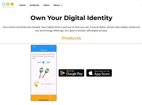
Update: It’s live! Check it out at https://tricyrcle.com/
Not a complicated web page
Don’t get me wrong, I do like the challenge of figuring out how to build all those special effects and interactions and things flying around the page, it’s genuinely fun to do that. But I also enjoy the simple, straight-forward web page.

This is a mostly single column layout, with some components within sections having side by side content. Such a design also performs very well on a narrow viewport. In the grand scheme of things, I probably spent more time trying to figure out how to get my Sequoia 15.0.1 macOS to run pip correctly so I could subset fonts than I did building this page.
Layered design with pseudo-elements
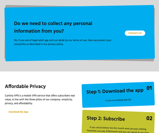
The most interesting bit of the design was this background half peaking out behind a piece of content that already had a background colour. I recognise this is a horrible description, so please refer to the image below. And if you are unable to see the image, again, I sincerely apologise for my lack of explanation skills.

Although my first thought was box-shadow but realistically, there is no way to rotate the shadow while leaving the original element untouched. If I’m wrong about this, please let me know. So I reach for my other trusty technique, the pseudo-element.
And because my brain is still time-zoned out from a month of travel, I ended up having to refer to my own blog post from 2 years ago on implementing shadow-style designs (CSS card shadow effects) to figure out how to get the pseudo-element be the same height as the parent element.
position. The answer is position. 🤦
.info-privacy::before {
  display: block;
  content: "";
  position: absolute;
  top: 0;
  left: 0;
  height: 100%;
  width: 100%;
  background-color: var(--brand-cyan);
  transform: rotate(-2deg);
  border-radius: var(--border-radius);
  z-index: -1;
}
I also had another brief moment of “eh, why is this happening” when I saw that the pseudo-element was just not in the right position. But that one came to me after a couple of minutes, so it wasn’t that bad. Remember to tell the absolutely positioned element what its offset needs to be. That’s all.
You can google math
If you look at the screenshot above, you’ll also see there are a few steps cards that are rotated in different angles. There are actually 4 of them but only 3 different colours so the fourth one is blue again. And I couldn’t figure out the n formula by myself. Thankfully, you can google math on the internet and I managed to get the answer: nth-of-type(3n - 2).
.affordable-privacy li:nth-of-type(3n - 2) {
  background-color: var(--brand-cyan);
}

.affordable-privacy li:nth-of-type(2) {
  background-color: var(--brand-chartreuse);
}

.affordable-privacy li:nth-of-type(3) {
  background-color: var(--brand-orange);
}
Did I need to do math? Not really, I could have just gone with li:first-of-type and li:nth-of-type(4) as 2 separate selectors but ¯\_(ツ)_/¯
Download CantinaVPN
So the whole reason why I was enjoying afternoon building this web page is because Tricrycle Corporation, which is Kathy’s project, now has proper branding, with a brand guidelines document and all that good stuff.
The organisation is behind CantinaVPN (Google Play/App Store), which is an affordable VPN solution that does not collect any private information from you. No registration, no login. You remain anonymous.
It’s good stuff, and if you’re wondering where the website is, well, the team is busy building the VPN software, so the website is a little on the back-burner, and that’s how I got this sliver of opportunity to help out.
Wrap up
This is a short post because there really wasn’t that much to building the page, other than the fact that I was very chill and at peace for about 2.5 hours on this off day. I also decided to take a stab at recording the whole thing just to see how it would look sped up.
Full disclosure, I realised the site needed more than just one page, so I moved the whole thing to Astro, but that took like all of 15 minutes. Which is another reason why I’m fond of Astro, it’s very close to vanilla flavoured web development, just the way I like it.