I’ve been thinking a lot about web design lately. Actually I’ve been thinking about web design ever since I started working on the web. But it was upon learning more about browsers’ layout engines, how rendering works and their relationship with HTML and CSS that has shaped my current opinion of web design.
Perhaps you may not agree with me, but I do believe that an understanding of the history of the web, amongst many other things, is essential to becoming a better web designer. Let’s be honest, the digital age we live in now moves at a break-neck speed. The first electronic computers came about in the 1940s, that’s less than a century ago.
The web itself was invented by Sir Tim Berners-Lee in 1989. The web is a millennial, folks! Think about that the next time you get frustrated when building anything on the web 😈.
No, but seriously, this medium that has taken over the world in less than 30 years is still very young. Even though geographic distribution across the world is highly uneven, more than half the world uses a smartphone, and almost two-thirds of the world’s population has a mobile phone.
Screens are the new hot-ness
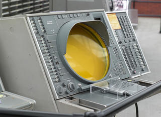
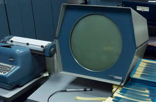
Electronic screens were introduced as an output device in the 1950s and screen technology has improved rapidly over these past few decades. But electronic screens are a proxy medium, in that whatever we see displayed on a screen comes from data encoded as electronic signals. The heart of electronic displays is light. It is transient. We cannot touch light.
Before this, we’ve always used physical media as a means of visual communication, from writing on all kinds of surfaces, to creating art, paintings and sculptures, or even physical expression through dance and performance.
When we encounter something completely new, like the web, we always try to reconcile it with something we’re already familiar with. In this case, the closest thing we had to the web was print. We even used similar terminology, calling them web pages.
However, because of the additional degree of separation between the creator and the final output, we cannot have the same set of expectations when it comes to handling the web as a medium. Let me attempt an emoji explanation.


My baby is growing up
My point is, designing for the web requires an intimate knowledge of the browser that will be rendering the final output. You can’t stick your hands in there and change things directly. You have to change the instructions given to the browser, explaining how you would like things to be rendered instead.
When browsers first started out, they couldn’t do much except display text and maybe images if you were lucky. Like a baby, that hasn’t developed the motor skills to even sit up yet. But over the years, browsers have become more mature and vastly more capable. And when it comes to layout on the web, I feel that the release of CSS grid is like the web finally getting it’s driver’s license.
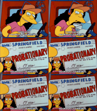
There are still a lot of legacy expectations brought over from print that cause designers a lot of frustration when designing for the web. I know, because I’d given my fair share of grief to them when I said, no, we can’t build that because it requires resorting to measures of extreme-hackishness.
To me, the magic of the web is the process by which the web evolves. The web was meant to be an open platform. One where new features can be proposed and discussed by the community before being implemented into browsers.
Because you’re amazing, just the way you are
The new normal I would like to see is one where people don’t expect websites to look the same on different browsers and devices. Where we embrace the fluidity of content and work with it instead of against it. Where we cede control of our designs to the browsers that render them rather than constantly engage in this battle to dictate where every pixel should fall.
In this sense, Flexbox and CSS grid gives us a whole suite of commands to tell the browser how we’d like things to look depending on the context of the screen being used. And it’s much easier to trust the browser if we understand how it works.
Yes, there are a boat-load of browsers using different layout engines and hence each have their own quirks, or release features at different times, and you know what? That’s perfectly fine. Your parents didn’t expect you to behave exactly like your siblings, did they? (Sorry, if they did)
Browsers operate on an evergreen update model now, so features and bug fixes get shipped much faster than we’re used to with traditional software. So the range of browsers with varying features is extremely wide. This is part of parcel of web design, where we layer on different styles and looks based on feature support. This is part of the new normal I want to see.
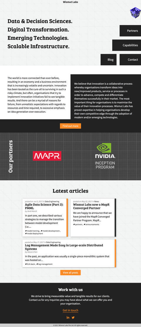
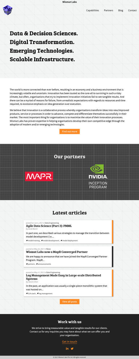
Feature queries are a fantastic addition to our toolbox, because it allows us to perform this layering natively, without resorting to extraneous code libraries. If you had to write extra code to make the website look exactly the same on every browser, you could write less code and have designs that work well on browsers with different levels of feature support.
Mind over matter?
The hardest part is changing our thinking, not our CSS.
—Jen Simmons
Jen Simmons said this in her talk at An Event Apart a couple years ago, that we can always create the same old boring layouts we always have with these new powerful tools at our disposal. Or we can draw inspiration from graphic design and print magazines. Those sources of designs that, only a year before, I was saying could not be built. They couldn’t be built before, but they can be now.
Some people might ask, why are we reinventing the wheel? We need to build things faster, with less effort, ship ship ship! I don’t support that view. In fact, is the wheel still relevant when you’re no longer on land? The web is a unique medium altogether. Maybe we ought to be thinking about wings instead.
It’s not that I want things to take forever to build, but I still maintain a moderately romantic view of craftsmanship. A potter works his clay with deft fingers, a sculptor chisels his marble with the precision of a surgeon, and I would like to direct my browser like a conductor does his orchestra.
Wrapping up
So these are just a few thoughts I had as I develop my content for the two up-coming events I will be speaking at in September, namely Form, Function, Class 8 in the Philippines, and the Mozilla Developer Roadshow, Asia. Both are quality events run by wonderful people so if you’re in the region, come and join us. We can geek out about the web together 🤓.