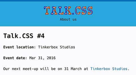
If you’ve been following along my latest exploits (though I doubt anyone is), you may know that I’m the co-organiser of Talk.CSS, the first CSS-centric meet-up group in Singapore. We’ve been in existence for around 5 months now and some time last month I thought it’d be a good idea to build a website for our little meet-up group.
Sort of a place where people can find out more about us, and check out what happened during our previous meet-ups. Okay fine, it was an excuse for me to build another website, but with the freedom to try all sorts of new technologies.
Since we’re a CSS-centric meet-up, the website must have some CSS-related mojo going on, right? (Just kidding, no voodoo involved, just cool code). I’m one of those people who still uses an RSS feed reader. Between that and Twitter, I come across many interesting CSS articles every day. And this website turned out to be the perfect playground for me to try out a lot of the things I read about.
Basic stuff
I’ve become pretty fond of Jekyll to spin up simple websites these days. If you haven’t heard of Jekyll before, it’s just one of countless static site generators out there on the interwebs. Web trends ebb and flow, so maybe this static site generator craze will die out soon, but as long as it suits my requirements, who cares?
Anyway, if you’re curious, StaticGen lists all the open-source static site generators out there by GitHub stars. So the site is built on Jekyll, and hosted on GitHub pages, because we’re too poor for paid hosting. Nor did we have the funds to purchase a domain name. Life. ¯\_(ツ)_/¯
If you’re interested in my Jekyll site workflow, check out this post which covers all the steps from setting up the repository to the gulp-run workflow.
I don’t know about you, but I’m one of those people who can spend hours happily searching for a font that feels right. Abduzeedo’s Friday Fresh Free Font segment has a lot of solid fonts. There are also those ever-so-popular listicle-style posts which feature new and noteworthy fonts.
I originally wanted to use Ahamono but the kerning didn’t feel right on the body copy, and the stylised descenders looked a bit odd. I eventually settled for Hack.
Fun stuff
CSS variables
One of the articles I read and found fascinating was Why I’m Excited About Native CSS Variables by Philip Walton. Seriously, you should follow this man. But I digress, point is, I arbitrarily decided this site should use CSS variables, at least for colours. What could possibly go wrong? Thing is, I like having my colours in Sass maps. Hmmmm… How to get both to play nice?
Then I remembered another article I read: CSS4 variables and SASS by Jake Albaugh. The word awesome does not do this article enough justice. Based on that article, I simply had to tweak my existing colour function to look like this:
@function color($color-name) {
  @return var(--#{$color-name}-color, map-get($colours, $color-name));
}
My colours map didn’t need to be touched but they would be used to generate my CSS colour variable declarations.
// Sass map for colours
$colours: (
  main: #1572b6,
  secondary: #33a9dc,
  border: #e8e8e8,
  shadow: rgba(0, 0, 0, 0.3),
  text: #110,
  bg: #fafaff,
);

// Loop to generate colour variables
:root {
  @each $name, $colour in $colours {
    --#{$name}-colour: $colour;
  }
}
CSS variables are not supported by Internet Explorer or Edge, and was only recently supported by Chrome (in 49) and Safari (in 9.1). So, fallbacks to the rescue. A simple map-get would suffice. Yes, it’s extra code, but that’s the trade-off when we play with the new and shiny.
background-color: map-get($colours, bg);
background-color: color(bg);
color: map-get($colours, text);
color: color(text);
Unfortunately, I couldn’t solve the issue with using Sass colour functions, as they still do not recognise my CSS variables as colours. Since that was the case, I tossed the plan to use darken as my hover effect on links.
Font-weight on hover trick
Instead I used a technique I recently learned from reading Quick Tip: Fixing the font-weight Problem on Hover States by George Martsoukos. The article suggested using the text-shadow property to simulate the effect of increasing the font-weight on hover, and I think it works fairly well.
a {
  color: map-get($colours, main);
  color: color(main);
  transition: all 0.2s;

  :hover {
    text-shadow: 0 0 0.35px map-get($colours, main), 0 0 0.35px map-get($colours, main);
    text-shadow: 0 0 0.35px color(main), 0 0 0.35px color(main);
  }
}
Chromatic font
Earlier in March, Roel Nieskens released Bixa Color, the first chromatic webfont as a collaboration with Novo Typo. Ever since I heard Chris Lilley (another man you really should follow) talk about webfonts at CSSConf.Asia last year, I was intrigued by the concept of chromatic fonts. Bixa Color is definitely a display font, so I just used it for the site title. Right now it’s only viewable on Firefox, but the built-in fallback (black) works on every other browser.
Flexbox
This site is not complicated. I could probably get away with almost no layout at all, but some things still need to fall in line. Might as well throw in some flexbox, right? TL:DR is, flexbox plus media queries = win! 😎
.o-flex {
  display: flex;
  flex-flow: row wrap;
  justify-content: space-between;
}

.o-flex3__item {
  flex: 0 0 100%;

  @include mappy-bp(small medium) {
    flex: 0 0 span(6 of 12);
  }

  @include mappy-bp(medium) {
    flex: 0 0 span(4 of 12);
  }
}
Styling broken images
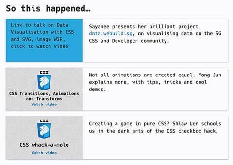
Another article that was making the rounds was an article by brilliant Nigerian developer Ire Aderinokun, who writes a blog called bitsofcode. It covered the technique of styling broken images by making use of pseudo-elements :before and :after and how they work with the <img> element.
First point, we can style the alternative text by applying typography-related properties to the <img> element. Also, the <img> element is a replaced element. Remember the src attribute? The image’s appearance and dimensions are controlled by an external source, hence pseudo-elements will not apply when the image is loaded. But when the image is broken, it’s not loaded, so pseudo-elements can be rendered.
.c-video__img {
  display: block;
  line-height: 1.5;
  min-height: 9em;
  position: relative;
  width: 100%;
  @include mappy-bp(medium) {
    display: inline-block;
    vertical-align: top;
    width: 16em;
  }

  &::before {
    content: "";
    display: block;
    min-height: 9em;
  }

  &::after {
    content: attr(alt) ", image WIP, click to watch video";
    display: block;
    padding: 0.5em 1em;
    position: absolute;
    top: 0;
    left: 0;
    width: 100%;
    height: 100%;
    background-color: map-get($colours, secondary);
    background-color: color(secondary);
  }
}
Wrapping up
This was a really fun project because I got to play with all the new and shiny stuff, as well as try out interesting techniques all these rockstar developers came up with. Organising Talk.CSS has been a pretty fruitful experience thus far. We’re still learning as we go, and hopefully we can continue to grow interest for CSS amongst the Singapore developer community moving forward.